

Glaidy: a friendly, bold brand for an AI assistant.
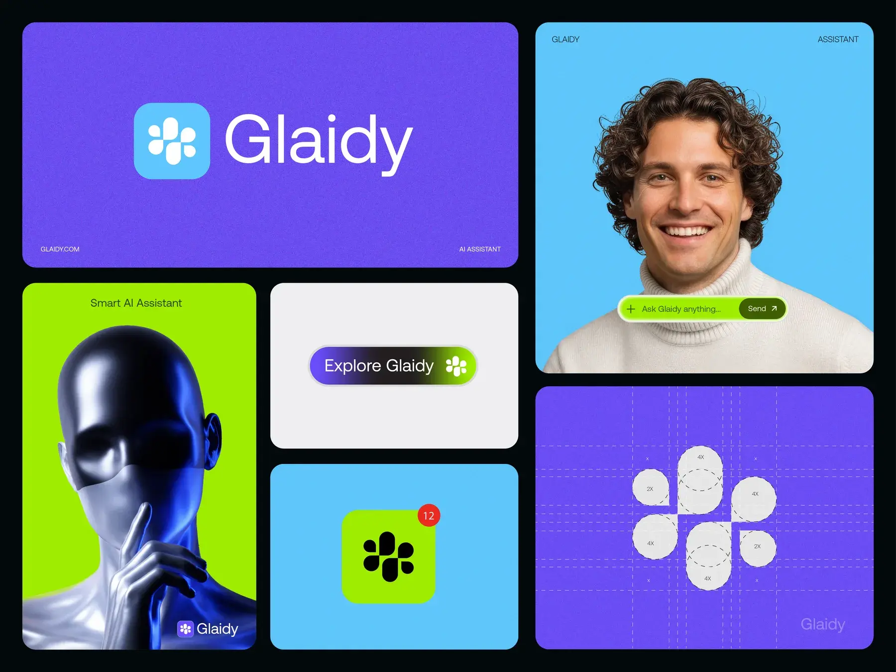
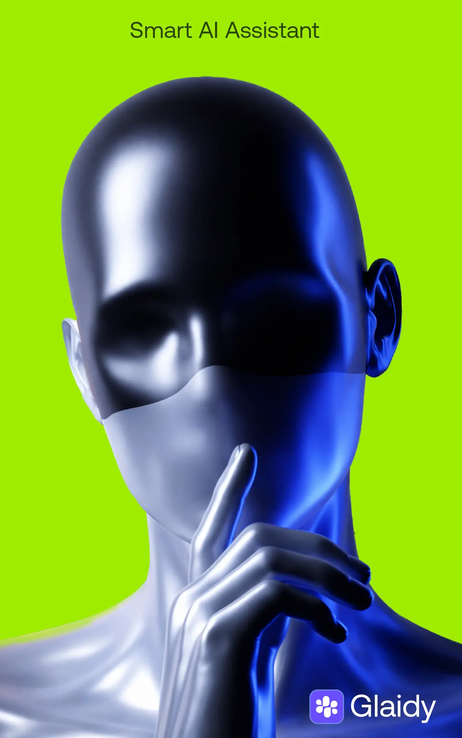
A brand identity for a smart AI assistant: a flower-like mark built from simple rounded shapes, a vivid palette of violet, sky blue and lime, and imagery that feels human rather than robotic.
Built by Gr8r for its own portfolio. Not client work.
The brief
An AI assistant people actually want to talk to.
Glaidy is an AI assistant. The brand had to feel approachable and human, so people are happy to ask it anything, while still looking modern and capable enough for an AI product.
- 1Friendly: soft, rounded shapes in the mark
- 2Bold: violet, sky blue and lime that stand out
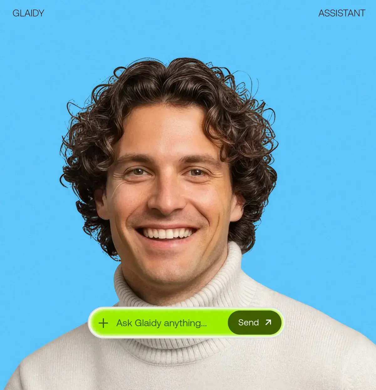
- 3Human: real people alongside the product
The system
Four parts, used the same way everywhere.
- 1Step 1
Mark
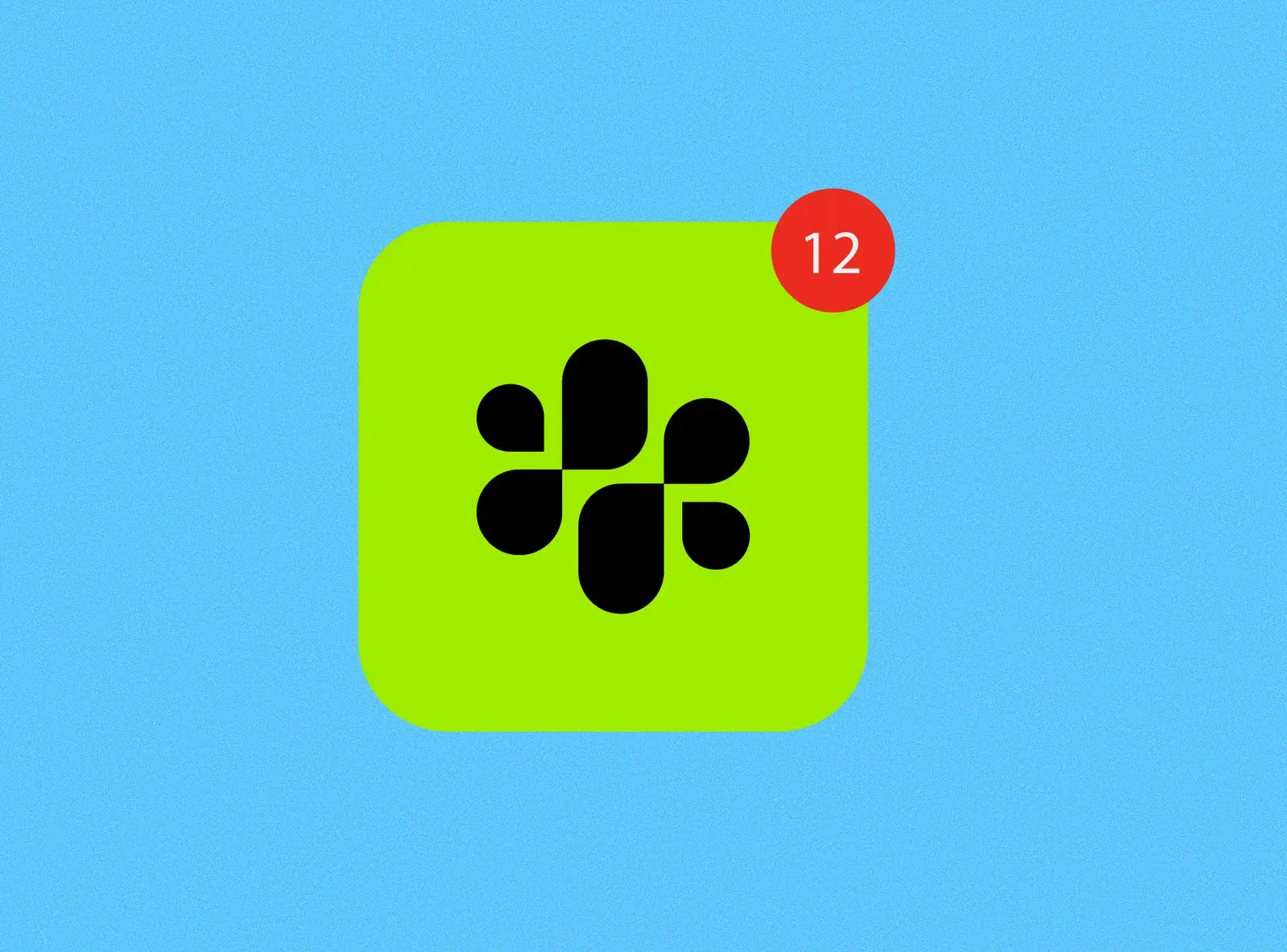
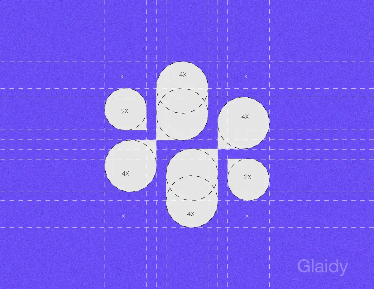
A flower-like form of circles and rounded bars, built on a proportional grid.
- 2Step 2
Wordmark
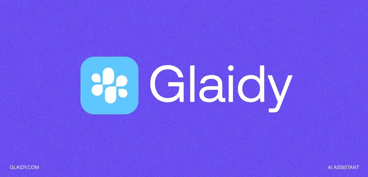
Glaidy in a clean, friendly sans beside the mark.
- 3Step 3
Colour
Violet carries the brand, with sky blue, lime and a soft grey.
- Step 4
Interface
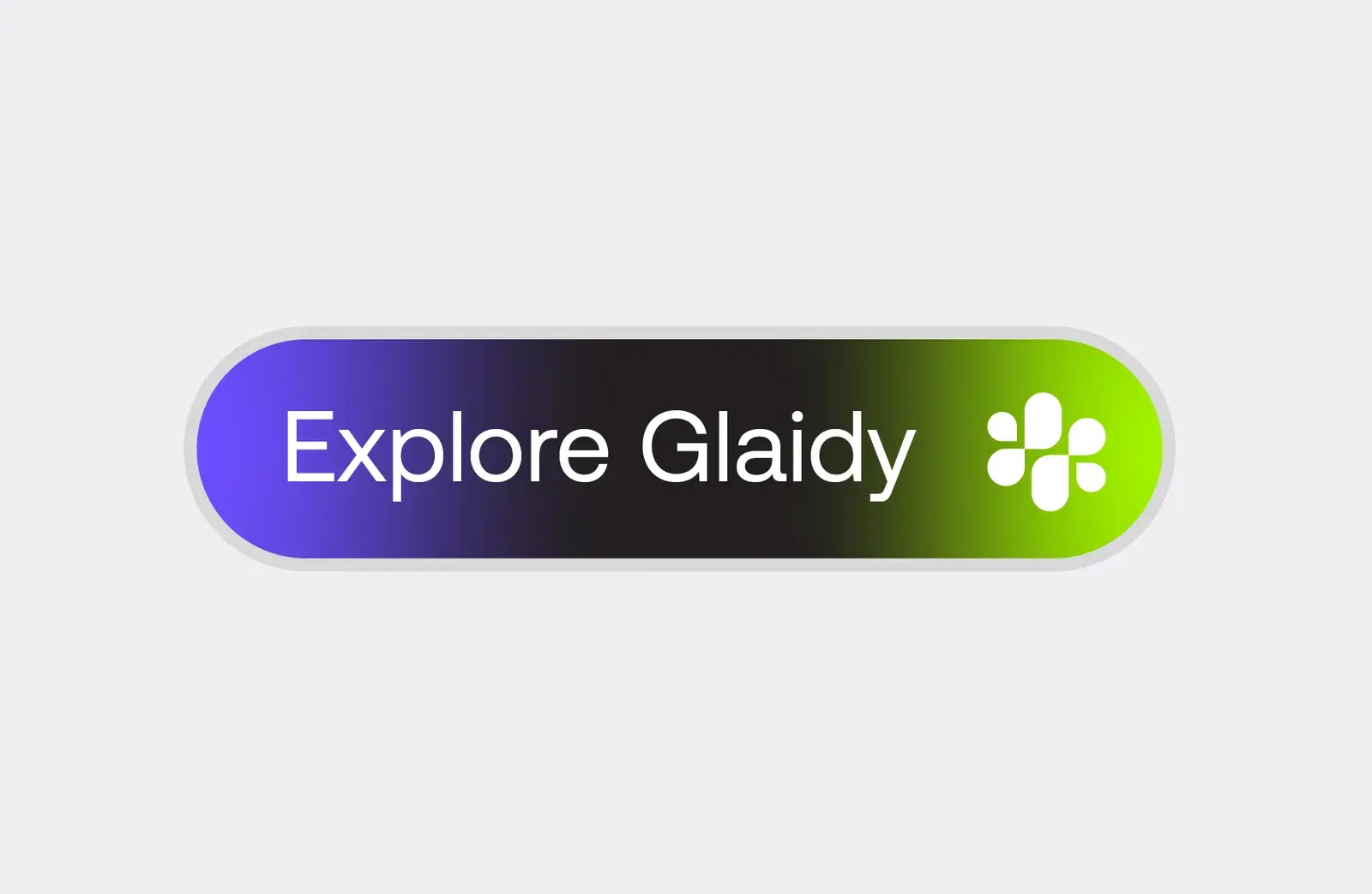
The Ask Glaidy bar and Explore Glaidy button bring the brand into the product.
Brand applications
The identity, applied.
From the logo construction to the product: every application from the brand board.
Style guide
Colours.
Violet carries the brand. Sky blue and lime bring energy to the app icon, imagery and buttons, with a soft grey and near-black for interface and text.
Violet
HEX #684DED
Black
HEX #0B0F14
Sky blue
HEX #64C6FB
Lime
HEX #9FEC01
Soft grey
HEX #EFEEF1
Outcomes
A complete identity, ready to use.
What we delivered. Measured business results will be added only with evidence and approval.
A mark that feels friendly
Rounded shapes on a strict grid: approachable, but precise at every size.
Colour you can't miss
Violet, sky blue and lime make Glaidy instantly recognisable.
Brand inside the product
The ask bar and Explore button carry the identity into the interface itself.