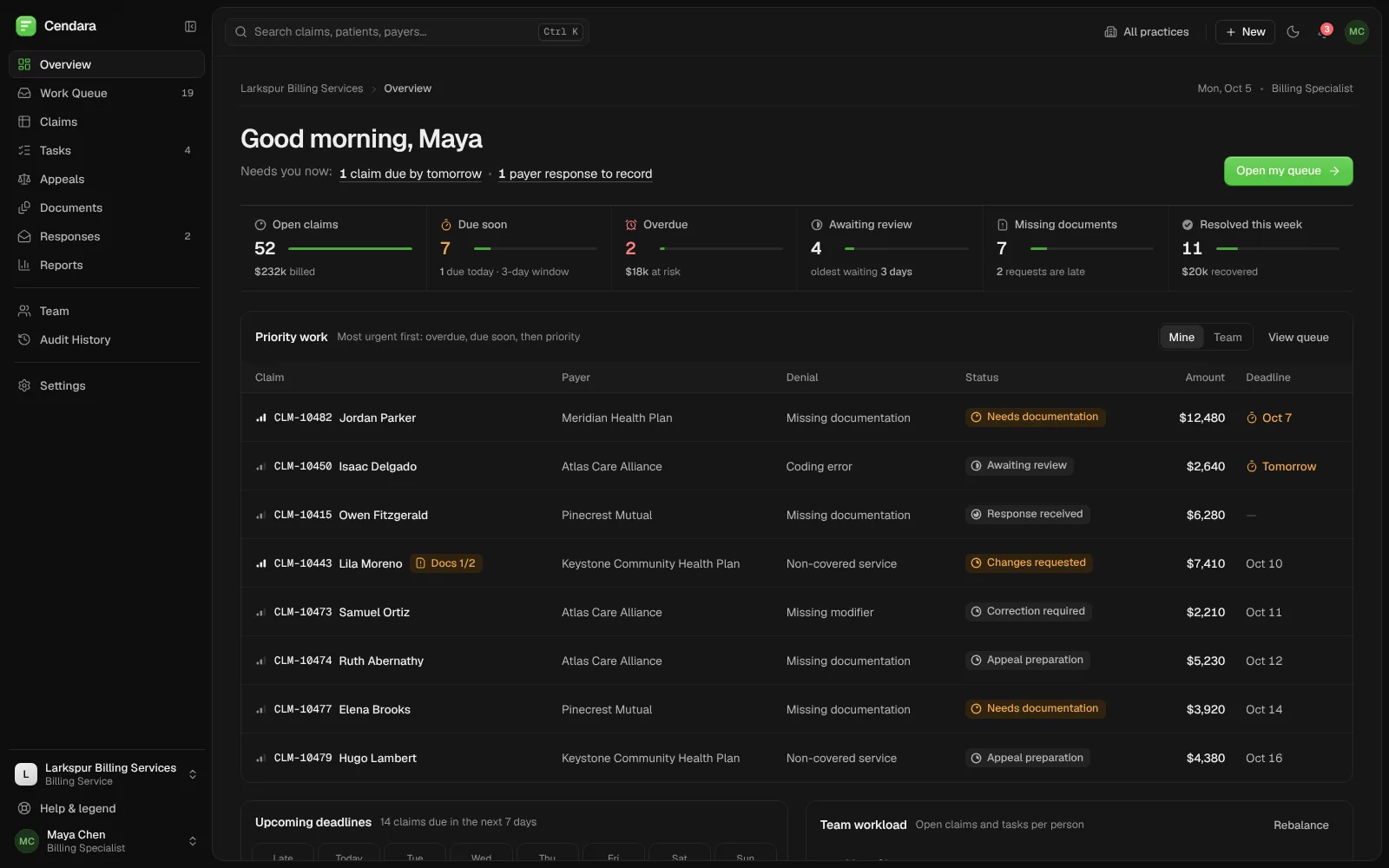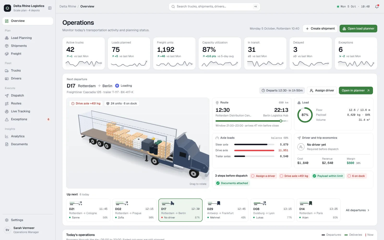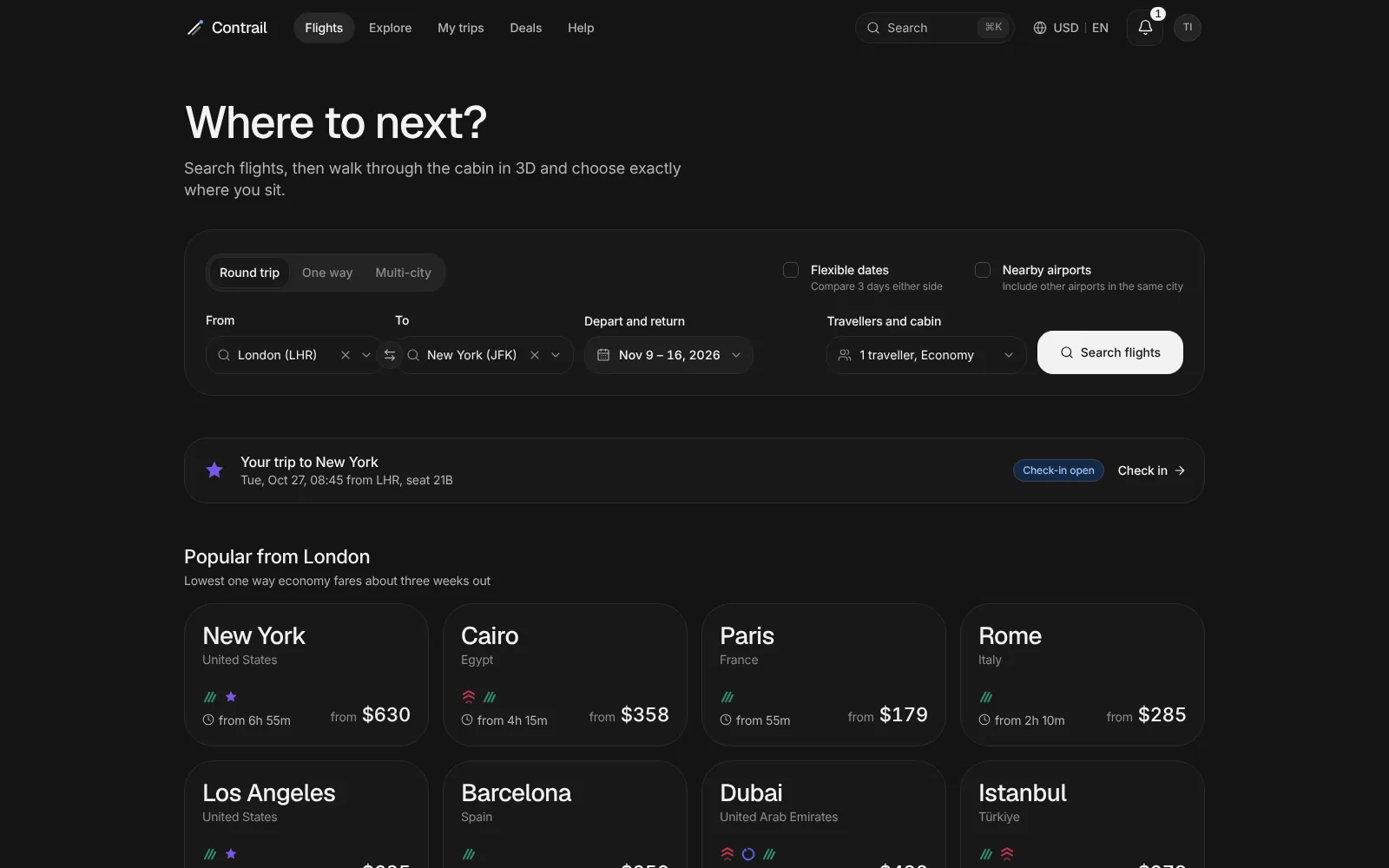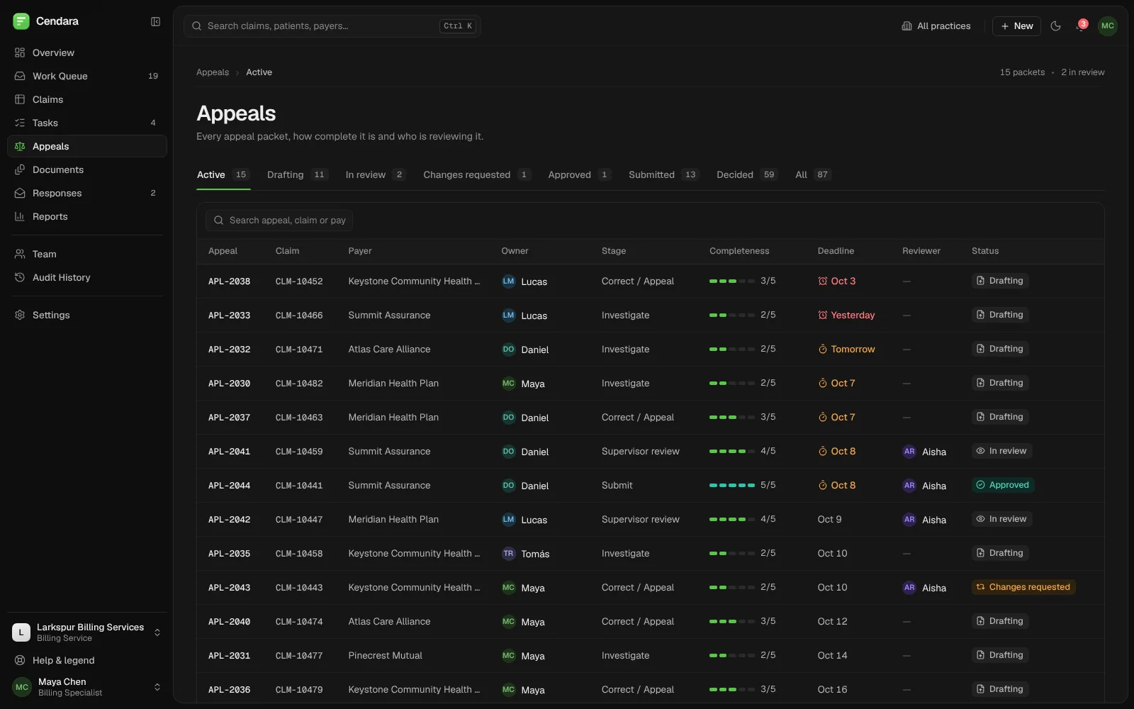


Veluno UX audit: a fast, well-built workspace whose numbers don’t always agree.
We audited Veluno, a product we built, the same way we audit client products: sign-in, the overview, suppliers, reviews, renewals and the supplier portal, at three screen widths, by mouse and by keyboard. We found 13 issues. The three high ones are counts that disagree, supplier rows a keyboard can’t reach, and a phone layout that scrolls sideways.
Built by Gr8r for its own portfolio. Not client work.
- Client
- Veluno (our product)
- Project
- UX audit
- Platforms
- Web app, tested at desktop (1600 and 1440px), tablet (768px) and phone (390px) widths
The brief
Would we pass our own audit?
Veluno is a supplier onboarding product we designed and built, so this is not a client project. We gave it the same review a client gets. We used the live demo, signed in as the procurement lead and as the supplier, and tested sign-in, the overview, the supplier list and profile, a procurement review, documents, renewals, the invite form and the supplier portal. First we ran automated checks (axe-core, overflow at three widths, load timings). Then senior designers and engineers walked the key tasks by mouse and keyboard and decided what matters.
- 1
The numbers disagree
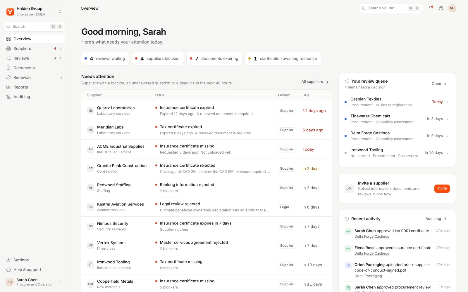
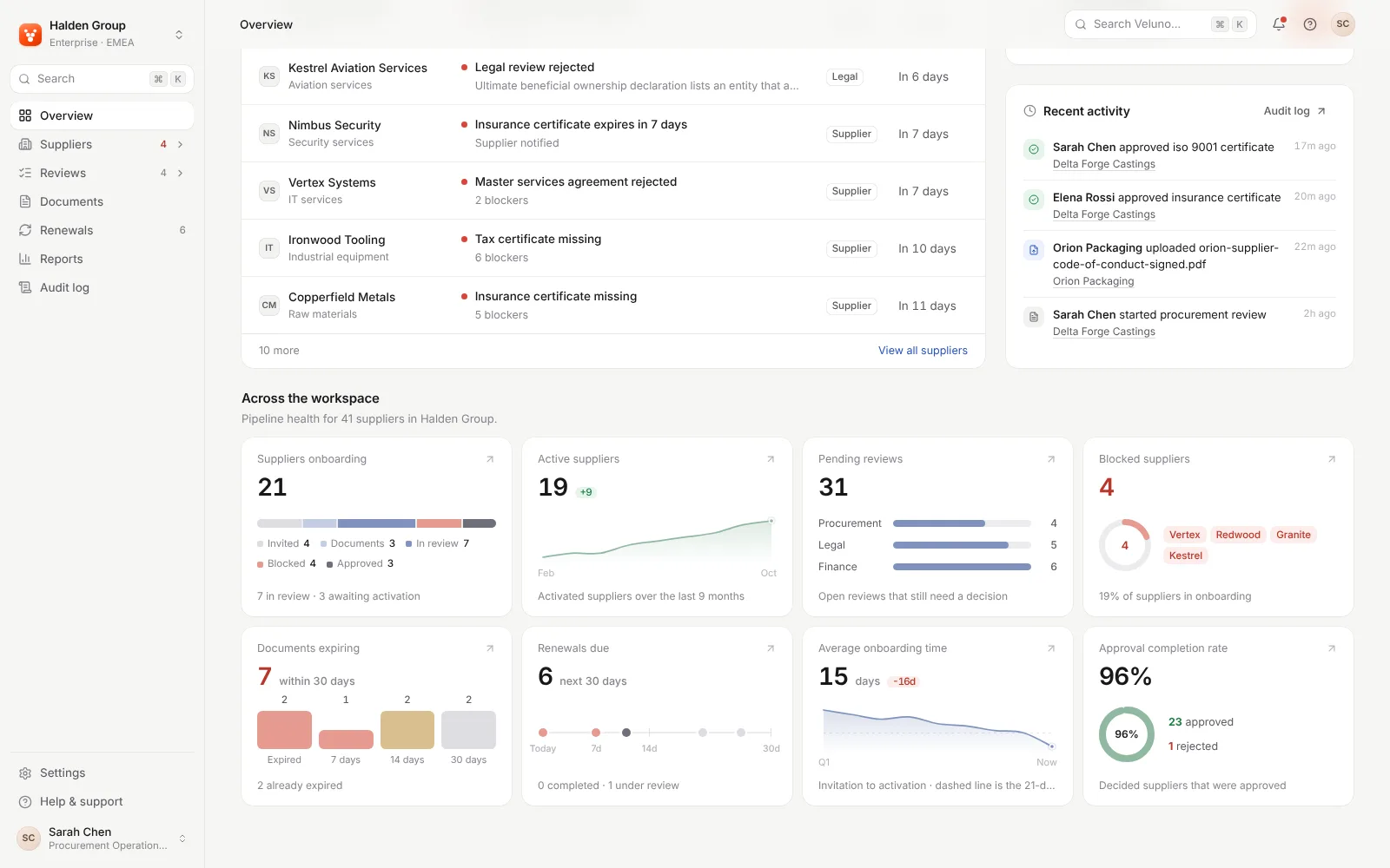
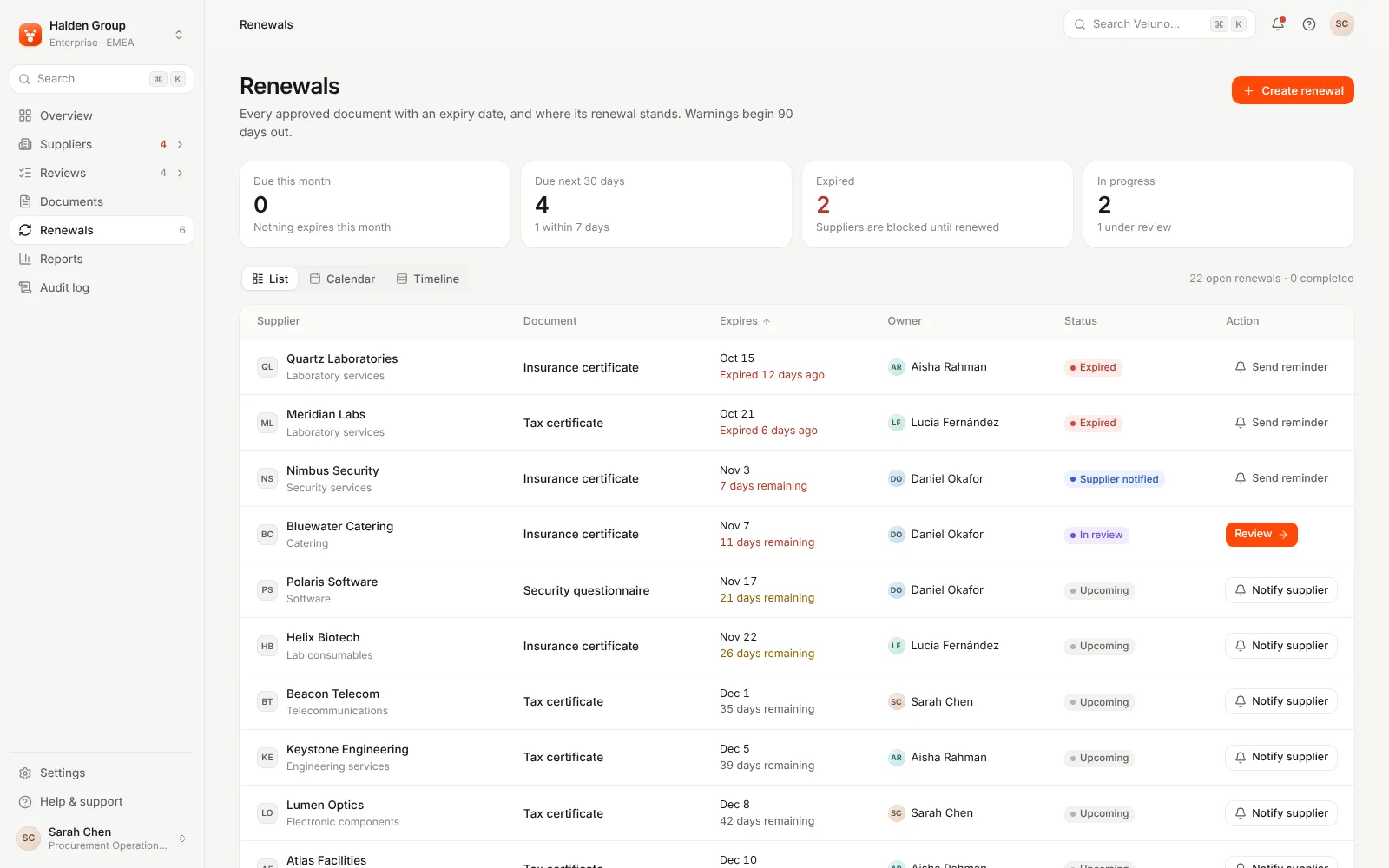
The overview says 31 pending reviews, but its own team rows add up to 15. It also says 6 renewals are due in 30 days, while the Renewals page says 4.
“Which number do I trust?”
- 2
Rows only work with a mouse
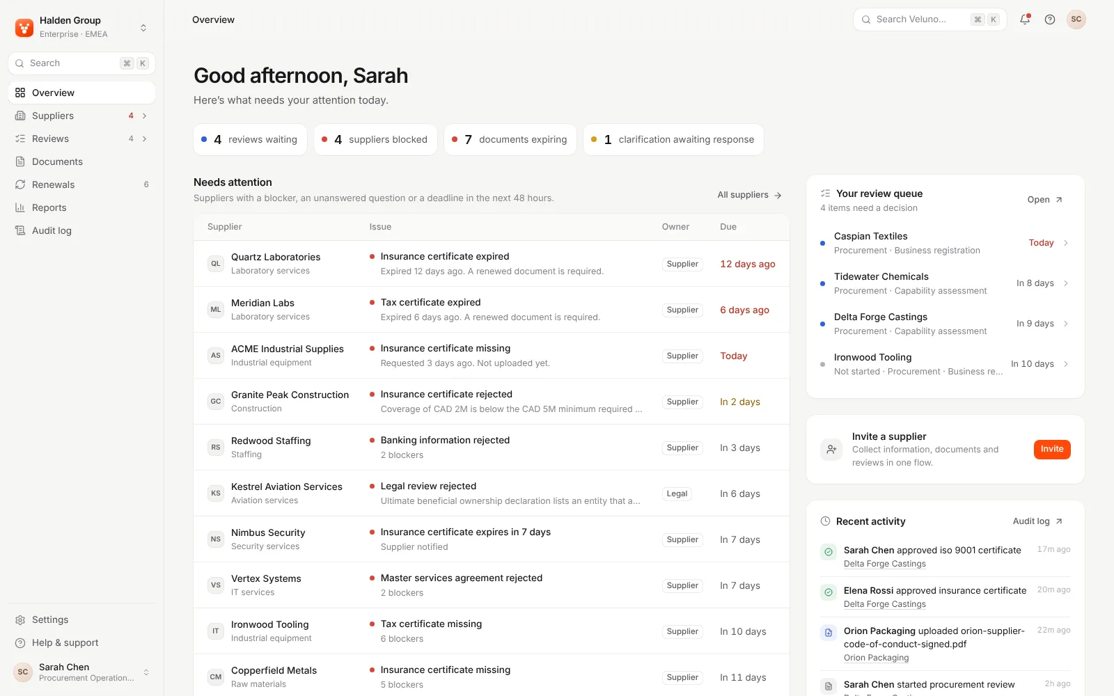
Supplier rows on the overview and the supplier list open when clicked, but Tab can’t reach any of them.
“How do I open this supplier without a mouse?”
- 3
Phones get the desktop table
At 390px the overview is 867px wide and scrolls sideways. On the supplier list, the Invite supplier button is cut off at the edge.
“Where is the rest of the page?”
Findings map
13 findings, grouped by where they hurt.
Here is everything we marked, grouped by the part of the experience it affects. Each item was seen or measured on the live demo.
Trust in the numbers
- 31 pending reviews; rows add to 15
- Renewals due: 6 here, 4 there
- Blocked count skips expired suppliers
- Attention: 8 on Suppliers, 20 on Overview
Keyboard
- Supplier rows skipped by Tab
- Palette lets focus escape behind it
- Faint focus ring on orange buttons
Phone and tablet
- Overview 867px wide at 390px
- Overview overflows at 768px too
- Invite supplier button cut off
- Status columns pushed off-screen
Accessibility basics
- Muted text at 3.38:1 contrast
- Sign-in email field has no label
- Invite form: three unlabelled fields
- No main landmark on any screen
Decisions
- Approve with 0 of 4 verified
- Open blocker not named in dialog
First run and navigation
- Password dots are only a placeholder
- Portal role below the laptop fold
- Four sub-nav items all marked current
- “Renewals” appears twice in the sidebar
Our own expert review and automated checks of the live demo. Not user testing; severity is our estimate.
The method
How we ran it.
- 1
Scope
We chose sign-in, the overview, suppliers, a procurement review, documents, renewals, the invite form and the supplier portal.
- 2
First pass
Automated checks: axe-core on nine screens, overflow at 390, 768 and 1440px, load timings and JavaScript weight.
- 3
Expert review
We walked sign-in, finding a supplier and deciding a review by mouse and by keyboard, and noted every place we got stuck.
- 4
Prioritise
Each finding got a severity from our estimate of impact, a recommended fix, and a call on whether to change it or leave it.
Top issues
Ranked by impact.
Ranked by our estimate of impact. Issue 3, the phone layout, is shown in the next section.
- 1 · High
Counts that disagree between screens
The Pending reviews card says 31, but its Procurement, Legal and Finance rows add up to 15, and Reports also says 15. Renewals due reads 6 here and 4 on the Renewals page. Fix: give each count one definition that every card, badge and page uses, and put the time window in the label.
- 2 · High
Supplier rows you can’t reach by keyboard
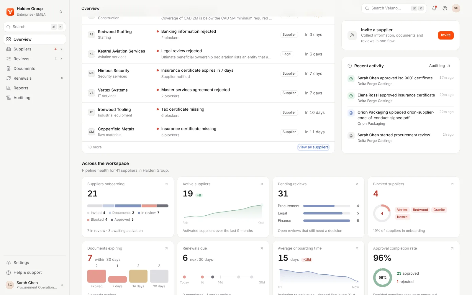
The ten Needs attention rows open on click, but Tab jumps from All suppliers straight to View all suppliers. On the supplier list, a row’s checkbox is the only thing you can focus. Fix: make each supplier name a real link and keep the row click as a shortcut.
- 4 · Medium
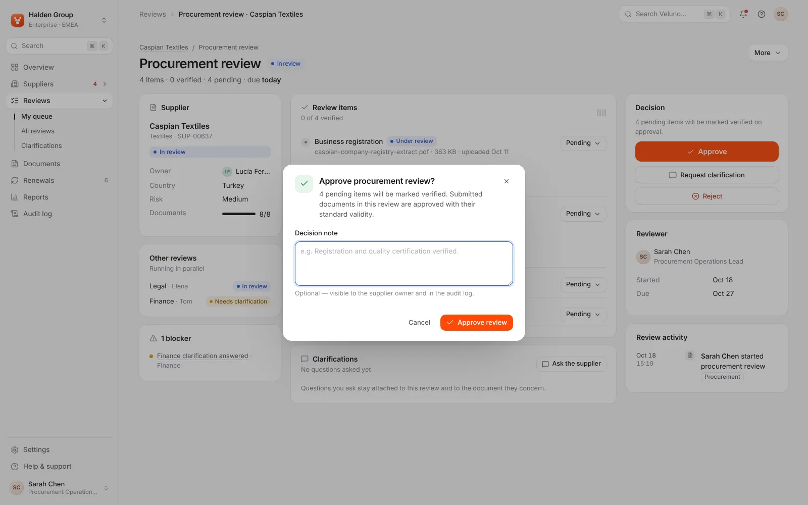
Approve with nothing checked
On Caspian Textiles, 0 of 4 items are verified and a blocker is open, but Approve is still the primary button. The dialog says all 4 items will be marked verified and doesn’t mention the blocker. Fix: list the unchecked items and any open blocker in the dialog, or make Approve secondary until they’re resolved.
- 5 · Medium
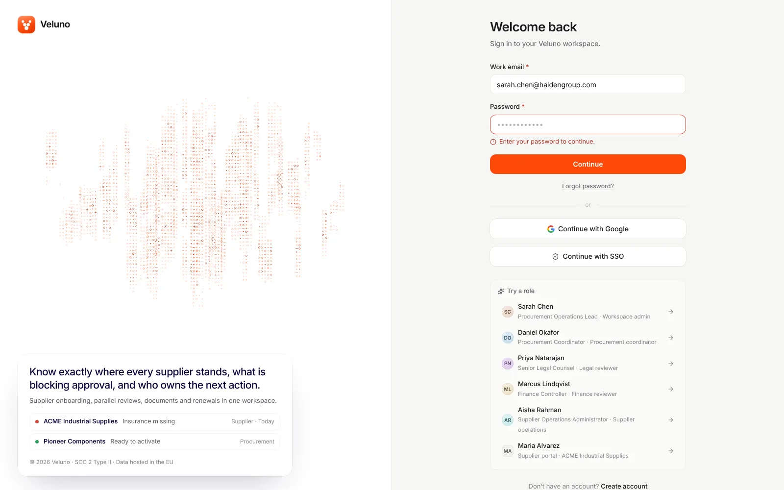
A sign-in form that looks filled in
The password field shows twelve dots, but they’re only a placeholder, so the first Continue fails. The visible Work email label isn’t connected to its field, and muted text such as “or” sits at 1.92:1 contrast. Fix: prefill a real demo password or leave the field empty, connect the labels, and darken the muted colour token.
On a phone
The desktop layout, squeezed.
At 390px the menu folds into a drawer, but the overview table keeps its desktop width. The page is 867px wide and scrolls sideways, and it is 879px wide at 768px. The supplier list is 474px wide, so Invite supplier is cut off. Fix: show Needs attention as stacked cards below about 900px, and let the page actions wrap.
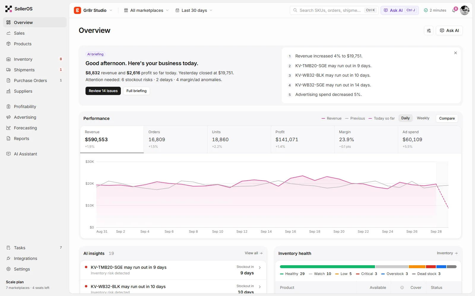
Veluno overview at desktop width, where the Needs attention table fits 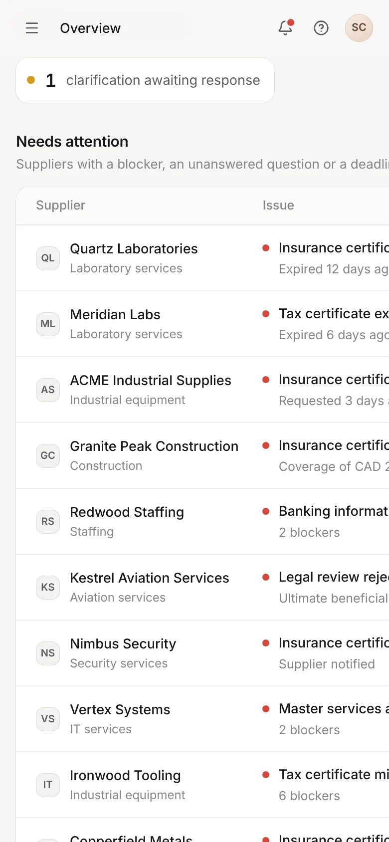
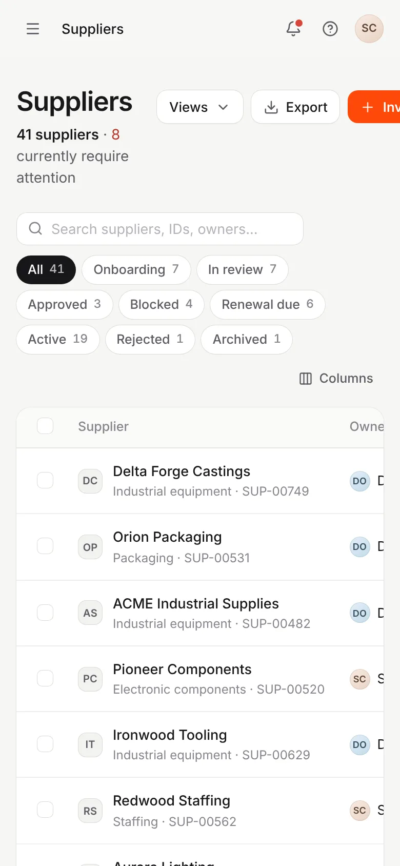
Overview at 390px: the Needs attention table is cut off at the right edge · Supplier list at 390px: the Invite supplier button and the table columns run off-screen
What we measured
Fast and light. The gaps are in semantics.
We ran axe-core 4.14 on nine screens. Every screen had 2 to 7 failing rules, mostly colour contrast: muted grey #85858c reaches only 3.38:1 on the page background, and white on the orange buttons is also 3.38:1. We also found unlabelled form fields and no main landmark. Performance is not a concern. The first load sends 202 KB of compressed JavaScript, and every route showed content within 1.5 seconds. Lists show a skeleton while they load.
- 202 KB of JavaScript on first load
- First paint in 0.6–0.9 s
- Overview at 390px: 867px wide
- Overview rows reachable by Tab: 0 of 10
What the audit delivered
What to fix, and what to leave alone.
These are findings and recommendations, not results: nothing here has been fixed yet. We’ll add what changed once the fixes ship.
Fix first
Make the counts agree across screens, turn supplier rows into real links, and give the overview a phone layout.
Quick wins this month
Connect labels to the unlabelled fields, darken the muted text token, trap focus in the command palette, and mark only the current sub-nav item.
Decide with reviewers
Agree on whether a review can be approved with unchecked items before changing the Approve flow.
Leave as it is
Keep the one-click demo roles, deep links that survive sign-in, the command palette, and the confirm dialogs that say what will happen.