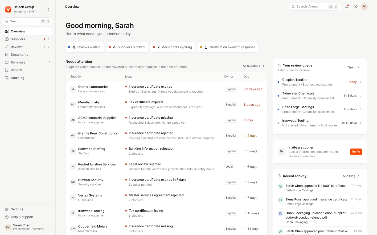


Cendara UX audit: strong on desktop and keyboard, but data tables push the page sideways on smaller screens.
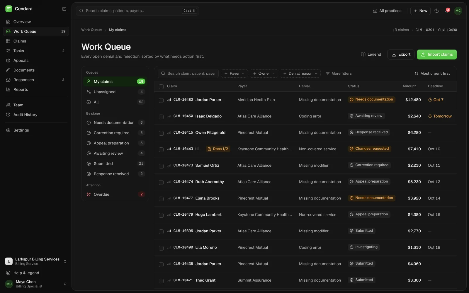
We audited Cendara, a product we built, the same way we audit client products: sign-in, the overview, the work queue, a claim, appeals and documents, at desktop, tablet and phone widths, by keyboard and with automated accessibility checks. Twelve findings came out, one of them high: on tablets and phones, three table pages scroll sideways as a whole.
Built by Gr8r for its own portfolio. Not client work.
- Client
- Cendara (our product)
- Project
- UX audit
- Platforms
- Web app at 1600, 1440, 768 and 390 px wide, mouse, keyboard and touch
The brief
Would a billing team get stuck anywhere?
Cendara is our own product: a workspace where billing teams work denied and rejected healthcare claims through to a resolution. We reviewed its live demo the way we review a client's product. We signed in as the billing specialist demo account, walked the core flows (find the next claim, open it, request a document, add a claim), ran axe-core on eight screens, measured page width at 390, 768 and 1440 px, and tabbed through sign-in and a claim by keyboard. Nothing here comes from user interviews; it is what we saw and measured.
- 1
Tables push the page sideways
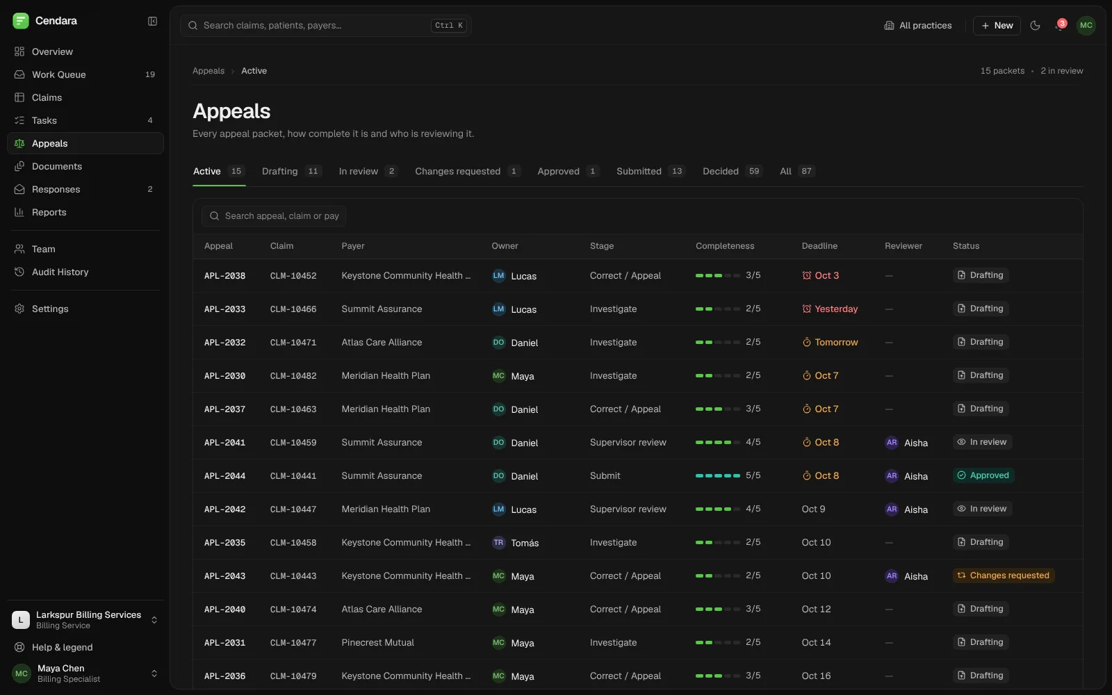
At 768 px the Claims page is 1,118 px wide, so the whole page scrolls sideways, not just the table. Work Queue and Appeals do the same, and Appeals does it on a 390 px phone too.
“Why does the whole page slide when I scroll?”
- 2
Team totals on a personal page
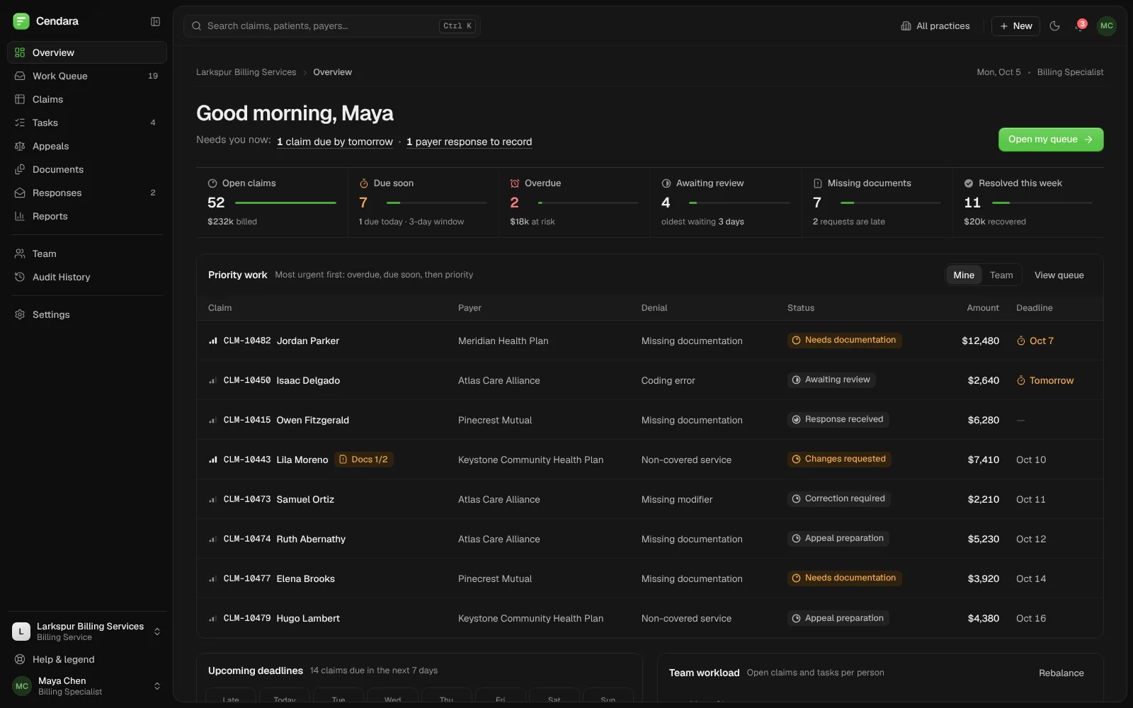
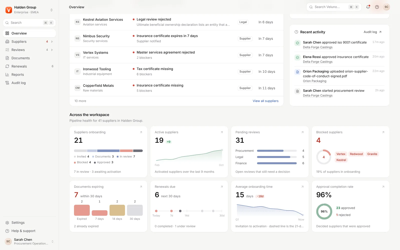
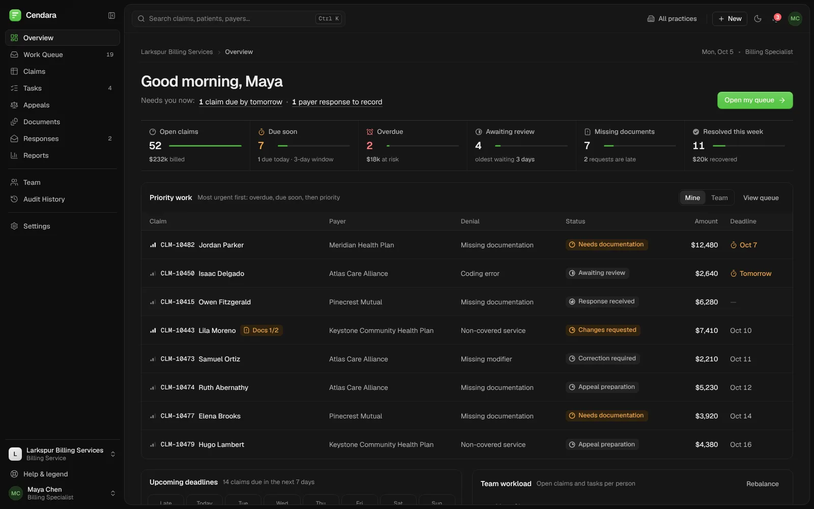
The overview greets Maya with what needs her now, and its priority list starts on Mine. The six tiles above it count the whole team: the two overdue claims belong to another specialist.
“Are these two overdue claims mine?”
- 3
Demo logins don't look clickable
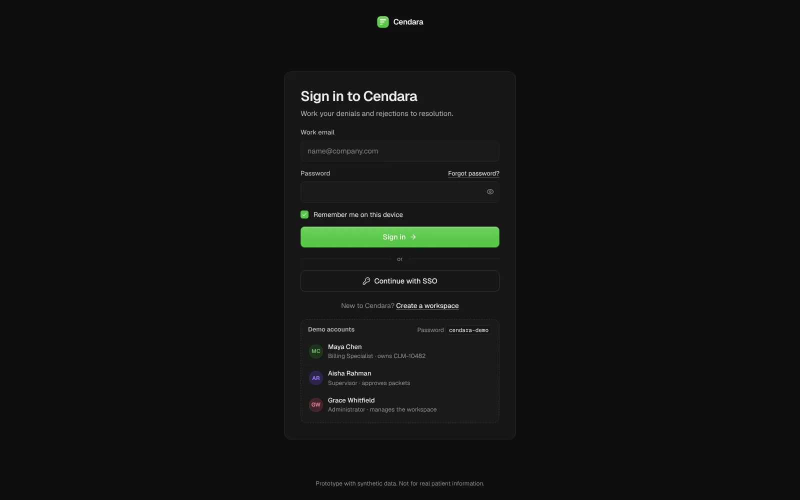
Each demo account has a Use label, but it stays invisible until you hover or tab to the row. On a touch screen it never appears, and Use only fills the form, so Sign in is a second step.
“Do I tap a name or type the password?”
Findings map
12 findings, grouped by where they hurt.
Every finding from the audit, grouped by where a person runs into it. The full list, ranked, is in the written summary.
Phone and tablet
- Tables push the page sideways
- Claim page cut off at 390 px
Getting in
- Demo logins look unclickable on touch
- Dark theme ignores the device setting
Overview
- Team totals on a personal page
Screen readers and voice
- Priority icons aren't announced
- Spoken names differ from visible labels
- Focus stays on submit after errors
- Document preview unreachable by keyboard
Visual polish
- Two text colours below 4.5:1
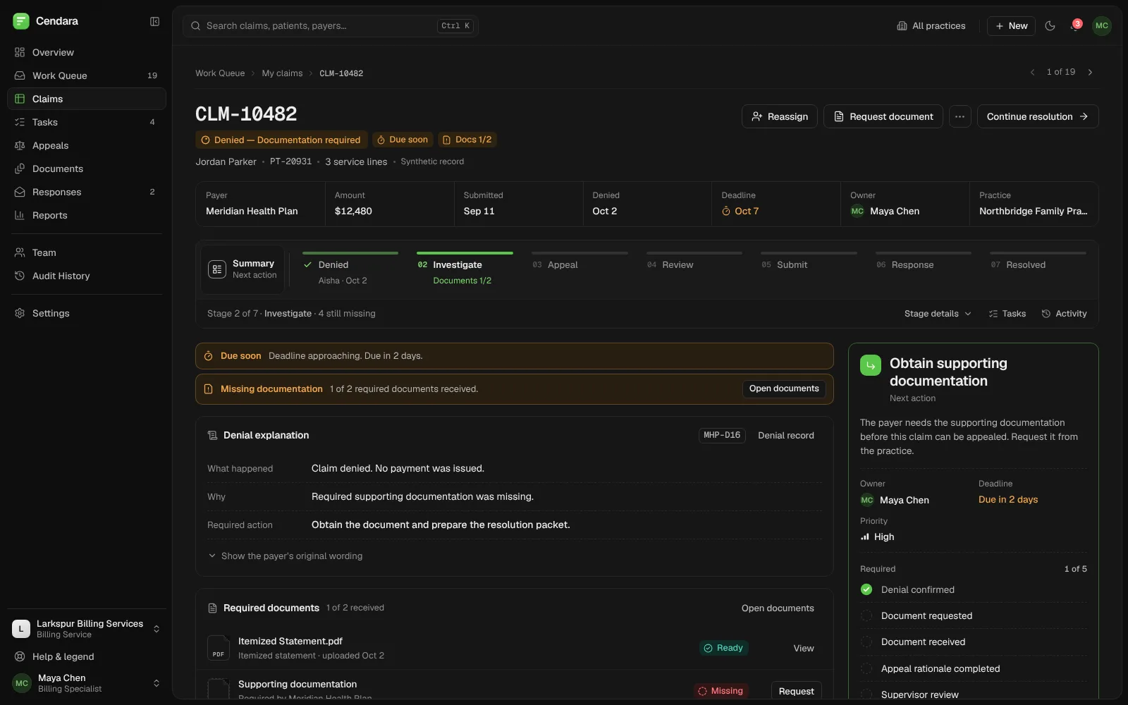
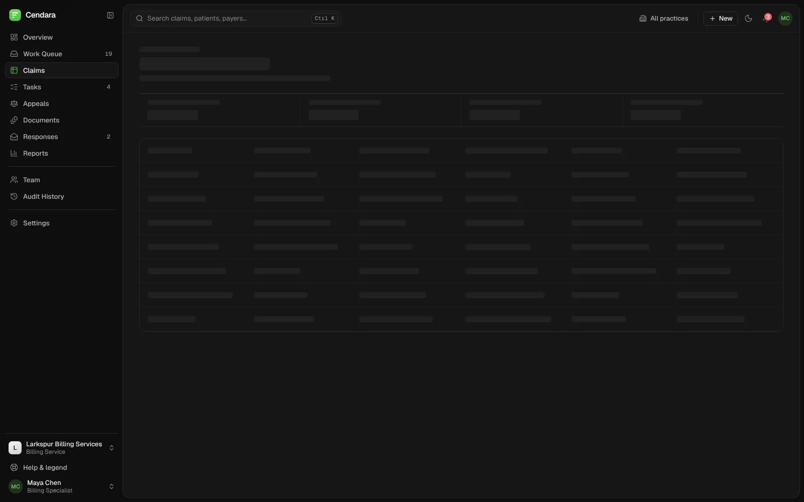
- Skeleton doesn't match the Claims page
- Help shows ⌘ K, search shows Ctrl K
Our own expert review and automated checks of the live demo. Not user testing; severity is our estimate.
The method
Measure first, then judge.
- 1
Scope
Sign-in, overview, work queue, a claim, appeals, documents and reports, signed in as the billing specialist demo account.
- 2
First pass
Scripted checks with Playwright and axe-core: accessibility on eight screens, page width at three sizes, load and skeleton timings.
- 3
Expert review
We tabbed through sign-in and a claim, opened the palette and dialogs, submitted empty forms and walked the core flows by hand.
- 4
Prioritise
We ranked twelve findings by our estimate of impact and split them into fix first, quick wins and what to leave alone.
Top issues
Ranked by impact.
The four findings we would fix first, ranked by our estimate of how much they get in a billing team's way. Each one comes with the fix we recommend.
- 1 · High
Tables push the whole page sideways
The tables sit in their own scroll box, but hidden “due soon” and “overdue” labels for screen readers escape it, so the page grows: Claims is 1,118 px wide at 768 px, Appeals 790 px on a 390 px phone. Fix: give the table's scroll box position: relative so it contains those labels, then recheck the three pages.
- 2 · Medium
Team totals on a personal page
The greeting and the Mine list are about Maya, but the tiles count the whole team, so the two overdue claims don't appear in her list. Due soon uses a 3-day window, the deadlines panel 7 days. Fix: label the tiles' scope, or make them follow the Mine / Team switch.
- 3 · Medium
Demo logins don't look clickable
The Use label on each demo account is set to opacity 0 until hover or keyboard focus, so on a phone the rows look like plain text. Choosing one fills the form and leaves focus on the row. Fix: show the action all the time, worded as “Sign in as Maya”, and sign in in one step.
- 4 · Medium
Priority isn't announced to screen readers
Priority is shown only as signal bars, labelled with aria-label on a plain span, which assistive tech may ignore (axe: aria-prohibited-attr, 19 elements on the Work Queue, 15 on the Overview). The My claims count is 2.12:1 white on green. Fix: give the icon role="img", and darken the badge.
What we measured
The numbers behind the findings.
axe-core 4 ran on sign-in and seven app screens: sign-in passed; five rules failed across the app, mostly aria-prohibited-attr and label-content-name-mismatch. At 390 px, 2 of 11 screens were wider than the screen; at 768 px, 3 of 11; at 1440 px, none. Reaching sign-in took 163 KB of compressed JavaScript in 7 files. Each section shows a skeleton for 0.5 to 0.9 seconds on its first visit and none on later visits. The demo opens in dark mode even when the device asks for light.
- Sign-in: 0 axe violations
- 5 axe rules fail across 7 app screens
- Claims at 768 px: page is 1,118 px wide
- 163 KB of JavaScript to reach sign-in
What the audit delivered
What to fix first, and what to leave.
These are findings and recommendations, not results: nothing here has been fixed yet. We'll add what changed once the fixes ship.
Fix first
Contain the hidden table labels so the page stops scrolling sideways (one CSS rule), and let the claim page's alerts wrap on a phone.
Next
Say whose numbers the overview tiles show, and make the demo accounts look like the buttons they are.
Quick wins this month
role="img" on priority icons, accessible names that start with the visible label, two contrast fixes, System as the default theme, and the right ⌘ or Ctrl in Help.
Leave as it is
The command palette, how dialogs handle focus and Esc, the inline form errors, and the Help & legend panel all work well.