

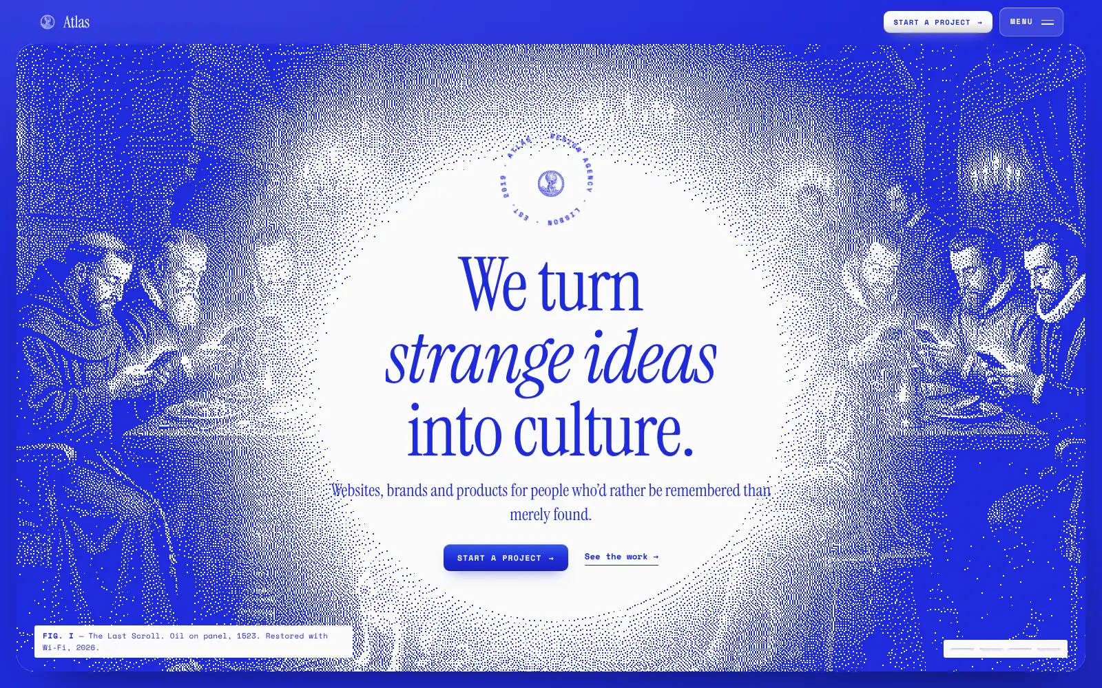
Atlas: a design agency website that walks you through a gallery.
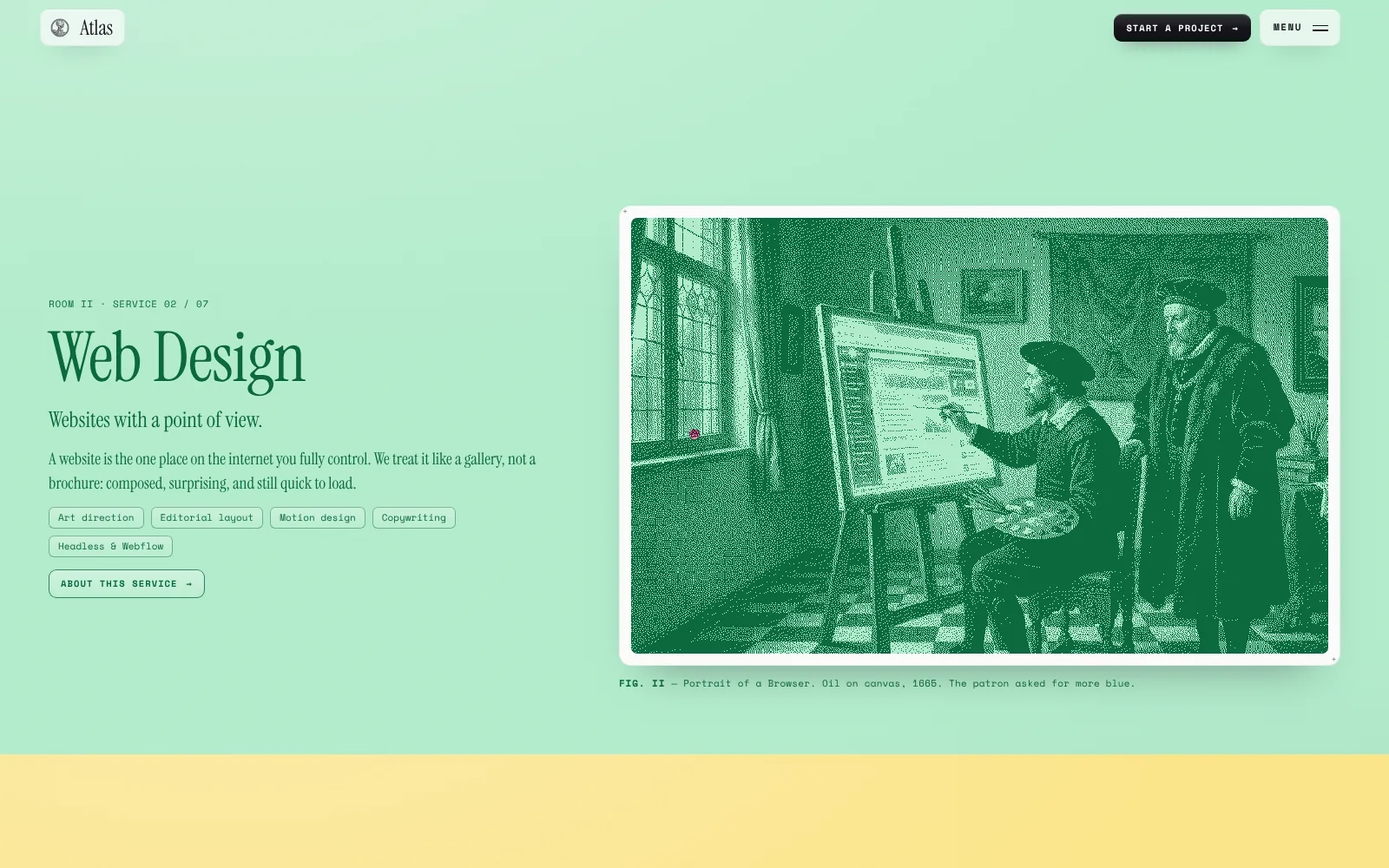
A website concept for a Lisbon design studio, told as a museum visit. Old master paintings, reworked as dot prints with captions to match, carry the services, work, process and contact form.
Built by Gr8r for its own portfolio. Not client work.
The problem
Make an agency site people remember.
Most agency websites look the same: a bold claim, a grid of logos and a contact button. Visitors skim them and forget them. Atlas sells strange ideas, so its own site had to be one. It needed a clear visual idea that could hold seven services, five projects, a team and a contact form without getting in the way.
- 1Agency sites blur into one another
- 2Lots of content to fit in one story
- 3Personality can't cost clarity
The workflow
A visit, room by room.
- 1
Enter
The hero sets the idea: strange ideas, made clear.
- 2
Browse
Seven service rooms and five projects, each with its own colour.
- 3
Wander
A horizontal gallery of experiments and a tapestry of the process.
- 4
Write
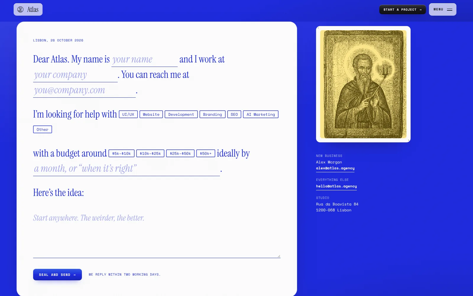
The contact form is a letter you fill in.
The website
One idea, carried through every page.
Every section is a numbered room with a painting and a museum caption. The joke stays light, and the content stays easy to read.
- Work
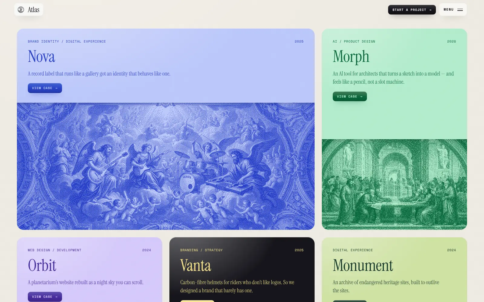
Projects as cards
Five projects on coloured cards, each with its discipline, year, a one-line summary and a link to the full case.
- Gallery
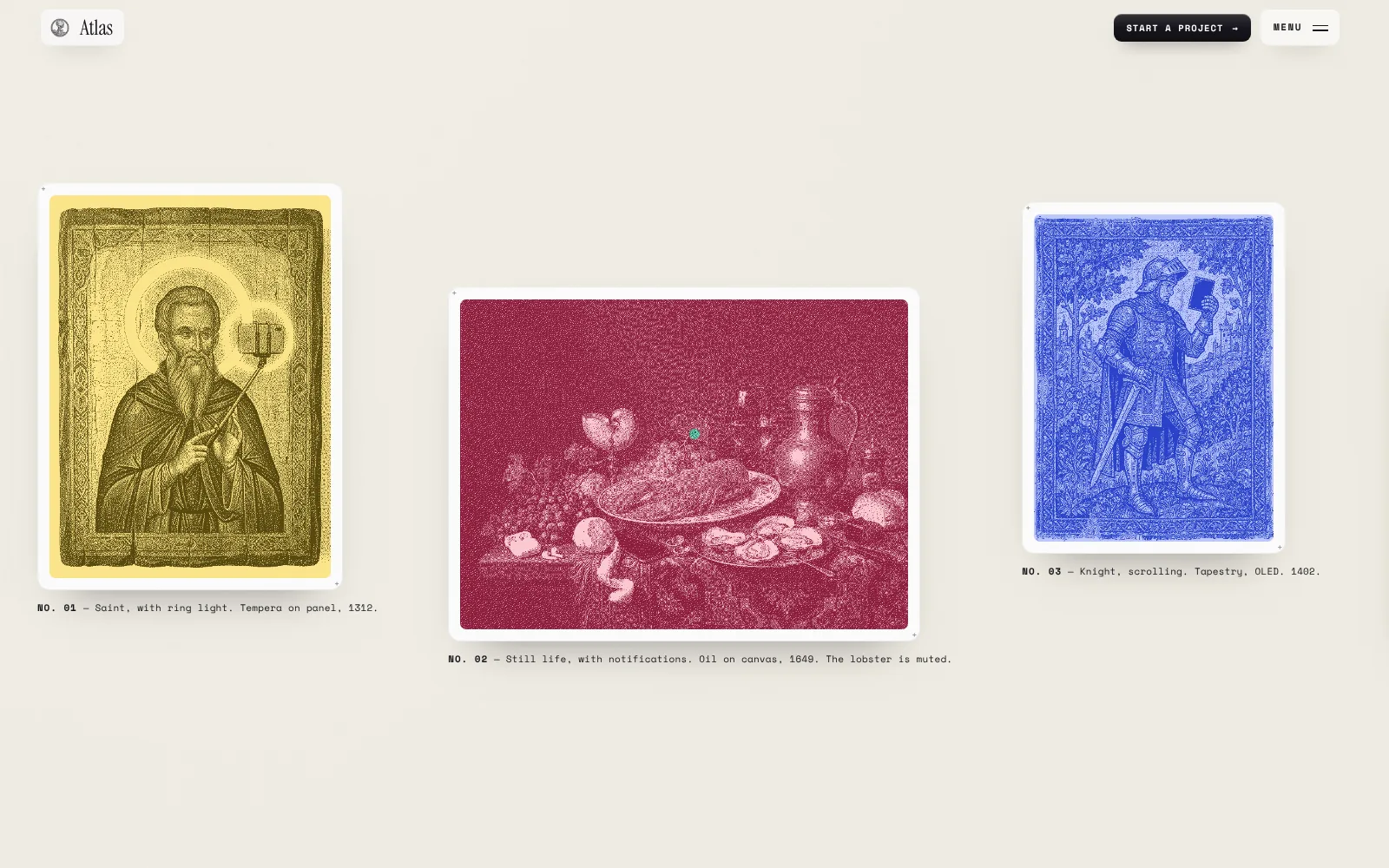
A wall you scroll sideways
Experiments hang in a horizontal gallery that moves as you scroll down, each print with its own caption.
- Process
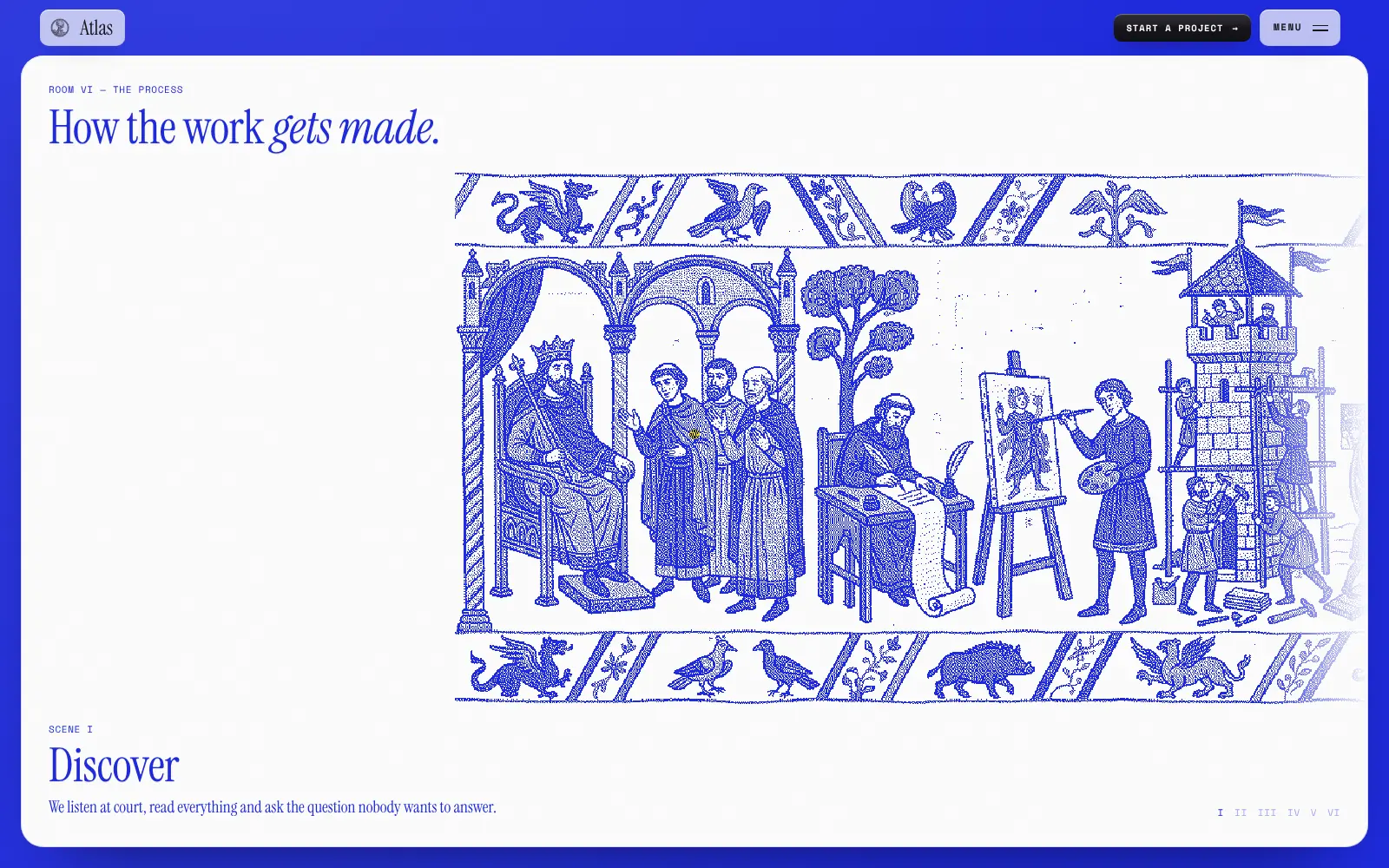
The process as a tapestry
Six scenes, from Discover to Launch, play out across one drawn tapestry as you scroll.
- Contact
A letter, not a form
Name, company, service, budget and idea are blanks in a letter to the studio, sent with a "Seal and send" button.
Engineering
Motion that serves the story.
Atlas is a React single-page site with client-side routing between its pages. Smooth scrolling drives the pinned sections: the sideways gallery and the tapestry that changes scene as you scroll. The full-screen menu previews each page's painting on hover, and the layout reflows to a single column on phones.
- React single-page app
- Lenis smooth scrolling
- Scroll-driven gallery and tapestry
- Responsive down to phone width
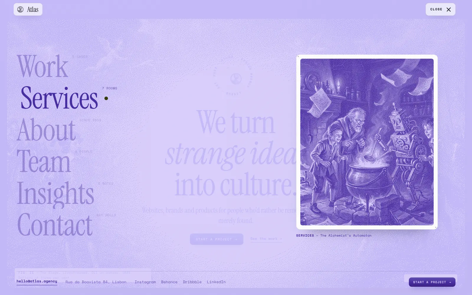
Navigate: the menu previews each page
Explore: one room per service
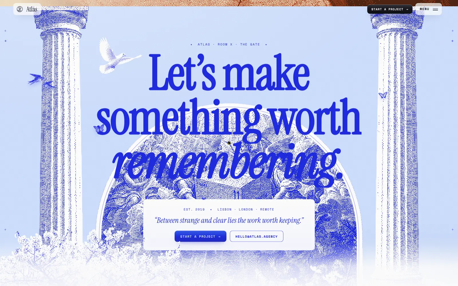
Close: the gate at the end of the visit
Outcomes
Designed to be remembered.
What the website demonstrably does. Measured results will be added only with evidence and approval.
One clear visual idea
Every page is a room with a painting and a caption.
Content that stays readable
Services, work, team and insights each have a plain, scannable page.
An easy first message
The contact letter asks for the essentials in a single paragraph.