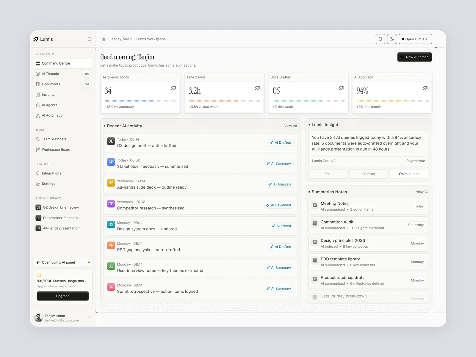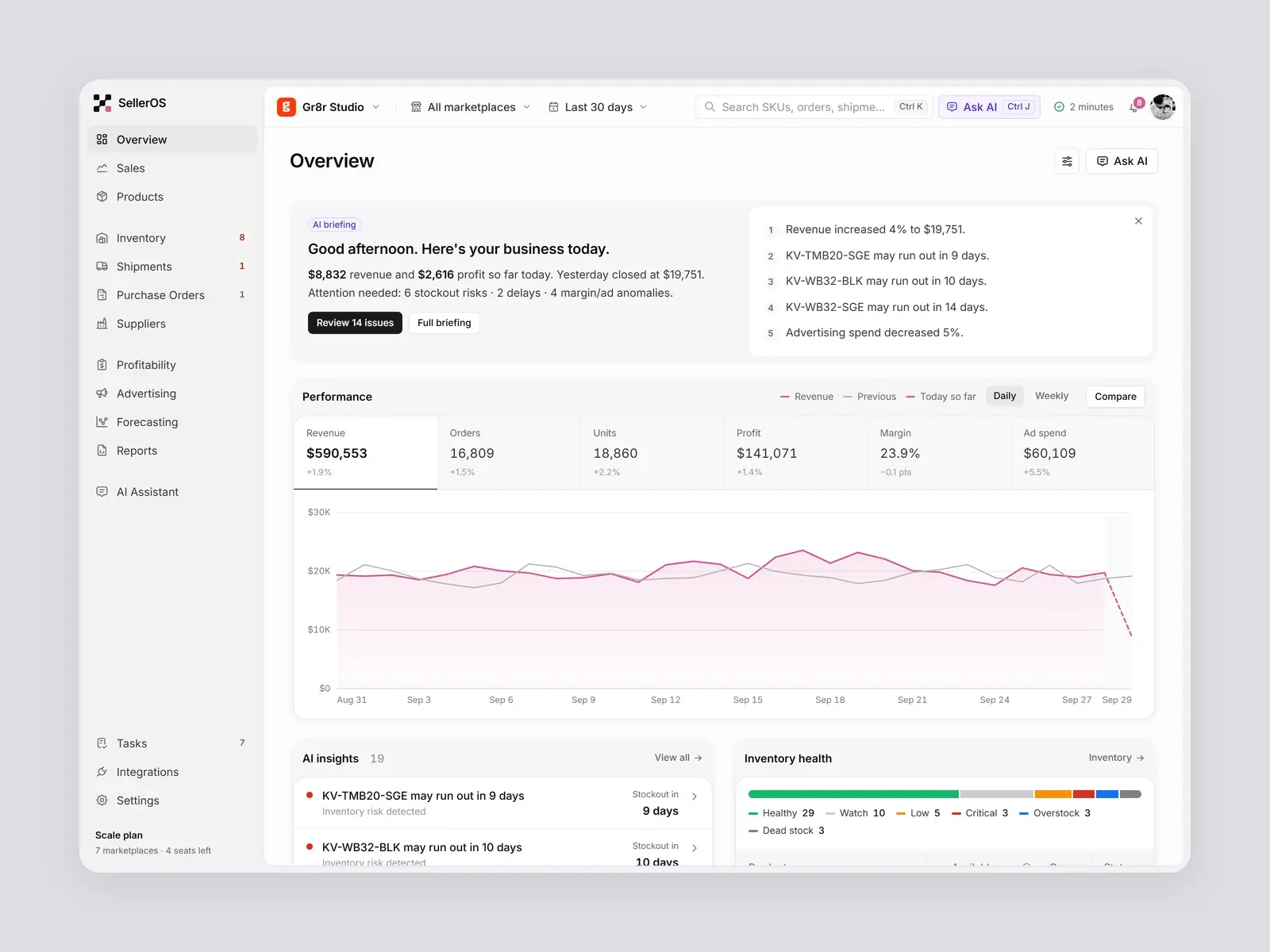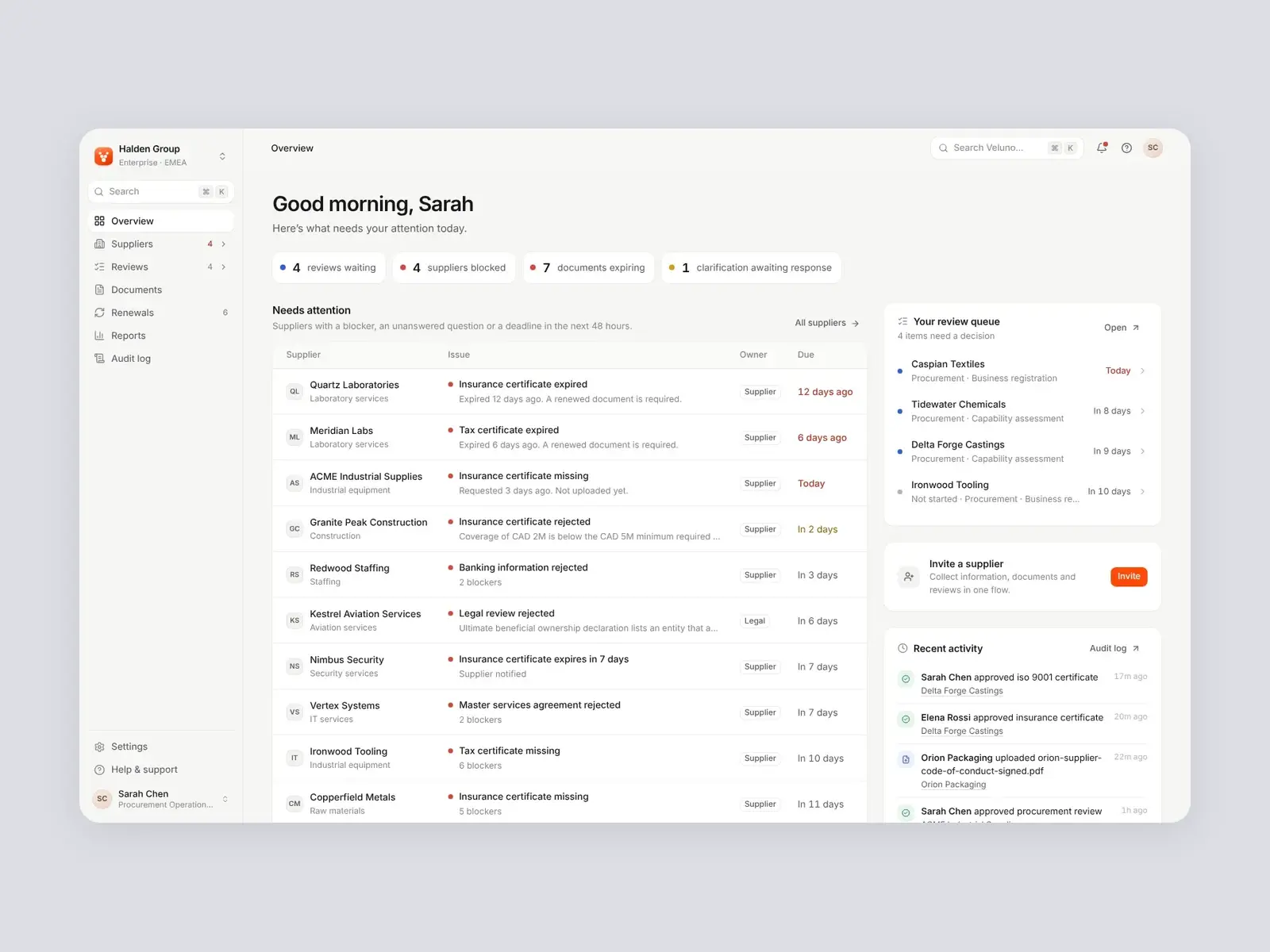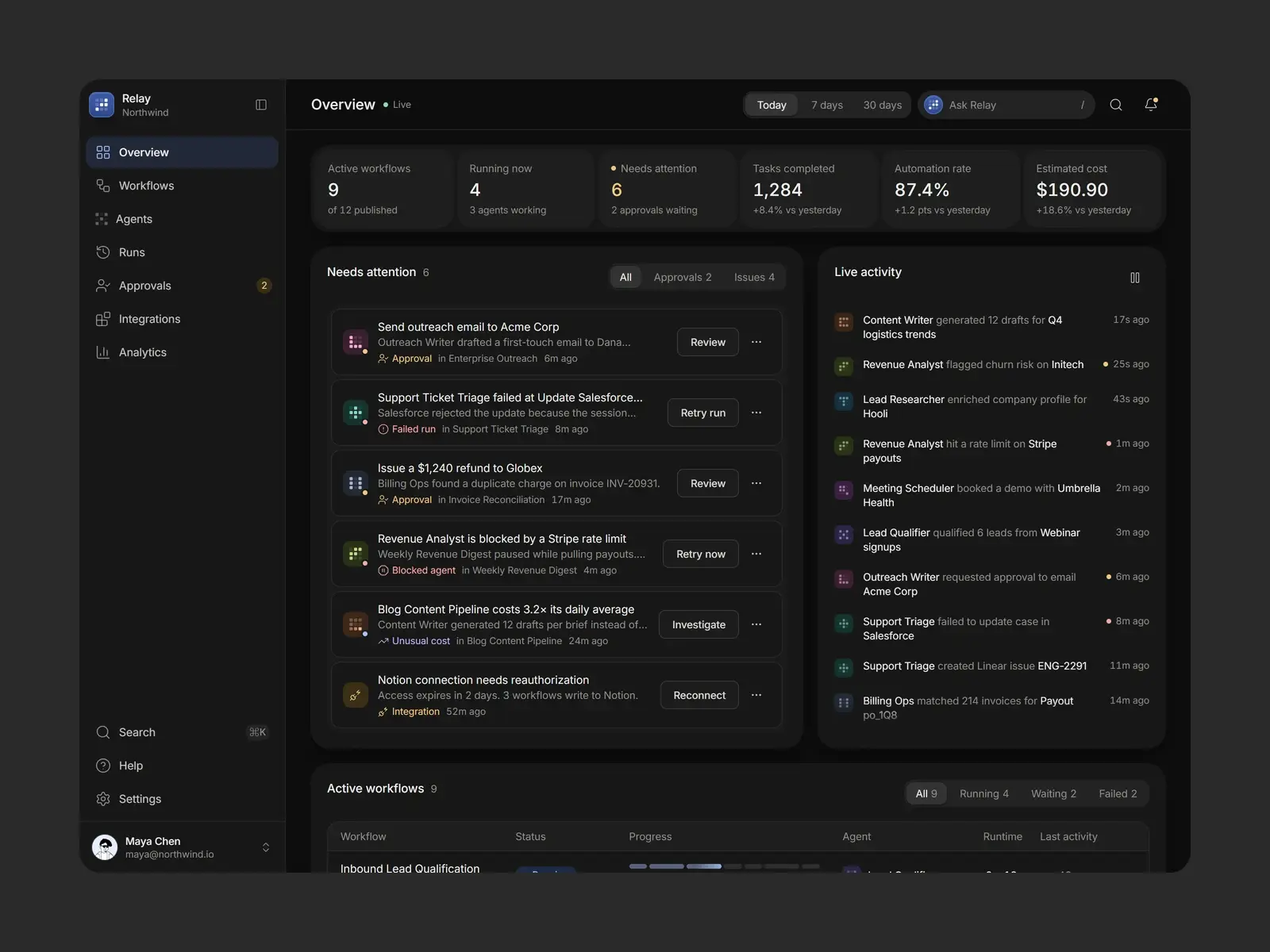



CloseCRM: from an AI-generated MVP to a product people trust.
AI had already built the foundation: contacts, deals, tasks and a dashboard that worked. We audited every screen, fixed the experience and redesigned the interface, so the same product feels clear, consistent and professionally designed.
Built by Gr8r for its own portfolio. Not client work.
- Client
- CloseCRM
- Project
- AI MVP Cleanup
- Platforms
- Web app, desktop-first
- Deliverable
- Redesigned screens + design system
The starting point
AI built the features. The experience wasn't there yet.
The MVP already did the job: contacts, deals, tasks and activity were all in place. But it looked like a template, every screen gave everything the same weight, and layouts broke as soon as real data filled them. It worked, but it didn't yet feel like a product a team would choose to live in every day.
- 1
Everything looks equally important
Stat cards, lists and buttons shared one weight and one grey. Nothing told a rep where to look first or what needed doing.
“Where do I start?”
- 2
Layouts break with real data
Statuses, dates and names wrapped mid-word in tables and cards, so even simple screens looked unfinished.
“Why does this say 'In Progr ess'?”
- 3
It looks like a template
A generic name, default components and no visual identity. The product didn't feel like it belonged to anyone.
“Is this a real product or a demo?”
Before and after
Same product. A very different experience.
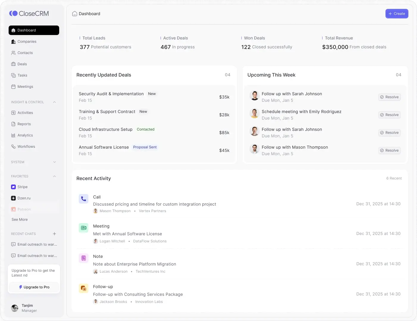
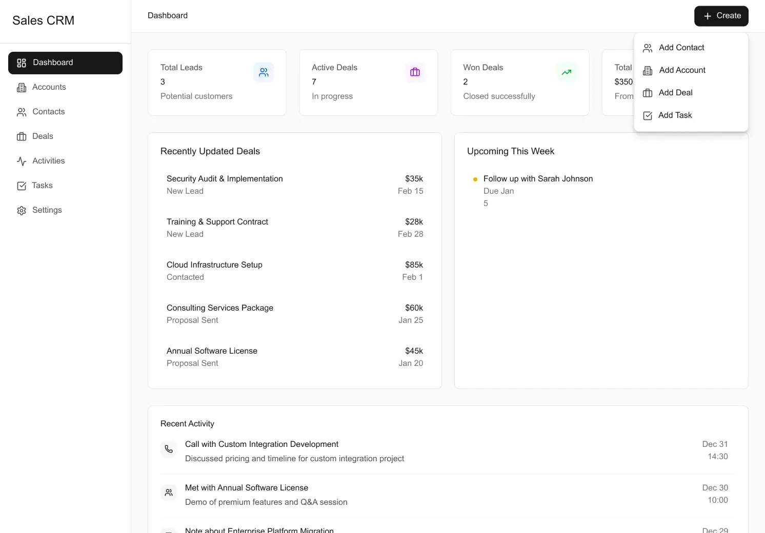
Each AI-generated screen beside our redesign. The features stayed; what changed is how clearly the product shows people what matters and what to do next.
AI-generatedBefore Redesigned by Gr8rAfter 01 / 04
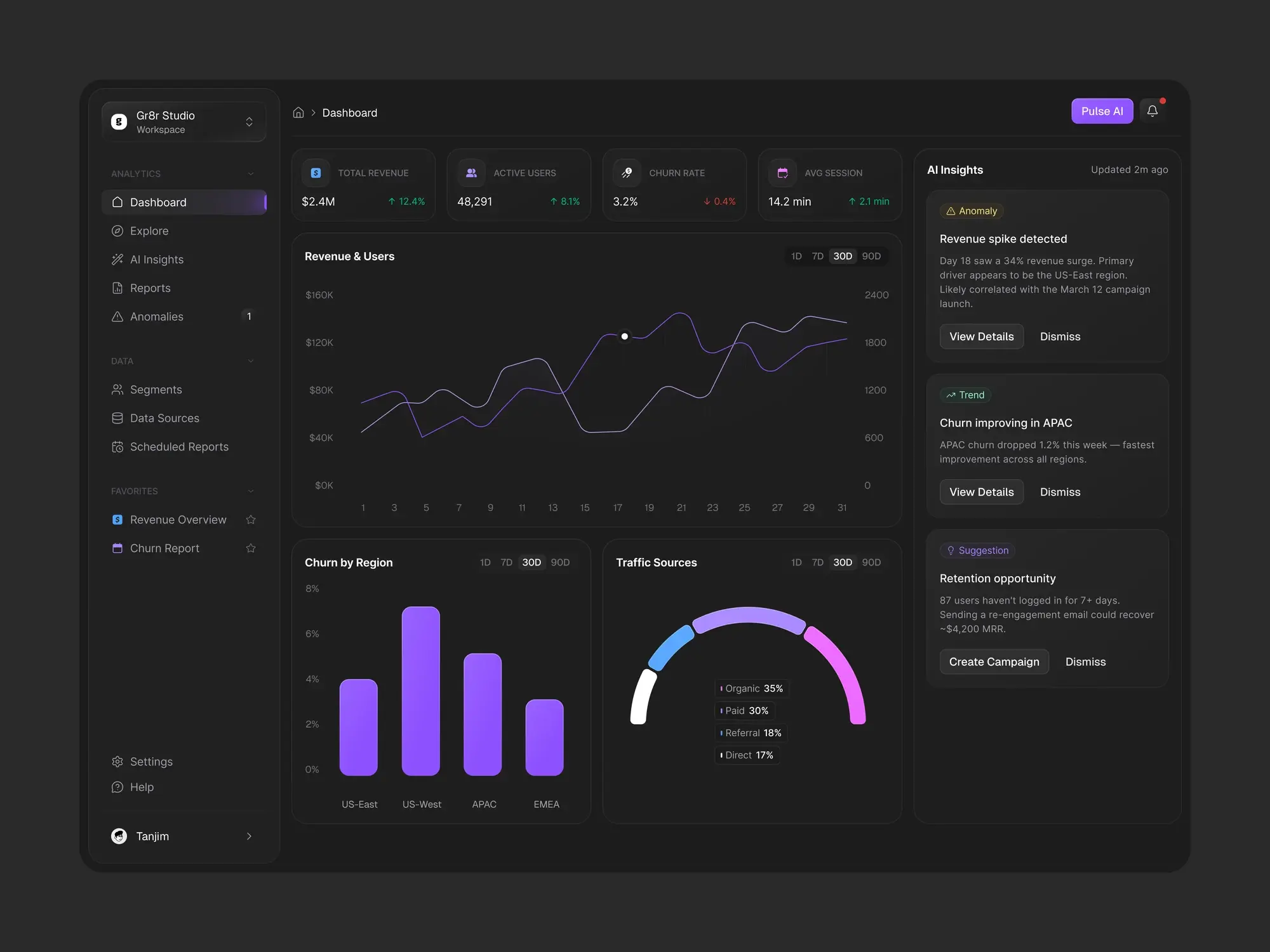
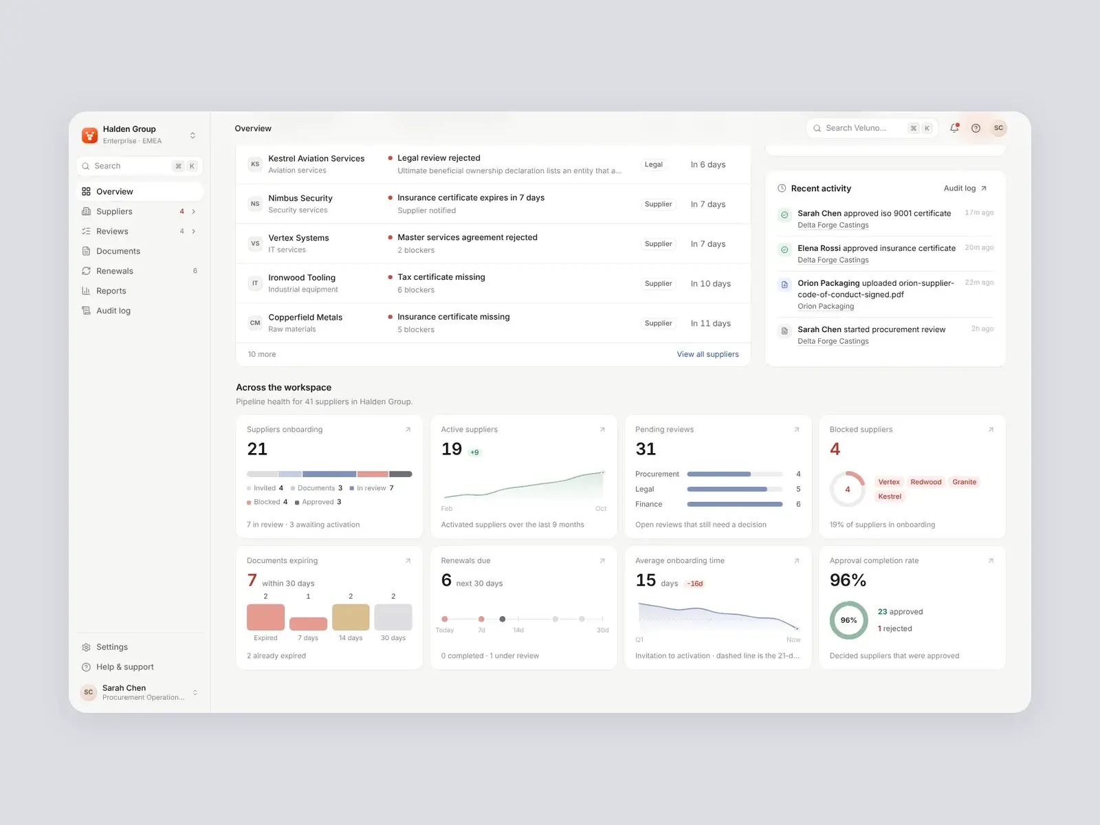
Dashboard
The first screen a rep sees. The AI version listed everything at the same weight; the redesign makes the day readable at a glance.
A clear hierarchy
Totals sit in one calm row, then what changed and what's due, so the eye knows where to start.
Status you can scan
Deals carry labelled tags like New, Contacted and Proposal Sent instead of grey text.
Tasks you can act on
Upcoming work shows who it's with and a one-click Resolve, not just a title.
Activity with context
Calls, meetings, notes and follow-ups get their own icons, people and companies.
AI-generatedBefore 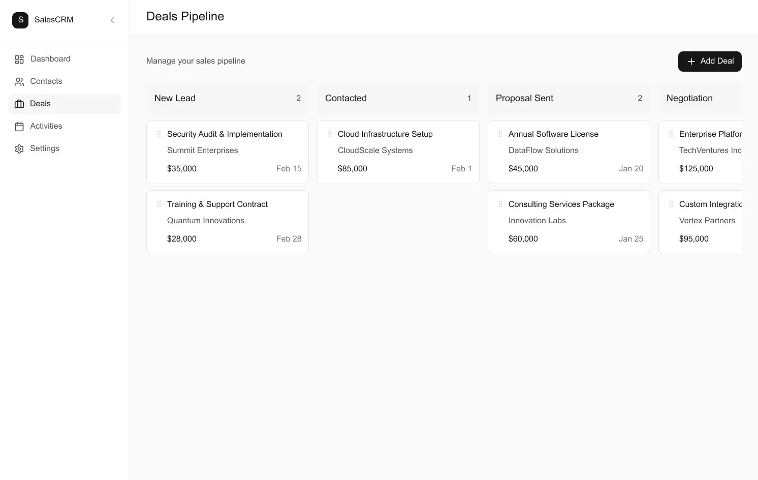
Redesigned by Gr8rAfter 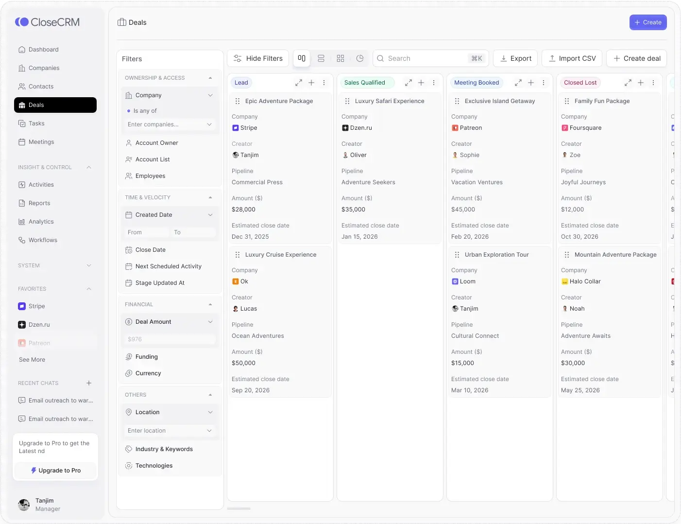
02 / 04
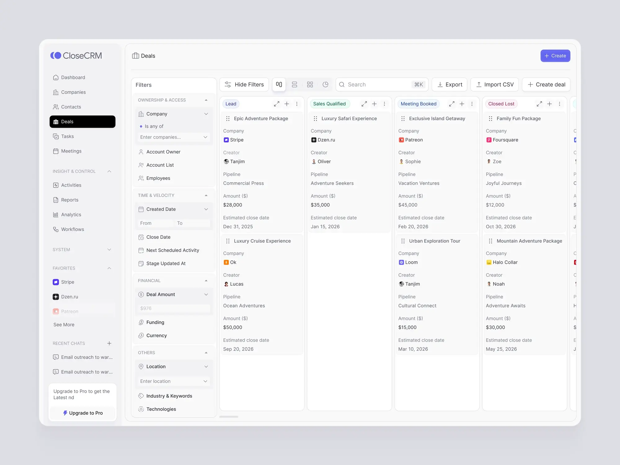
Deals board
The pipeline worked, but every column looked the same and there was no way to narrow it down.
Stages at a glance
Each stage has its own colour, so the pipeline reads left to right in seconds.
Filters built in
Owner, dates, amount and location sit in one panel beside the board.
Cards that answer questions
Company, owner, pipeline, amount and close date on every deal, in the same order.
One toolbar
Views, search, export, import and Create deal live together at the top.
AI-generatedBefore 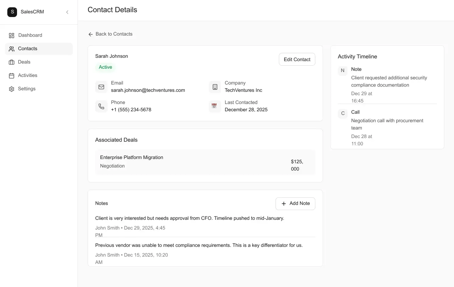
Redesigned by Gr8rAfter 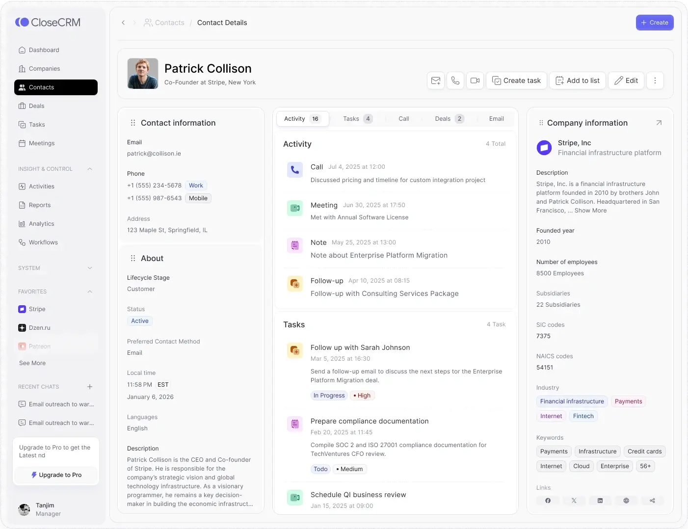
03 / 04
Contact record
The AI version had the data but no story: a few fields, one deal and notes in a column.
Who, at a glance
A profile header with photo and role, and quick actions to email, call, meet or add a task.
Everything in one place
Activity, tasks, calls, deals and emails sit in tabs instead of separate pages.
The company alongside
Industry, size and links for the contact's company, without leaving the record.
No broken layouts
Amounts, dates and labels stay on one line; nothing wraps mid-word.
AI-generatedBefore 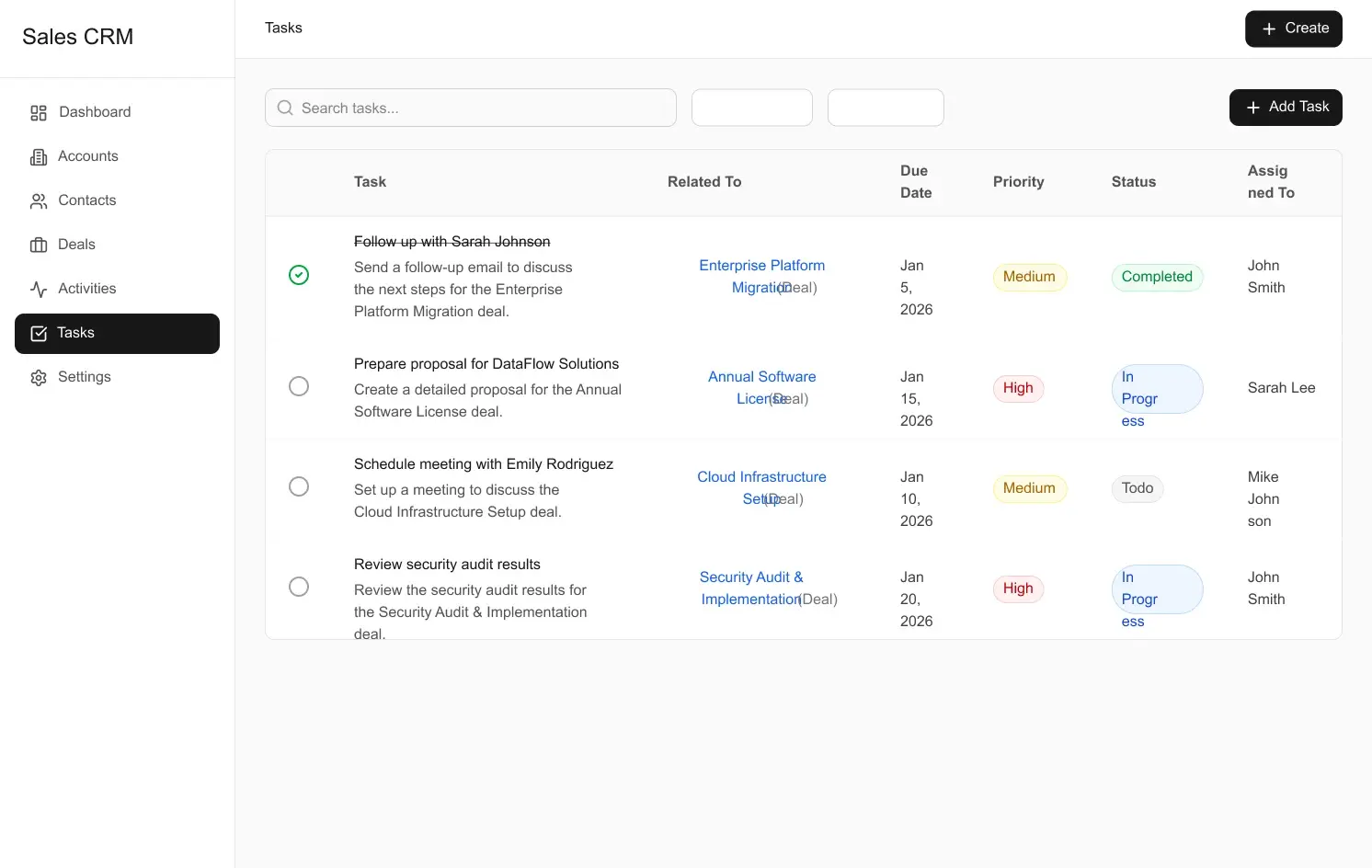
Redesigned by Gr8rAfter 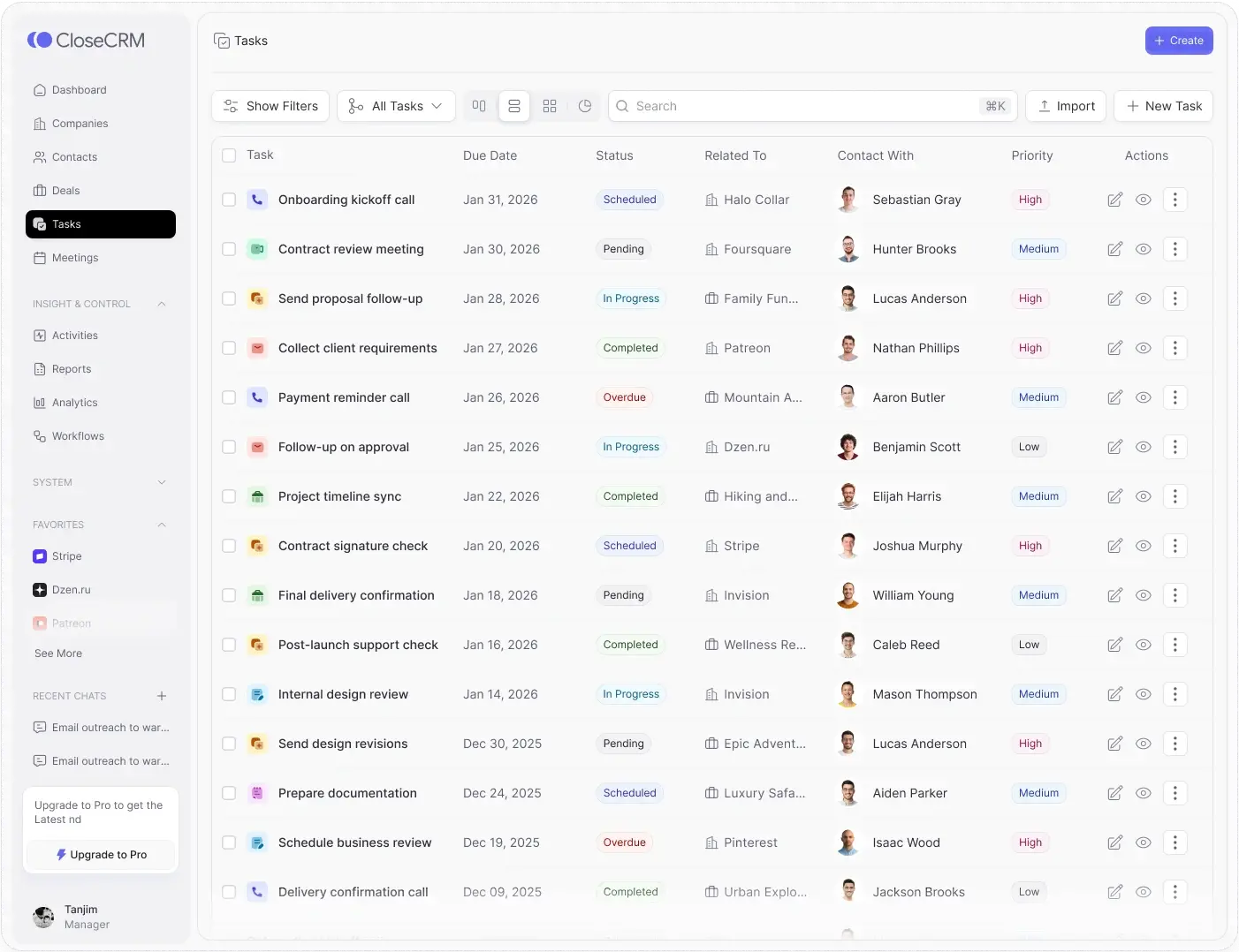
04 / 04
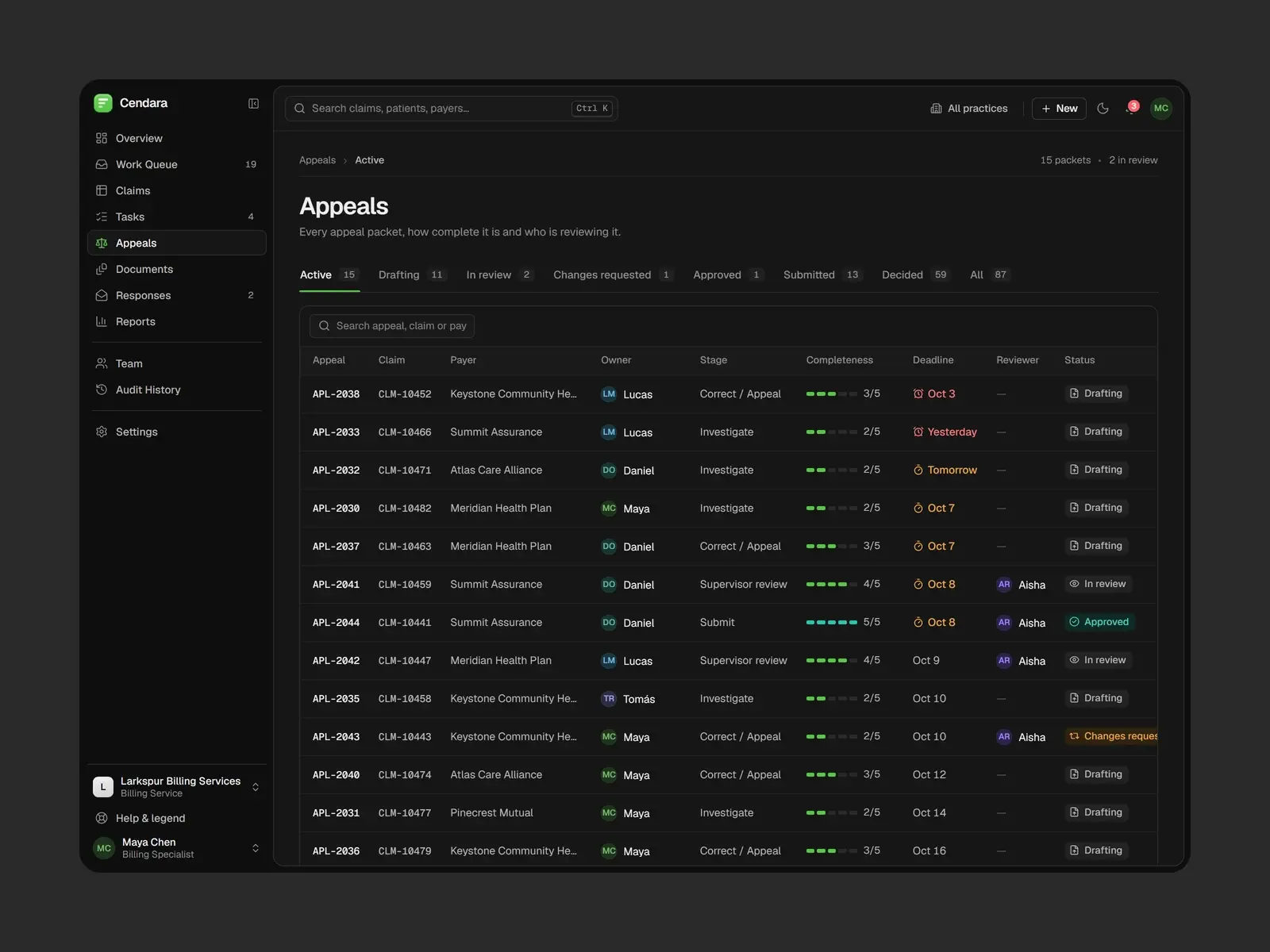
Tasks
The table ran out of room: statuses, dates and names broke across lines and every row looked the same.
Clean, scannable rows
Due date, status, related company, contact and priority each fit on one line.
Consistent tags
Status and priority use one tag style with clear colours, from Scheduled to Overdue.
People, not just names
Contacts show their photo and companies their icon, so rows are easy to tell apart.
Actions where you need them
Select, edit, view and more on every row, with filters, views and import above.
How we did it
From AI MVP to polished product, in four steps.
- 1Step 1
Audit
We reviewed every screen and flow and listed what got in the way, from hierarchy to broken layouts.
- 2Step 2
Fix the experience
We simplified the key workflows and decided what each screen should help people do first.
- 3Step 3
Redesign the interface
A consistent visual system: type, colour, tags, icons and components across every screen.
- Step 4
Ready to build
Redesigned screens and a design system the existing app could take on, screen by screen.
What changed
The foundation AI built, made into a product.
What the redesign delivers. Measured business results will be added only with evidence and approval.
Nothing rebuilt from scratch
The features stayed. We improved how they look, read and work.
Clear at a glance
Every screen now says what matters first and what to do next.
A real identity
A name, a mark and a consistent visual language instead of template defaults.
A system to keep building on
Shared components and tags, so new features look like they belong.