


area.ai: a warm, characterful brand for an AI analytics platform.
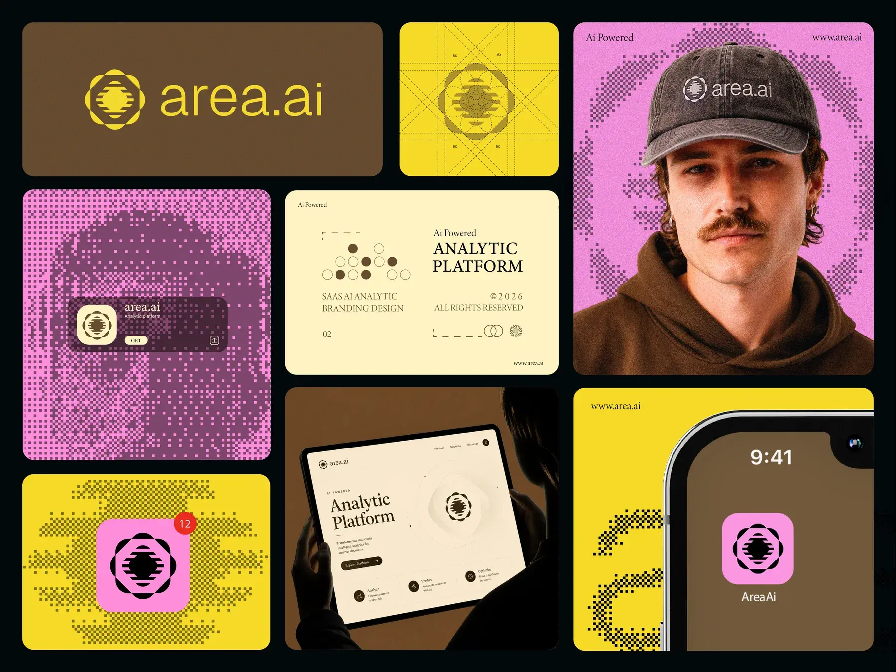
A brand identity for an AI-powered analytics platform: a radiating mark built on a strict grid, a palette of mustard, brown and pink, and pixel textures that carry it from the app icon to merchandise.
Built by Gr8r for its own portfolio. Not client work.
The brief
An analytics brand that doesn't look like every other dashboard.
area.ai turns data into clear decisions with AI. Most analytics brands look cold and interchangeable; this one needed warmth and personality, while still feeling precise enough for a product people trust with their numbers.
- 1Precise: a mark drawn on a construction grid
- 2Warm: mustard, brown and pink instead of tech blue
- 3Recognisable: a pixel texture that works at any size
The system
Four parts, used the same way everywhere.
- 1Step 1
Mark
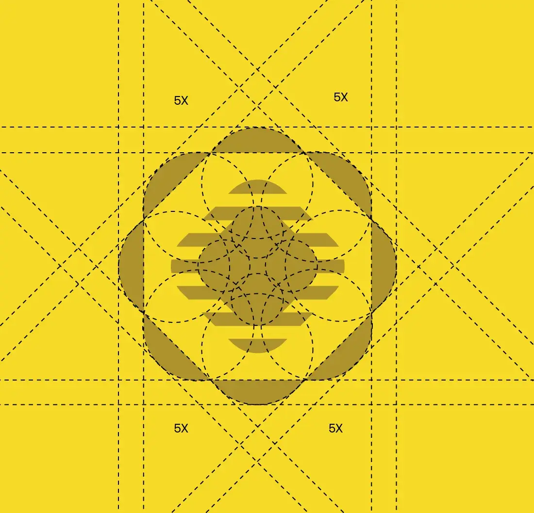
A radiating form with a striped core, drawn on a construction grid.
- 2Step 2
Wordmark
area.ai in a soft, rounded sans beside the mark.
- 3Step 3
Colour
Mustard and brown carry the brand, with a bright pink and a soft cream.
- Step 4
Texture
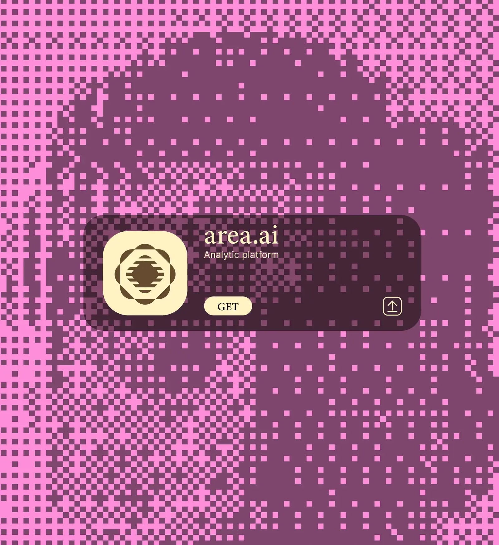
A pixel pattern of the mark that fills backgrounds, posters and screens.
Brand applications
The identity, applied.
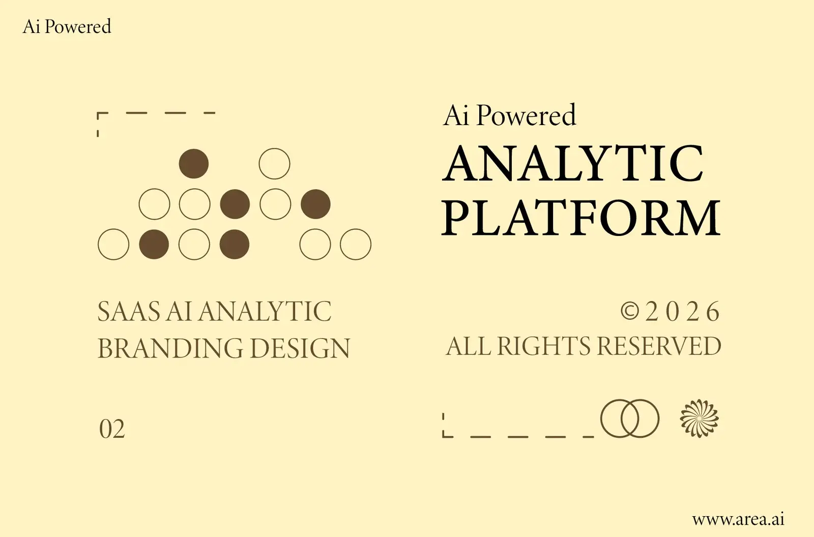
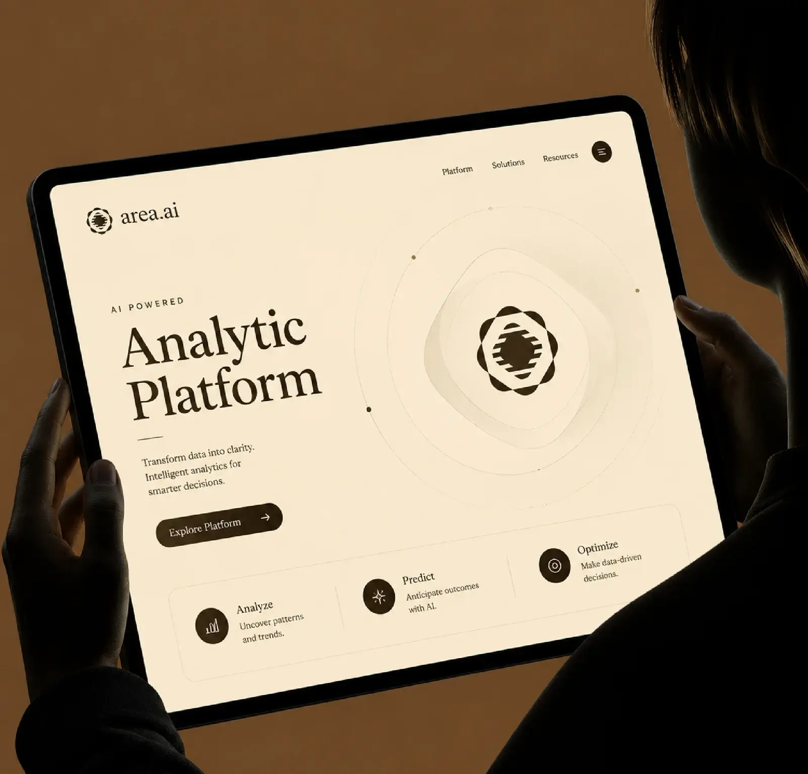
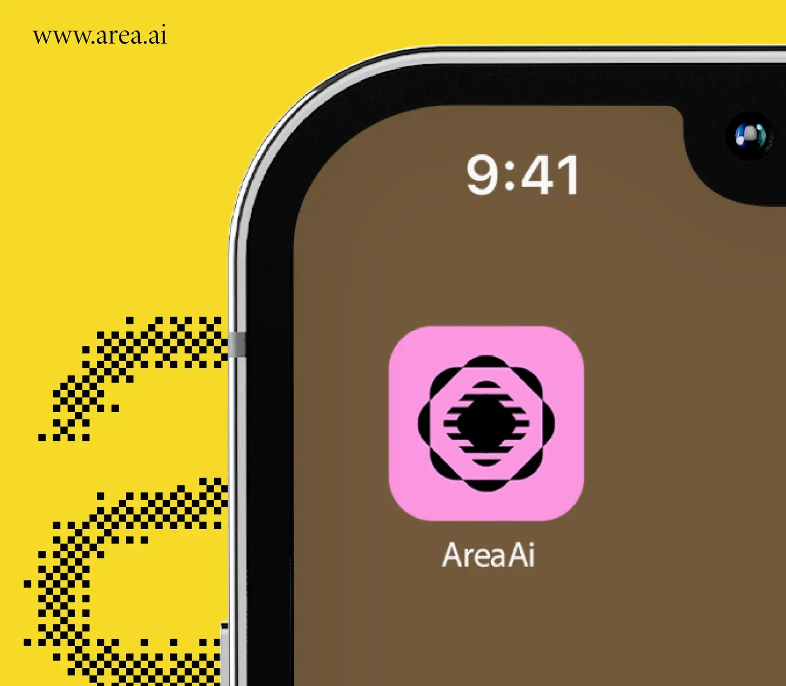
From the logo construction to the product and merchandise: every application from the brand board.



Style guide
Colours.
Mustard and a deep brown carry the brand. A bright pink adds energy on the app icon and posters, and a soft cream holds print and long reading.
Brown
HEX #674A2E
Black
HEX #0B0F14
Mustard
HEX #F6DA27
Pink
HEX #FE8EDA
Cream
HEX #FFF3C3
Outcomes
A complete identity, ready to use.
What we delivered. Measured business results will be added only with evidence and approval.
A mark built to scale
Drawn on a grid, the mark holds up as an app icon, on a cap and across a website.
A palette nobody else has
Mustard, brown and pink set area.ai apart from the blue of most analytics tools.
A texture that does the work
The pixel pattern makes any surface recognisable, even without the logo.