

AI UX Design: 7 Screen States That Make Users Trust Your AI Feature

Tanjim Islam
Founder & CEO · · 16 min read


That is the short version. The rest of this guide is the long one, written for SaaS founders, CPOs and product leads who have an AI feature on the roadmap and a nagging feeling that the mockups look too clean.
What is AI UX design?
AI UX design is ordinary product design plus one hard fact: the machine in the middle guesses. Every screen has to help a person decide whether to trust that guess.
The term gets used two ways. Some pages use it for designers using AI tools to make layouts faster. This guide is about the other meaning: designing the product your customers use when an AI feature sits inside it.
Picture a support inbox. A customer writes in. An AI drafts the reply. In a normal app the design job ends at "show the draft, add a send button". In an AI product you also have to answer:
- What does the agent see while the draft is being written?
- How does it know the draft quoted the right refund policy?
- What happens when the draft invents a policy that does not exist?
- Who sends it, the agent or the AI?
Those four questions are the whole field in miniature.
Jakob Nielsen put the shift well in June 2023. He called AI the first new user interface paradigm in about 60 years, because users now tell the computer the outcome they want instead of the steps to get there (Nielsen Norman Group, "AI: First New UI Paradigm in 60 Years", 18 June 2023). When the user stops giving step by step commands, they also lose sight of how the result was made. Good design hands some of that sight back.
How is AI UX design different from designing a normal app?
The difference is predictability. A button that says "Export CSV" exports a CSV. A box that says "Summarize this call" might give a perfect summary, a vague one, or one that puts words in the wrong person's mouth.
Here is how that changes the work, side by side.
| Design question | Normal app | AI feature |
|---|---|---|
| What will the screen show? | Known in advance | Varies every time |
| Can you mock every state? | Yes | Only the frame |
| What does an error look like? | A red message and a code | A confident answer that is wrong |
| How do you test it? | Click through the flow | Run many real inputs and read the outputs |
| Who is in control? | The user, step by step | Shared, and you decide where |
Our view at Gr8r is that this changes the work in four ways. You design for uncertainty, because the answer may be wrong. You explain decisions, because people need to know why the AI said what it said. You collect feedback, because that is how the team learns which answers fail. And you set expectations, because people arrive thinking AI is either magic or useless.
The last row of the table above matters most. In a normal app, control is never in question. In an AI product, deciding who holds the wheel at each moment is a design decision, and it is yours to make.
What is the trust ladder for AI features?
The trust ladder is the set of autonomy levels an AI feature can work at. Each rung gives the AI more freedom and asks for more trust, so each needs different screens.
| Rung | What the AI does | What the person does | Example |
|---|---|---|---|
| 1. Suggest | Offers an option | Accepts, ignores or dismisses | A suggested reply chip |
| 2. Draft | Writes a full first version | Edits, then sends | A drafted email in the composer |
| 3. Act with approval | Prepares an action | Approves or rejects it | A refund waiting for sign off |
| 4. Act and report | Acts on its own | Reviews a log, undoes if needed | Tickets tagged overnight, with a summary |
Start new features low on the ladder and move up as people learn where the AI is good. Microsoft's Fluent 2 responsible AI guidance says an agent should "express its autonomy level by communicating its triggers, access permissions, and action rights" (Microsoft Fluent 2, Responsible AI). In plain terms: the screen should always make clear which rung the AI is on.
What are the seven screen states of an AI feature?
Every AI feature moves through seven states. Most teams design two of them, the input box and the perfect answer, and leave the rest to whoever writes the code. That is where trust leaks out.
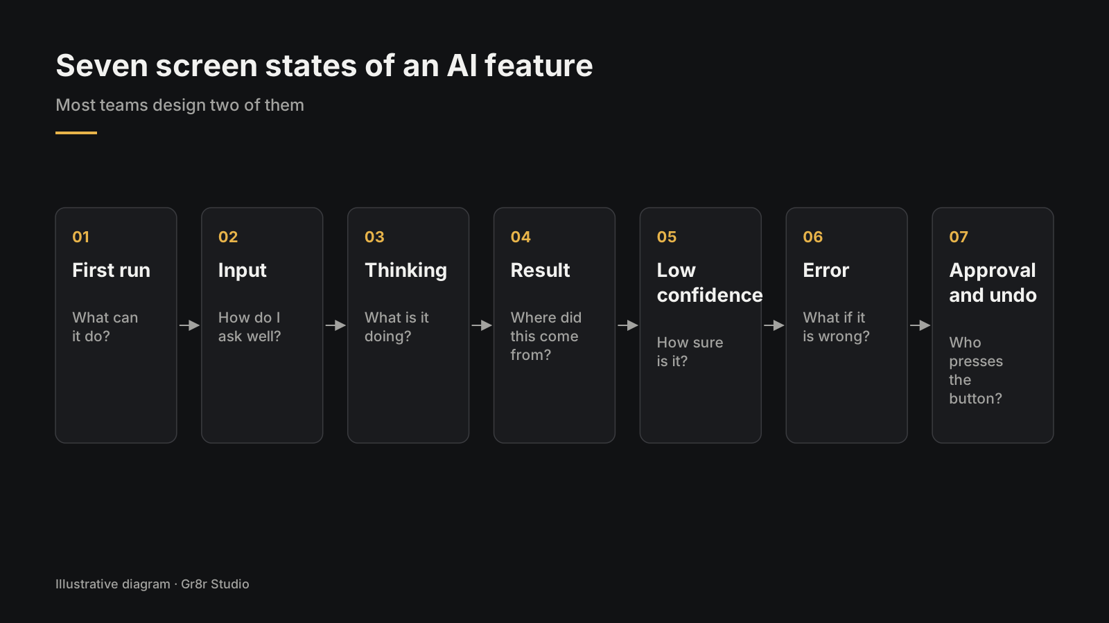
1. First run: what can this thing do?
The first screen sets the expectation. If it says "Ask me anything", people will, and they will be let down. Name the three or four jobs the feature is good at and offer them as suggested prompts a person can tap. Google's People + AI Guidebook calls this "set the right expectations" (Google PAIR, Guidebook patterns).
2. Input: how do I ask well?
The input should do some of the asking for the person. Offer chips, templates or fields for the details the AI needs, such as the date range or the customer name, so a vague request becomes a precise one. Show what context the AI will use, such as "Using: this invoice, last 3 emails".
3. Thinking: what is it doing right now?
AI can take seconds, and agents that work through several steps take longer. A spinner tells the person nothing. Show the steps in words they understand: "Reading 14 invoices", "Matching to purchase orders", "2 need your eyes". Patterns for showing an agent at work live in AI Agent UI Patterns That Keep Users in Control.
4. Result: where did this come from?
When the answer lands, put its sources next to it as links people can click, plus a visible label that says the text was written by AI. Every claim about the person's own data should point back to the record it came from. AI text should land as normal text the person can click into and change, with one undo that rolls back the whole AI change.
5. Low confidence: how sure is it?
When the system is less sure, the screen should say so in plain words and invite a check. Use softer wording, highlight the part in doubt, and offer the source to compare. Fluent 2 lists "prevent overreliance on AI" as a goal and describes it as supporting "user judgment" and reducing blind trust in what the AI writes (Microsoft Fluent 2, Responsible AI). Apple's Human Interface Guidelines put the stakes plainly: "In general, the more sensitive the data, the more serious the consequences of inaccurate or unreliable results" (Apple Human Interface Guidelines, Machine learning). A wrong movie suggestion deserves a whisper. A wrong dosage deserves a stop sign. Patterns in How to Show AI Confidence and Sources in Your UI.
6. Error: what happens when it is wrong?
This is the screen most teams never draw. The AI misread the PDF. The agent booked the wrong date. Give the person the draft to edit, a way to try again with more context, a way to do it by hand, and a way to tell you it failed. More in When the AI Gets It Wrong.
7. Approval and undo: who presses the button?
For anything hard to undo, the AI proposes and a person approves: a refund, a sent email, a deleted record. Show exactly what will happen, let the person edit before approving, and keep an undo window for actions that can be reversed. That gets its own post in Designing the Review Step Before an AI Agent Acts.
Which design guidelines map to which screen state?
The published guidelines are good on principles and thin on screens. This table maps each one to the state where it shows up.
| Screen state | Guideline it puts on screen | Source |
|---|---|---|
| First run | Make clear what the system can do, and how well | Microsoft HAX guidelines G1 and G2 (CHI 2019) |
| First run | Set the right expectations | Google PAIR Guidebook |
| Input | Help users get from a vague request to a precise one | Gr8r working practice |
| Thinking | Avoid vague latency messaging that hides what the AI is doing | Microsoft Fluent 2 |
| Result | Show sources the person can check | Microsoft Fluent 2, prevent overreliance |
| Low confidence | Calibrate trust; support user judgment | Google PAIR; Microsoft Fluent 2 |
| Error | Support efficient correction | Microsoft HAX guidelines (CHI 2019) |
| Approval and undo | Express the autonomy level and action rights | Microsoft Fluent 2 |
Microsoft's 18 guidelines come from the paper by Amershi et al. (CHI 2019, Microsoft Research). They predate today's large language models, which is one reason teams need to translate them into current screens themselves.
What does engineering need to expose to the UI?
The screens above only work if the system sends the right data with each answer. Agree this list with engineering before design starts, because adding it later means rework on both sides.
- Sources. IDs and links for every record or document the answer used.
- Confidence signal. Some measure the UI can turn into plain wording, even a simple high, medium or low.
- Run steps. The steps an agent is taking, as they happen, for the thinking state.
- Proposed action. For the approval state, a structured description of what will change, before it changes.
- Audit log. What the AI did, when, with which inputs, and who approved it.
- Feedback hooks. A way to record thumbs down, edits and undos against the answer that caused them.
The US National Institute of Standards and Technology lists "accountable and transparent" and "explainable and interpretable" among the traits of trustworthy AI in its AI Risk Management Framework, released January 2023 (NIST AI RMF 1.0). This list is what those words look like in an API response.
How do you measure trust in an AI feature?
Measure what people do with the answers. Four numbers tell you most of what you need.
| Metric | What it means | Watch for |
|---|---|---|
| Acceptance rate | Share of AI outputs used as they are | Very high can mean blind trust |
| Edit distance | How much people change a draft before using it | Heavy edits mean the draft misses |
| Override rate | How often people reject or replace the AI's choice | Clusters point to a weak area |
| Undo rate | How often people reverse an AI action | Any rise after a model change |
Read them together. High acceptance with near zero edits on a task where the AI is often wrong is a warning sign, because people may have stopped checking.
Where should an AI feature live inside your product?
Put the AI where the work already happens.
Picture a finance lead looking at a cash flow chart. If the insight she needs sits in a separate chat window, she has to copy numbers across and ask the right question. If it sits on the chart, as a short line under the dip that says why it dipped, she reads it in two seconds.
There are four common homes for an AI feature:
| Where it lives | Good for | Watch out for |
|---|---|---|
| Inline, next to the content | Suggestions, summaries, rewrites | Clutter if every field gets a sparkle button |
| A sidebar copilot | Questions about what is on screen | Becoming a chat box nobody opens |
| Search | Finding things in plain language | Answers with no link to the source record |
| A background agent | Repeated multistep jobs | People not knowing what it did overnight |
Most products end up using two or three of these. Which ones depends on where your users already spend their day. Two of them have their own guides: adding an AI feature to a SaaS product and designing an AI copilot inside a SaaS product.
What is the process for designing an AI product?
The process looks like normal product design with one big change: you bring real model output into the design work early, because a mockup with a perfect answer in it lies to you.
Here is the order we follow.
- Pick one job. Name the task, the person doing it, and what "done well" means. "Draft the first reply to billing tickets" beats "AI support".
- Collect real examples. Ask your engineers for 20 to 50 real outputs, good and bad, from the model on real inputs. Print them. Read them. This is your design material.
- Map the seven states. First run, input, thinking, result, low confidence, error, approval. Sketch each one for this specific job.
- Draw the frame in Figma. Layout, components, the states above. Leave room for long answers, short answers and no answer.
- Build a rough coded prototype. Wire it to the real model as soon as you can. In our experience, catching every edge case of an AI feature in Figma is not practical, so we move to a working prototype early and design against what the model really says.
- Test with real people and real outputs. Watch where they trust it too much and where they ignore it.
- Turn components into a system. Once the patterns settle, write them down as reusable parts so every new AI screen does not start from zero.
Step 7 is where an agentic design system comes in: your tokens, components and rules, written so coding tools like Cursor or Claude Code reuse them instead of inventing new ones. That topic has its own guide: what goes in a SaaS design system v1.
At Gr8r we work in short loops. Our rhythm: first concept within 48 hours of kickoff, a revised draft by day 2 to 3, so the team reacts to something real before opinions harden. Our five stage method is written up at process.
What does good AI UX design look like in real products?
It looks calm. The AI stays quiet about itself. It shows up where the work is, says where its answers came from, and steps aside when a person wants control.
A few places you can see our own thinking on this:
- Client websites. For Savari, a platform for coach and minibus operators, we designed and built the website in Framer. We designed and built the Orthotropic website in Webflow. These are website projects.
Across 50+ projects shipped, the lesson that keeps coming back is simple: the screens nobody drew are the ones users remember. The loading state. The wrong answer. The moment they had to find the undo button.
What are the most common AI UX design mistakes?
Most mistakes come from designing the demo instead of the product. Here are the ones that show up again and again.
- The magic box. One text field, "Ask me anything", no hints. People type something vague, get something vague back, and leave.
- Hiding the machine. Making the AI feel smooth by removing sources, labels and undo. It feels slick until the first wrong answer, then it feels like a trap.
- The perfect mockup. Every Figma frame shows a crisp, correct, three line answer. Real answers run to 40 lines or arrive empty.
- Chat for everything. Nielsen's point from 2023 still holds: clicking and tapping are fast and clear, and filling a long form by chatting is often worse (NN/g, 2023). Use chat where open questions help. Use buttons where the choices are known.
- No way to say "wrong". If people cannot flag a bad answer, you never learn which answers are bad.
- Autopilot on day one. Letting an agent send, delete or pay before anyone has watched it work for a week.
How do you test an AI feature before launch?
You test the screens and the answers together, because a good screen around a bad answer still fails.
Three kinds of testing matter:
- Output review. Take a fixed set of real inputs and read what the model returns. Engineers call these evals. Designers should read them too, because the shape of the answers decides the shape of the screen.
- Usability sessions with live output. Put the coded prototype in front of five or six real users. Watch for two things: when they accept a wrong answer without checking, and when they ignore a right one.
- Failure drills. Feed it the worst inputs on purpose. A blurry scan. An angry customer email. An empty account. Then look at what the screen does.
Microsoft's guidelines add a point teams forget: plan for how the system behaves over time, as it learns and as the model underneath changes (Amershi et al., CHI 2019). A screen that worked in March can mislead in June if the model behind it changed. Put a date in the calendar to rerun your output review.
What should an AI design review checklist include?
Run this list in every design review for an AI feature. Each item is a yes or no.
First run and input
- The first screen names what the feature is for in one sentence.
- It offers suggested prompts or actions.
- It says what the feature cannot do.
- The input shows what context the AI will use.
- Structured fields or chips capture details the AI needs.
Thinking
- Waiting shows named steps in plain words.
- Long tasks can run in the background with a notice when done.
- The person can stop a run.
Result and confidence
- AI output is labeled as AI.
- Every claim about the person's data links to its source.
- Sources open within two clicks.
- Wording softens when confidence is lower.
- Low confidence parts are highlighted for checking.
- Output lands as editable content.
- One undo reverses the whole AI change.
Error
- Every failure offers a next step.
- The person can retry with more context.
- A manual path exists.
- Feedback takes one tap.
Approval and autonomy
- The current rung of the trust ladder is visible.
- Irreversible actions need approval.
- The approval screen shows exactly what will change.
- The person can edit before approving.
- Reversible actions have an undo window.
- An activity log shows what the AI did and who approved it.
Who should design your AI product?
You need someone who can design the screens and someone who can read the model's output with a critical eye, ideally working side by side with the engineers wiring it up.
Some teams hire a product designer in house. Some bring in a studio. If you are weighing outside partners, we wrote a separate buyer's guide on how to choose one: How to Choose an AI MVP Development Company. If you are weighing working models, the comparisons live at compare.
If you want us to design those screens with you, our AI product design work covers the screens, the design system and the frontend. If the product is already live and you first need to know where users get stuck, start with a UX audit. Clients own everything once it's paid for.
Frequently asked questions
What is AI UX design?
AI UX design is the design of products where an AI feature sits inside the experience. It covers how people ask the AI for something, follow its work, judge the answer, correct mistakes and approve actions. The aim is the right amount of trust for each task.
How is AI UX design different from normal UX design?
A normal app gives the same result for the same input, so you can draw every screen in advance. An AI feature can give a different answer each time and is sometimes wrong. That means designing for uncertainty, sources, correction and approval, and testing with real model outputs as well as mockups.
How do you show AI confidence without scaring users?
Match the signal to the stakes. Use softer wording and a highlighted part to check when the AI is less sure, and keep sources one click away. Save strong warnings for decisions where a mistake costs money, health or reputation.
When should an AI act without approval?
Let the AI act alone only when the action is cheap, reversible and visible, such as tagging or sorting, and offer an undo. Anything that costs money, cannot be undone, or goes out under someone's name should wait for a person to approve it.
How do you measure trust in an AI feature?
Track what people do with the outputs: acceptance rate, how much they edit drafts, how often they override the AI, and how often they undo its actions. Read the numbers together, because very high acceptance with almost no edits can mean people stopped checking.
Where to start this week
Pick the one AI feature on your roadmap. Ask your engineers for 20 to 50 real outputs, good and bad. Read them with your designer, then sketch the seven states for that feature. If you want a second pair of eyes on those sketches, book a 30 minute call with me.
LedgerOS, a finance operations app Gr8r built, shows who holds the wheel: each agent has a visible status, and risky payments wait behind a Review button. Built by Gr8r for its own portfolio. Not client work. It runs on demo data, so it shows the screens, not results.
Related reading
- AI product design
- UX audit
- AI agent UI patterns that keep users in control
- how to show AI confidence and sources in your UI
- what a UX audit is and what you get at the end
- how to build AI agents for business
Tanjim Islam is the founder of Gr8r Studio, a digital product and AI engineering partner for scaleups and enterprise teams, founded in 2023.