

How to Show AI Confidence and Sources in Your UI

Tanjim Islam
Founder & CEO · · 6 min read


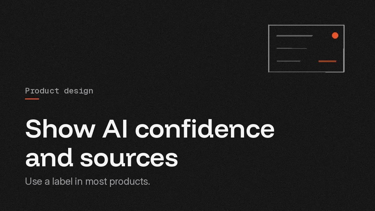
To show AI confidence to users, turn the model's score into a short label that says what to do, such as "Check this", and put it on the exact field, row or sentence it applies to. Place the source next to the claim, one click away. Save raw percentages for expert users who know what 80% means in your product.
Why do users need to see AI confidence at all?
Because the model is sometimes wrong, and people can't tell which times. If every answer looks equally sure, users either trust all of it or none of it. Both are expensive.
Google's People + AI Guidebook puts it plainly: "the user shouldn't trust the system completely. Rather, based on system explanations, the user should know when to trust the system's predictions and when to apply their own judgement" (Google PAIR Guidebook, Explainability + Trust). That is the job of a confidence display. It tells people where to spend their attention.
Microsoft's guidelines for human AI interaction say the same thing as a design rule: "Make clear how well the system can do what it can do" (Microsoft Research, Guidelines for human AI interaction design, published 1 February 2019).
Should you show a percentage or a label?
Use a label in most products. Google's guidebook calls numeric confidence "risky because they presume your users have a good baseline understanding of probability." It also asks the question every team should ask about decimals: "what should I do when the system is 85.8% certain vs. 87% certain?" (Google PAIR Guidebook, Explainability + Trust).
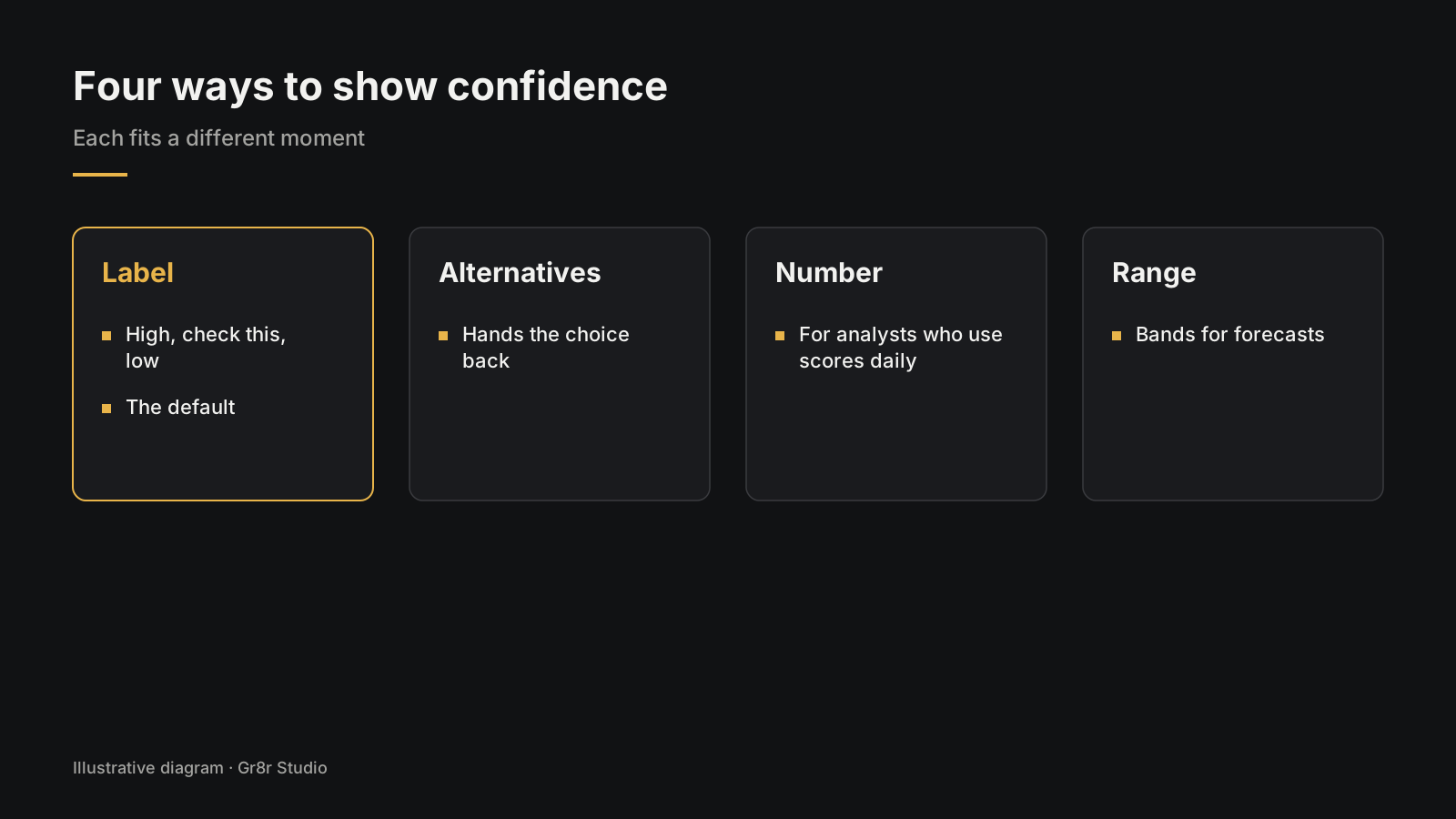
There are four ways to show confidence, and each fits a different moment:
- Label. High, check this, low. Your team sets the cut points, and each label maps to one action. This is the default.
- Alternatives. "This might be Acme Ltd or Acme Holdings." Good when the model is unsure, because it hands the choice back to the person.
- Number. A percentage, for analysts and reviewers who work with scores daily.
- Range. Shaded bands on a chart, for forecasts and estimates.
Whichever you pick, test it with real users early. People read the same badge in very different ways.
Where should sources and citations go?
Next to the claim, not at the bottom of the page. AWS's Cloudscape design system recommends you "cite the sources inline of the generative AI response" so users can verify the information, with numbered markers like 1] that open the source title in a popover, and a "Sources" section listing each link with its title and date ([AWS Cloudscape, Generative AI chat, published 20 November 2024).
That works in chat. Outside chat, apply the same idea at the right size:
- A form field filled by AI gets a small source icon that opens the page of the document it came from.
- A table row gets a link to the record or email behind it.
- A paragraph in a generated document gets an inline marker, and hovering shows the quoted passage.
The rule is one click from claim to evidence. If checking takes five clicks, nobody checks.
Google's guidebook adds a second reason to show sources: telling users what data the model used "can help them know when they have a critical piece of information that the system does not" (Google PAIR Guidebook, Explainability + Trust).
How do you show confidence outside a chat window?
Most AI in B2B products does not live in chat. It fills fields, sorts rows and writes summaries. Confidence has to sit where that work sits.
Fields. Mark only the fields that need a look, with an amber underline and a "Check" chip. A form where every field is flagged teaches people to ignore flags.
Tables. Add a column or chip for rows to check, plus a filter: "Show only rows to check." Reviewers clear the uncertain rows first and skim the rest.
Dashboards. Show forecasts as a line with a shaded range rather than a single confident number.
Documents. Put citation markers on the sentences that make claims. Leave plain connective sentences unmarked.
What does this look like on a real screen?
Here is an illustration, not a real team or result. Picture a claims team reviewing medical claims. The AI reads each claim form and fills twelve fields. Ten come back high confidence and show as normal text. Two, the procedure code and the date of service, come back low. Those two get an amber "Check" chip and a source icon that opens the scanned form at the right spot. The reviewer confirms both in seconds and moves on.
Gr8r also builds in this sector. Cendara is a medical claims operations SaaS. Built by Gr8r for its own portfolio. Not client work.
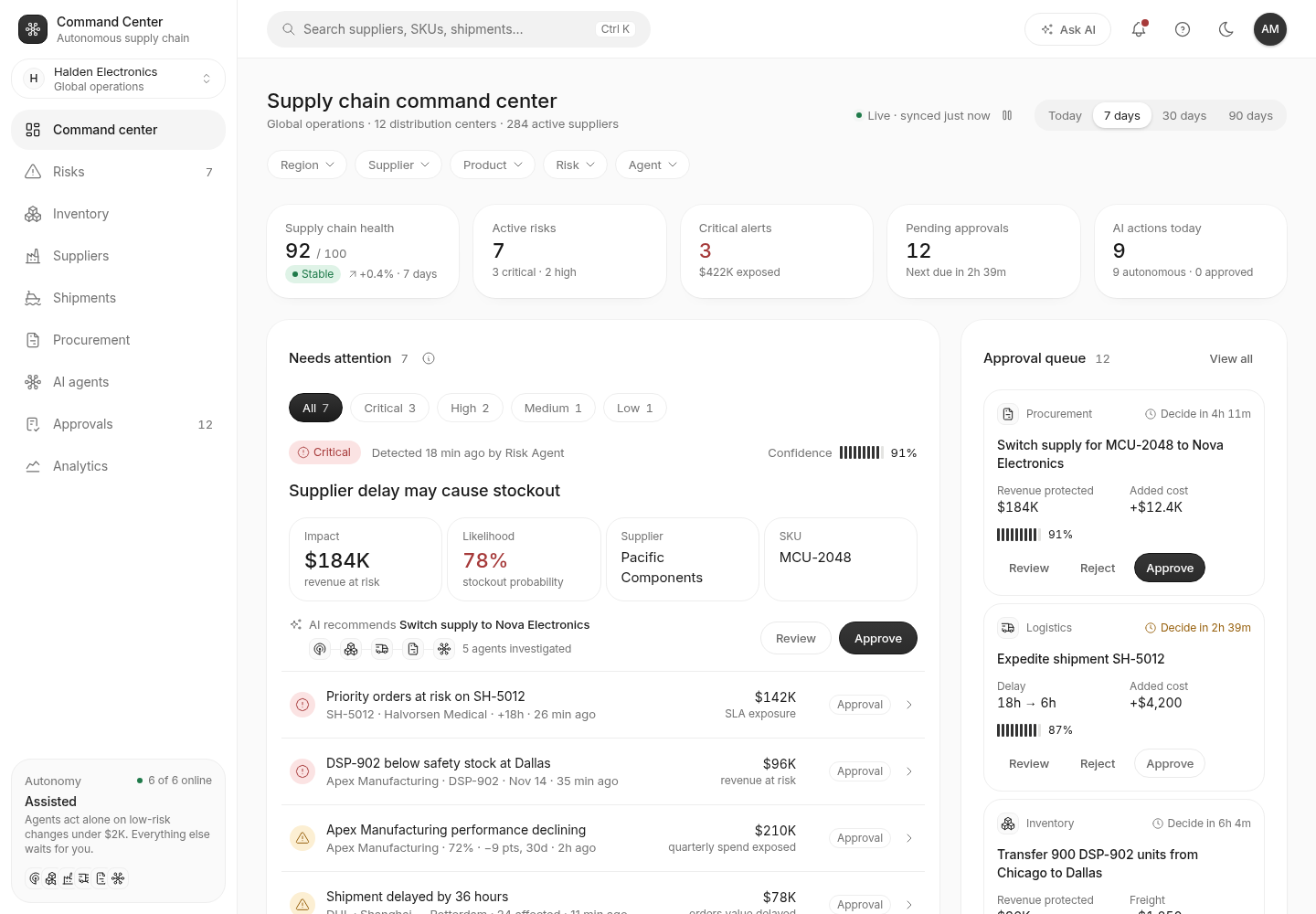
Convoy, a supply chain app Gr8r built, shows a confidence percentage on each risk alert, next to which agent raised it and when. Built by Gr8r for its own portfolio. Not client work. It runs on demo data, so it shows the screens, not results.
What should you do and avoid?
Use action labels, mark the exact field, link sources beside claims, show alternatives, allow fixes in place, and test with real users. Avoid raw decimals, page wide scores and buried sources.
| Do | Avoid |
|---|---|
| Use labels tied to an action | Raw decimals for everyday users |
| Mark the exact field, row or sentence | One confidence score for a whole page |
| Link the source next to the claim | A source list buried at the bottom |
| Show alternatives when the model is unsure | A single answer that hides doubt |
| Let people correct the value in place | Making them start over |
| Test the display with real users | Assuming everyone reads "80%" the same way |
When the confidence is low, what next?
Low confidence should never be a dead end. Offer a next step: check the source, pick from alternatives, or fill the value by hand. When the AI is actually wrong, the product needs a recovery path, covered in designing error states for AI features. For risky actions, a person should approve first; see designing the review step before an AI agent acts.
The wider set of screens every AI feature needs is in AI UX design: the seven screen states.
We design confidence and source patterns as part of our AI product design work.
Frequently asked questions
Should AI confidence be shown as a percentage or a label?
Use a label for most users, such as high, check this or low, with one clear action for each. Show percentages only to expert users who work with scores every day and know what a given number means in your product.
Where should citations go in an AI answer?
Put each citation next to the claim it supports, with a numbered marker that opens the source title and a link. Add a sources list for the whole answer as well. The goal is one click from claim to evidence.
How do you show low confidence without scaring users?
Mark only the specific field, row or sentence that is uncertain, explain it in plain words such as "Check this", and give a fast way to verify or fix it. Leave confident output unmarked so the warnings stay meaningful.
Do you need to show confidence on every AI output?
No. Google's People + AI Guidebook suggests leaving confidence out when it does not change what the user does, or when it could mislead. Show it where a wrong answer costs time, money or trust.
Should AI show alternatives when it is unsure?
Yes, when the model is torn between a few answers. A short list such as "This might be Acme Ltd or Acme Holdings" hands the choice back to the person.
About the author
Tanjim Islam is the founder and CEO of Gr8r Studio. He founded the studio in 2023. Here he writes about how Gr8r approaches hiring, product design and AI engineering. More on the About page.
If you want help with this, book a 30 minute call.