

When the AI Gets It Wrong: Designing Error States for AI Features

Tanjim Islam
Founder & CEO · · 6 min read


To design error states for AI, first name how it failed: wrong, incomplete, refused, slow or unsafe. Then give each failure its own screen. Say what happened in plain words, keep whatever the person already did, and offer one next step: edit it, retry it, or do it by hand.
Why do AI errors need their own design?
A normal error is binary. The save worked or it didn't. AI output can look finished and still be wrong, and the product often can't tell.
Google's People + AI Guidebook calls the worst of these "background errors": situations where "the system isn't working correctly, but neither the user nor the system register an error" (Google PAIR Guidebook, Errors + Graceful Failure). A form that errors out gets noticed. A summary that drops one fact does not.
So AI error design covers two things. The screens people see when something visibly fails, and the cues that help them catch failures nobody flagged.
What are the five ways AI fails?
AI features fail in five ways: wrong, incomplete, refused, slow and unsafe. Each one needs its own message and a next step the person can take.
| Failure | What the person sees | What the UI should say | Next step to offer |
|---|---|---|---|
| Wrong | A confident answer with a mistake | Nothing alarming; make editing easy | Edit in place, report it |
| Incomplete | Part of the job is done | "3 of 5 sections done" | Retry the missing part only |
| Refused | The AI won't or can't do it | Why, in one plain sentence | A manual path or a person to ask |
| Slow | Waiting with no result | What step it is on | Keep waiting, stop, or get notified |
| Unsafe | An action blocked before it ran | What was blocked and why | Change the request or ask for approval |
The table is Gr8r's working model, built from the error types in Google's guidebook. It is not an industry standard. Use it as a starting map and add your own rows.
How should the product handle a wrong answer?
Make correction cheaper than complaint. Microsoft's guidelines for human AI interaction list "Support efficient correction" for when the system is wrong: "Make it easy to edit, refine, or recover when the AI system is wrong" (Microsoft Research, Guidelines for human AI interaction design, published 1 February 2019).
In practice, that means the output is editable where it sits. A drafted email opens in the editor, not a read only bubble. An extracted field is a normal input box with the AI's value filled in. The person fixes the one wrong line and moves on.
Put a thumbs down or "Report" next to it, and when someone uses it, ask one short question: what did you expect? Google's guidebook suggests exactly this, to "ask a user what they expected to happen after a system failure" (Google PAIR Guidebook, Errors + Graceful Failure).
Should people regenerate or edit?
Lead with edit and offer regenerate as the second option.
Regenerate throws the whole output away and rolls the dice again. If the draft was mostly right, people lose the good part and any edits they made. Edit keeps it. Regenerate is useful when the output missed the point entirely. When you do offer it, keep the earlier version one click away.
What do incomplete, refused and slow look like?
Incomplete. Show what finished and what didn't. "3 of 5 sections done. Pricing and Timeline couldn't be drafted." Then retry only the missing parts. Never make people rerun the whole job.
Refused. Say why in a sentence, then point somewhere useful. Google's guidebook uses a flight price example: "There's not enough data to predict prices for flights to Paris next year. Try checking again in a month" (Google PAIR Guidebook, Errors + Graceful Failure). That is the shape: the reason, then a path. If the AI can't help, the manual way should be one click away.
Limits belong on screen too. Verdict, a legal AI workspace Gr8r built, states its limit on the sign in page: "Legal information, not legal advice." Built by Gr8r for its own portfolio. Not client work. It sits behind a login, so there is no link here.
Slow. A spinner with no words feels broken after a few seconds. Show the current step ("Reading 14 invoices"), give a stop button, and for long jobs offer to notify people when it is done. AWS's Cloudscape design system advises displaying "error and loading states to keep users informed" about what the AI is doing (AWS Cloudscape, Generative AI chat, published 20 November 2024).
How should unsafe actions fail?
Quietly and clearly. When a guardrail blocks something, say what was blocked and what the person can do instead: change the request, or send it for approval. Google's guidebook also warns against over explaining why something was blocked, because detailed explanations can teach people how to get around a filter (Google PAIR Guidebook, Errors + Graceful Failure).
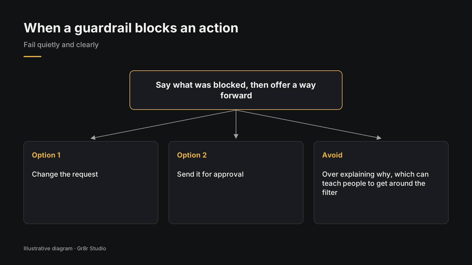
Where approvals belong is covered in designing the review step before an AI agent acts.
How do you catch the errors nobody reports?
Design cues that invite a second look before a mistake spreads. Mark uncertain fields, link claims to their sources, and show alternatives when the model is unsure. The patterns are in how to show AI confidence and sources in your UI.
Then close the loop behind the screen. Log every edit people make to AI output. A field that gets corrected again and again is telling your team something, even if nobody pressed thumbs down.
What should you check in a design review?
Check that every one of the five failures has a designed screen, messages are plain, the person's work survives errors, output can be edited in place, and long jobs can be stopped.
- Each of the five failures has a designed screen.
- Messages say what happened in plain words.
- The person's input and edits survive every error.
- AI output can be edited where it sits.
- Edit comes before regenerate; earlier versions stay reachable.
- Partial results show what finished and retry only the rest.
- Refusals give a reason and a manual path.
- Long jobs show the current step and a stop button.
- Feedback asks what the person expected.
- Edits to AI output are logged for the team.
The full set of AI screen states is in AI UX design: the seven screen states.
We design error states as part of our AI product design work.
Frequently asked questions
How should a product show an AI error?
Say what happened in plain words, keep the person's work, and offer one clear next step: edit the output, retry the part that failed, or do it by hand. Match the screen to the type of failure: wrong, incomplete, refused, slow or unsafe.
Should users regenerate or edit a wrong AI answer?
Lead with editing in place, because it keeps the parts that were right and any changes already made. Offer regenerate as a second option for output that missed the point, and keep the earlier version one click away.
Do AI features need thumbs up and thumbs down buttons?
They help, if someone reads the results. Place them next to the output, ask one short follow up question on thumbs down, such as what the person expected, and also log edits people make, since many never press a button.
What is a background error in AI?
It is a failure that neither the user nor the system notices, such as a summary that quietly drops a fact. Reduce them with confidence markers and source links on screen, and by reviewing how often people correct AI output.
What should a refused AI request show?
One plain sentence on why, then a path somewhere useful. If the AI cannot help, the manual way should be one click away.
About the author
Tanjim Islam is the founder and CEO of Gr8r Studio. He founded the studio in 2023. Here he writes about how Gr8r approaches hiring, product design and AI engineering. More on the About page.
Cendara, a claims workspace Gr8r built, states its own limit on the sign in screen: "Prototype with synthetic data. Not for real patient information." Built by Gr8r for its own portfolio. Not client work.
If you want help with this, book a 30 minute call.
Related reading
- Products Gr8r built itself, including Verdict
- AI product design
- AI UX design: the seven screen states
- how to show AI confidence and sources in your UI
- designing the review step before an AI agent acts
- UX audit report template