

When Your SaaS Needs a Design System, and How Big

Tanjim Islam
Founder & CEO · · 6 min read


Most advice says "when you scale." That is true and not much help. This post gives you the signs to look for this week and a rough size for each stage, so you build enough and not more.
What is a design system, in plain words?
A shared box of parts, plus the rules for using them.
The parts are buttons, inputs, tables, cards and modals. Under them sit tokens: the named values for color, type size, spacing and corner radius. The rules say which button goes where and what an error looks like.
The Nielsen Norman Group defines it as "a complete set of standards intended to manage design at scale using reusable components and patterns" (NN/g, Design Systems 101, Therese Fessenden, 11 April 2021, last reviewed 27 August 2026, fetched 25 Oct 2026).
Note "at scale." A system pays off when there is enough repeated work to share.
What are the signs you need one now?
Open your product and your design file side by side. Look for these.
- Five buttons that should be one. Slightly different blues, slightly different corners, on different screens.
- The same table built three times. Each by a different person, each sorting differently.
- A color change takes a day. Because it lives in forty places.
- New screens take longer than they should. Designers start from a blank page because nothing is reusable.
- Engineers ask "which one?" Two versions of the date picker exist and nobody knows which is right.
- A second designer or a second front end engineer is joining. Without shared parts they will make a third version of everything.
Two or more of these, and it is time for a version 1.
When is it too early?
Before you know what the product is.
During an MVP, screens change every week. Building polished, documented components for screens you may delete next month is time taken from finding out what users want. NN/g lists the same trade off. Creating and maintaining a design system takes a lot of time and "requires a dedicated team," and it is never finished once and left alone (same article).
That does not mean chaos. Even in an MVP, set a few tokens and reuse your buttons and inputs. That costs almost nothing and saves the cleanup later. For the MVP stage itself, see SaaS MVP product design guide.
How big should it be at each stage?
Here is a rough guide. The counts are a rule of thumb from how products tend to grow, not a published benchmark. Use them to size the work, then adjust to your product.
| Stage | Who builds screens | What to have | Rough size |
|---|---|---|---|
| MVP, finding fit | One designer, one or two engineers | Tokens and reused basics | Tokens plus about 5 parts |
| First paying customers | A small team | Version 1 system | Tokens plus about 10 to 15 parts, one page of rules |
| Growing product | Several designers and engineers | Documented system | Tokens plus about 25 to 40 parts, usage guidance, code to match |
| Several products or teams | Many teams | Owned system | A named owner, versioning, a request process |
The jump that matters most is the second row. That is where a small system saves the most and costs the least.
What goes in a version 1?
Only what every screen uses. Here is a starting list.
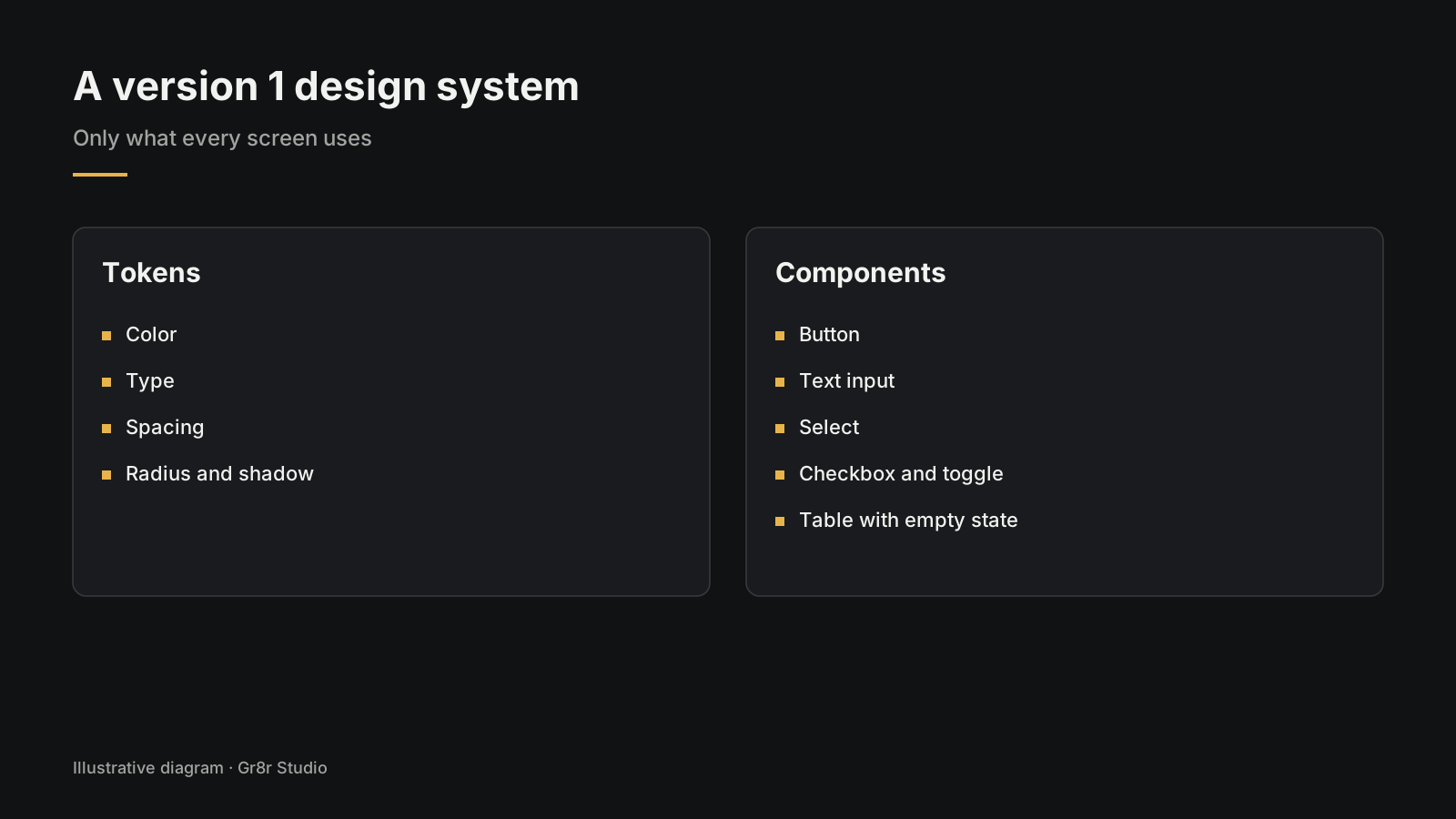
Tokens
- Color: brand, text, background, border, success, warning, error
- Type: three to five sizes, two weights
- Spacing: one scale, such as 4, 8, 12, 16, 24, 32
- Radius and shadow: one or two of each
Components
- Button (primary, secondary, quiet, destructive)
- Text input with label, help text and error
- Select or dropdown
- Checkbox and toggle
- Table with sorting and an empty state
- Card
- Modal or dialog
- Toast or inline message
- Navigation (side or top)
- Page header with title and actions
Rules, on one page
- When to use each button type
- How errors and empty states look
- Spacing between sections
One rule of thumb: a part joins the system the third time someone needs it. Once is a one off. Twice is a coincidence. Three times is a pattern.
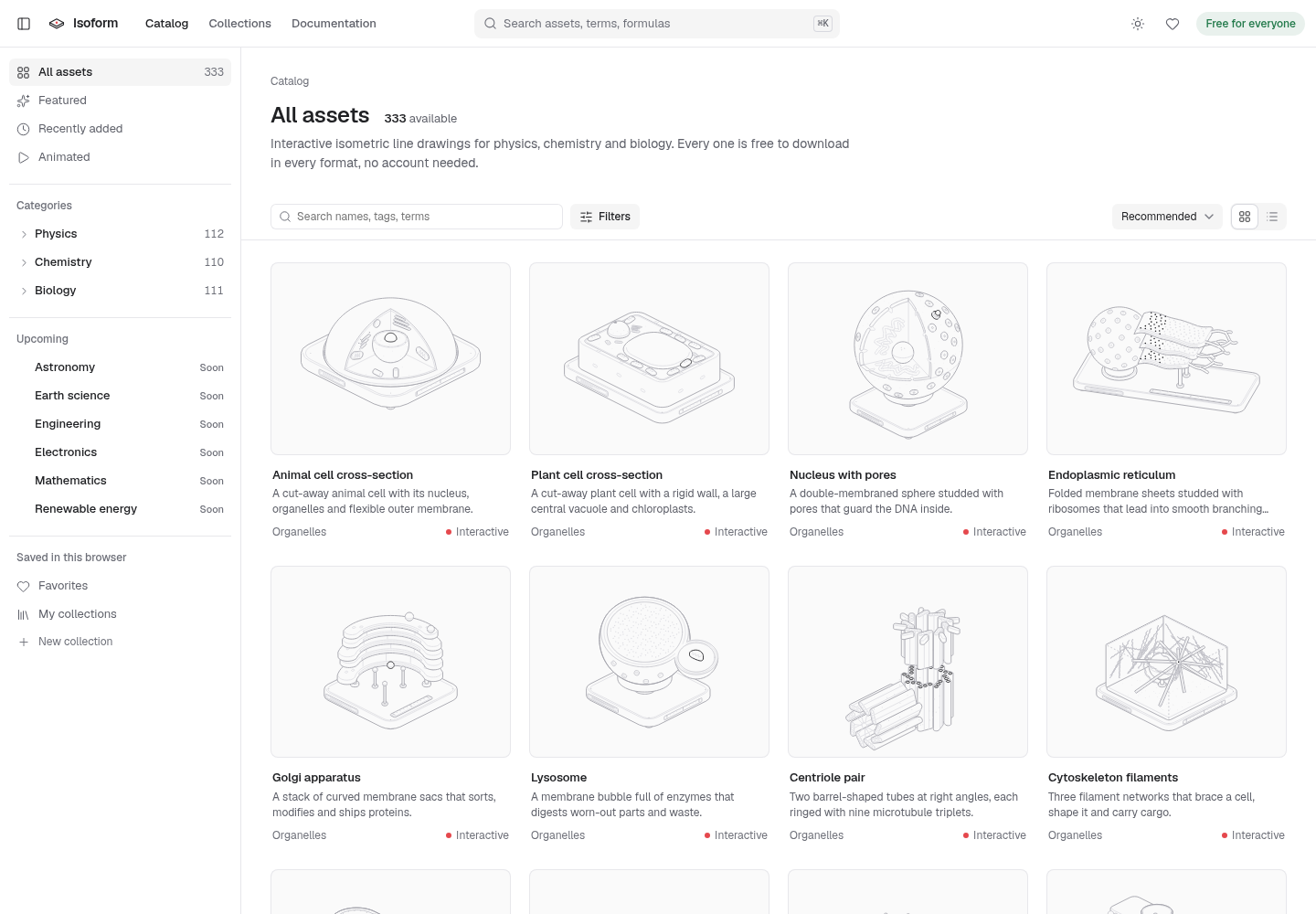
Consistency shows most when one pattern repeats many times. Isoform, an asset catalog Gr8r built, shows 333 isometric drawings for physics, chemistry and biology. It uses one set of filters and sort options for all of them. Built by Gr8r for its own portfolio. Not client work.
What does a design system cost you to keep?
Time, every month. Not money once.
Someone has to answer "can I change this button?", add the new part a team asked for, and keep the design file and the code in step. NN/g also points out that "it takes time to teach others how to use the design system" (same article).
So name an owner, even if it is a few hours a week. A system with no owner drifts, and in a year you are back to five buttons.
What is an agentic design system?
A design system set up so AI agents can use it as well as people. We cover it in full in our guide, so here is only where it fits.
Gr8r designed HostOp, built its Framer site and built an agentic design system for it. If your team already builds screens with AI coding tools, that guide explains why the same version 1 above matters even more: an agent copies whatever parts it finds, good or bad.
How do you start this month?
A short plan:
- Week 1. Screenshot every button, input and table in the product. Put them on one board. Count the duplicates.
- Week 2. Agree the tokens. Replace hard coded colors and sizes with them.
- Week 3. Build the ten components above, in design and in code, from the best existing version.
- Week 4. Write the one page of rules and name the owner.
Gr8r offers a free UX audit to the first 5 companies that ask, and our product design work can take a version 1 from there, with a first concept within 48 hours of kickoff and a revised draft by day 2 to 3. Clients own everything once it's paid for.
Frequently asked questions
When does a startup need a design system?
When more than one person designs or builds screens, the same parts keep being rebuilt slightly differently, and small changes have to be made in many places. For many early SaaS teams that happens after the MVP, not before.
How big should a first design system be?
Small. Tokens for color, type, spacing and radius, the ten or so components every screen uses, and one page of rules. Grow it only when a part has been needed three times.
Should you start with design tokens?
Yes. Tokens are the named values for color, type and spacing. They are cheap to set up, they make every later component consistent, and changing one token updates the whole product.
Can you use an existing component library instead?
Often, yes. Many teams start from an existing library and add their own tokens on top. Which library fits depends on your stack and product, and that choice deserves its own comparison.
Did Gr8r build a design system for a client?
Yes. Gr8r designed HostOp, built its Framer site and built an agentic design system for it.
About the author
Tanjim Islam is the founder and CEO of Gr8r Studio. He founded the studio in 2023. Here he writes about how Gr8r approaches hiring, product design and AI engineering. More on the About page.
Axle, a fleet operations app Gr8r built, shows why shared parts matter on dense screens: its fleet status panel sorts vehicles with one set of status labels (Moving, Stopped, Idle, Offline, In shop), and a shared system is what keeps labels like these the same on every screen. Built by Gr8r for its own portfolio. Not client work. It runs on demo data, so it shows the screens, not results.
If you want help with this, book a 30 minute call.
Related reading
- Isoform, built by Gr8r for its own portfolio
- product design
- SaaS MVP product design guide
- redesign, refactor or rebuild
- talk to us