

How to Do a Website UX Audit, Screen by Screen

Tanjim Islam
Founder & CEO · · 8 min read


This is the hands on part. If you want the definition first, read what a UX audit is. If you want a place to write findings down, use our UX audit report template. This post is the walk itself: which screen, what to look at, what to tick.
How should you set up before you open a screen?
Five minutes of setup saves an afternoon.
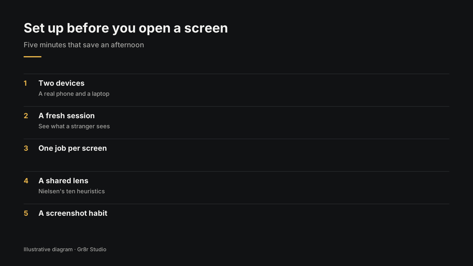
- Two devices. A real phone in your hand and a laptop. A resized browser window is not a phone.
- A fresh session. Log out, clear cookies, or use a private window. You want to see what a stranger sees.
- One job per screen. Write it at the top of your notes. Home page: "understand what this is." Pricing: "pick a plan." Sign up: "make an account."
- A shared lens. Jakob Nielsen's ten usability heuristics are the common set. The first one says the design "should always keep users informed about what is going on, through appropriate feedback within a reasonable amount of time" (NN/g, 10 Usability Heuristics for User Interface Design, 24 April 1994, last reviewed 30 January 2024, fetched 25 Oct 2026).
- A screenshot habit. Every problem gets a screenshot the moment you see it.
Then walk the screens in the order a new customer meets them.
What do you check on the home page?
The home page has one job: a stranger should know what you sell, for whom, and what to do next.
Do this test. Open the page on your phone, look for five seconds, then look away. Say out loud what the product does. If you cannot, neither can a visitor.
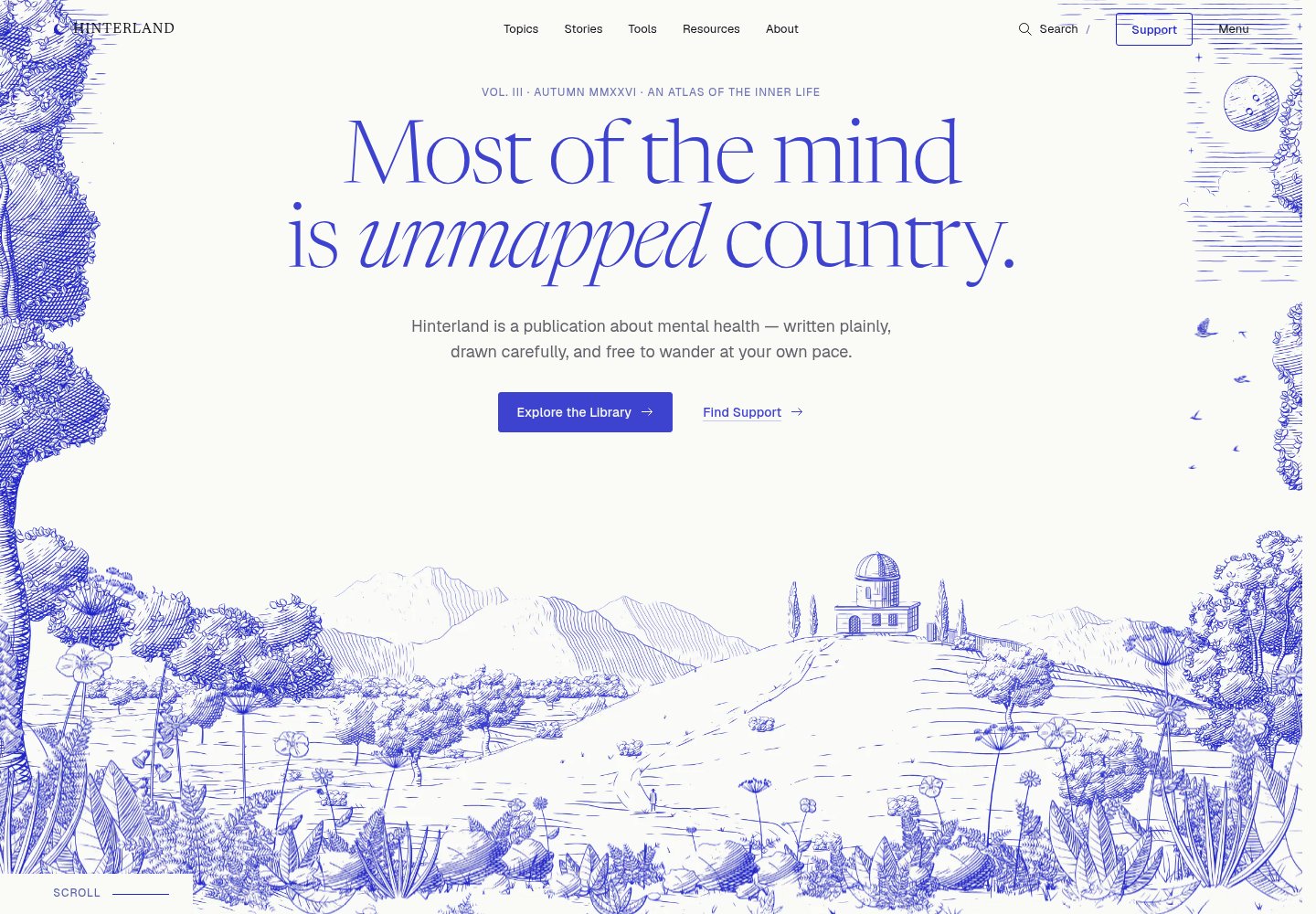
Try it on Hinterland, an editorial site about mental health that Gr8r built. The first screen shows two buttons, "Explore the Library" and "Find Support", and a line saying it is not a crisis service. Built by Gr8r for its own portfolio. Not client work.
Home page checklist:
- The headline says what the product does in plain words, not a slogan
- It is clear who the product is for
- There is one main button, and its label says what happens next
- Navigation labels use the customer's words, not internal team names
- Proof (logos, quotes) is real and close to the claim it supports
- Nothing important hides behind a carousel or autoplay
- Links and buttons are big enough to tap on a phone
On that last point there is a real number. WCAG 2.2 asks that pointer targets be "at least 24 by 24 CSS pixels," with some exceptions for spacing and inline links (W3C, Understanding SC 2.5.8 Target Size (Minimum), fetched 25 Oct 2026). Treat that as the floor, not the goal.
What do you check on the pricing page?
The pricing page has one job: a visitor should pick a plan, or know who to ask.
Picture the visitor with two tabs open, yours and a rival's. They are comparing line by line. Anything vague sends them to the other tab.
Pricing page checklist:
- Every plan says who it is for in one line
- The difference between plans is visible without reading every row
- Monthly and yearly prices are labeled so nobody misreads them
- What happens at the limit is stated (more seats, more usage)
- The free trial or free plan terms are on this page, not hidden in a footnote
- Each plan has a clear next step: start, book a call, or contact sales
- The page still reads well on a phone, where tables often break
Heuristic 2, "match between the system and the real world," is one that pricing pages often break. Feature names invented by the team mean nothing to a buyer.
What do you check on the sign up screen?
The sign up screen has one job: make an account with the least effort.
Count the fields. Then ask of each one: do we need this now, or could we ask later? GOV.UK's service manual puts it simply: "make sure you know why you're asking every question" (GOV.UK Service Manual, Designing good questions, fetched 25 Oct 2026).
Sign up checklist:
- Only the fields needed to create the account
- Labels sit above or beside fields, not only as placeholder text that vanishes
- Password rules are shown before the user types, not after they fail
- Errors say what went wrong and how to fix it, next to the field
- The whole form works with a keyboard alone
- Social or single sign on options, if offered, are clearly labeled
- After submitting, the screen says what happens next (check your email, you are in)
Try it twice: once doing everything right, once making every mistake you can. Heuristic 9 asks error messages to "precisely indicate the problem, and constructively suggest a solution" (NN/g, same article).
What do you check in onboarding?
Onboarding has one job: get a new user to the first moment the product is useful to them.
Time it. Start a timer when the account is created and stop it when you have done one real thing: made a project, sent an invoice, invited a teammate. Write down every screen in between.
Onboarding checklist:
- The first screen after sign up tells the user what to do now
- Every step has a visible reason; nothing asks for data the user cannot see the point of
- Progress is shown when there are several steps
- The user can skip and come back without losing work
- Empty screens explain what will appear there and how to fill them
- Sample data, if used, is labeled and easy to clear
- Help is close to the step that needs it, not only in a help center
For more on this screen type, see SaaS MVP product design guide.
What do you check in checkout?
Checkout has one job: let someone pay without doubt.
Baymard Institute has studied checkout for years. Its 2024 benchmark found "the average checkout flow in 2024 is 5.1 steps long and contains 11.3 form fields," and that "17% of users have abandoned due to checkout complexity." Baymard also argues the number of form fields matters more than the number of steps (Baymard, Checkout Optimization: 5 Ways to Minimize Form Fields in Checkout, 26 June 2024, fetched 25 Oct 2026).
So count fields first.
Checkout checklist:
- Total price, tax and any fees are shown before the last step
- Every field is needed; optional fields are marked or removed
- The form keeps what the user typed if they go back
- Card errors are explained in plain words
- The plan or items being bought are visible next to the payment form
- A confirmation screen and email say what was bought and what happens next
- The flow works on a phone with the keyboard open
What do you check in settings?
Settings has one job: let people change their mind without a fight. It is the screen founders audit last.
Settings checklist:
- A user can find billing, plan change and cancel within two clicks of settings
- Changing a plan shows the new price before it is confirmed
- Destructive actions (delete, cancel) ask for confirmation and say what will be lost
- The user can undo or recover where possible, per heuristic 3, "user control and freedom"
- Saving shows clear feedback; nothing changes silently
- Team and permission settings use plain words, not internal role names
- Data export, if offered, is easy to find
What do you do with what you found?
You will have a long list. Do three things with it.
- Rank it. Give each problem one severity score on one scale. The UX audit explainer shows the common 0 to 4 scale.
- Write each one as a card. Screen, screenshot, what the user hits, which rule it breaks. The report template has the layout.
- Ask a stranger. You know the product too well. Watch one person who has never used it try the same jobs. If they stumble where you did, the problem is real.
If you would rather have someone else walk the screens, Gr8r offers a free UX audit to the first 5 companies that ask.
How do you check that a fix worked?
A finding is only closed when someone repeats the original steps and the problem is gone. Add these fields to each row of your list:
| Field | What to write |
|---|---|
| Finding | The screen and the problem, in one line |
| Steps to repeat | The exact clicks, device and screen width you used |
| Fix shipped | What changed and when |
| How to check | The same steps again, plus any device or keyboard check that applies |
| Result | Fixed, partly fixed or still failing |
| Checked by | The person who repeated the steps |
Check on the same devices and widths as the first pass, and keep a short note of what you saw. If a fix moves the problem to another screen, open a new row.
Frequently asked questions
How do you do a UX audit step by step?
Pick the screens that carry your key tasks, open each one on a real phone and a laptop, try the job the screen exists for, check it against a short checklist, write each problem down with a screenshot, and rank the problems by severity.
Which pages should a website UX audit cover first?
The ones on the path to money or activation: home page, pricing, sign up, onboarding and checkout. Settings comes next, because that is where people cancel, change plans and lose trust.
What should a UX audit checklist include?
For each screen: can a new visitor tell what it is for in a few seconds, is the main action obvious, are labels in the user's words, can mistakes be undone, does it work on a phone and with a keyboard, and are errors explained.
Can I do a UX audit myself?
Yes. Anyone careful can walk the screens with a checklist. The risk is that you know the product too well, so ask someone who has never used it to try the same tasks while you watch.
Does Gr8r offer a free UX audit?
Yes, for the first 5 companies that ask. The UX audit page explains how to request one.
About the author
Tanjim Islam is the founder and CEO of Gr8r Studio. He founded the studio in 2023. Here he writes about how Gr8r approaches hiring, product design and AI engineering. More on the About page.
For a finished example, read our UX audit of Cendara. We tested a claims product we built at desktop, tablet and phone widths and by keyboard, and wrote up twelve findings. Built by Gr8r for its own portfolio. Not client work.
Related reading
- Hinterland, built by Gr8r for its own portfolio
- free UX audit for the first 5 companies
- what a UX audit is
- UX audit report template
- redesign, refactor or rebuild
- talk to us