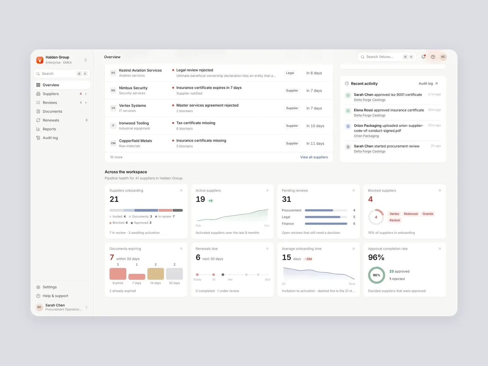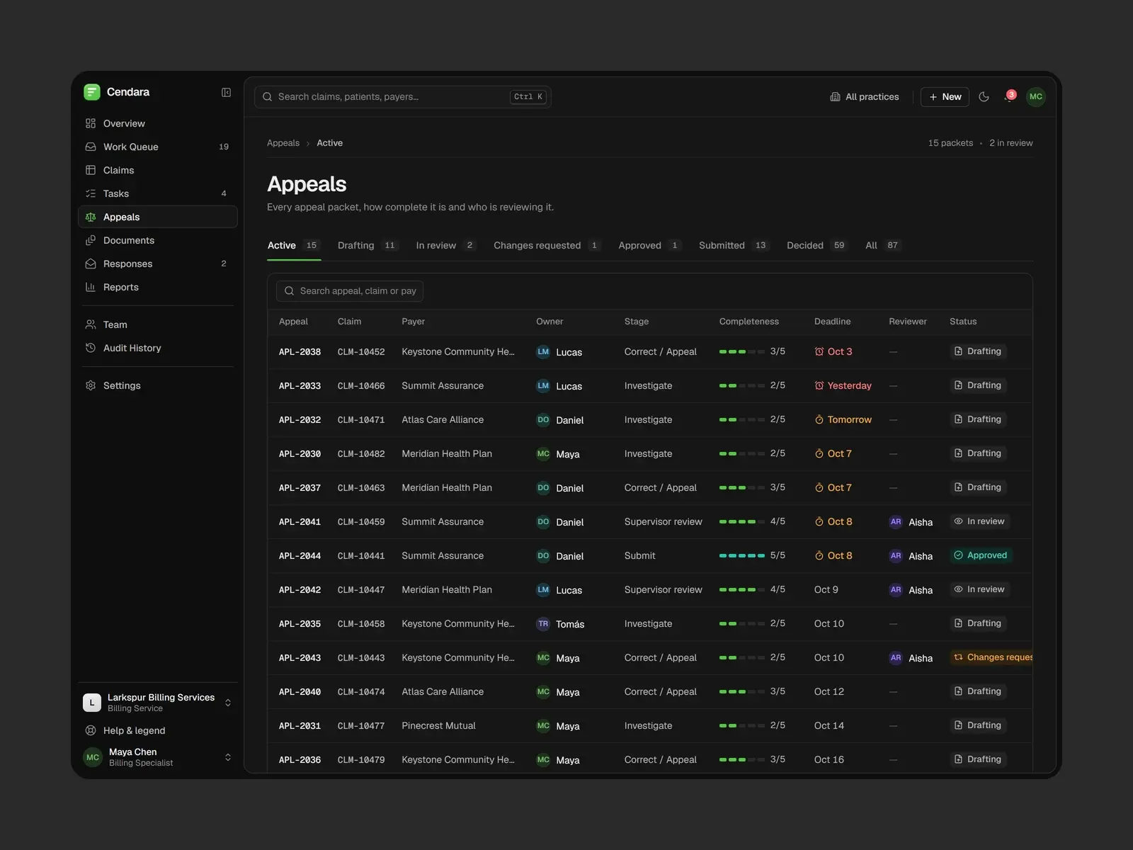



HostOp: one mark, from the billboard to the app icon.
A brand identity for a real estate operations platform: a mark built from two stacked panels, one blue to carry it, and a system that runs through the product, signage, stationery and packaging.
Built by Gr8r for its own portfolio. Not client work.
The brief
A platform brand that works at every size.
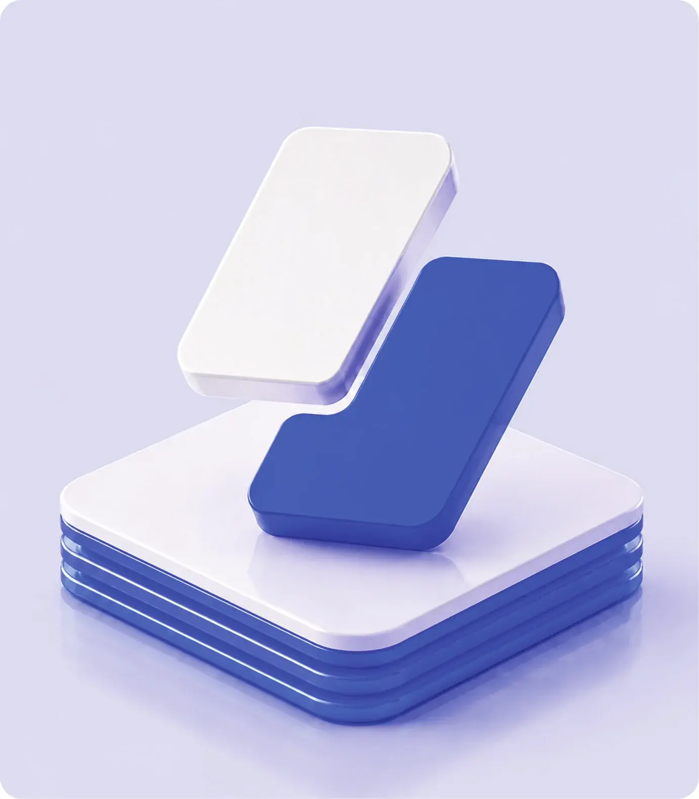
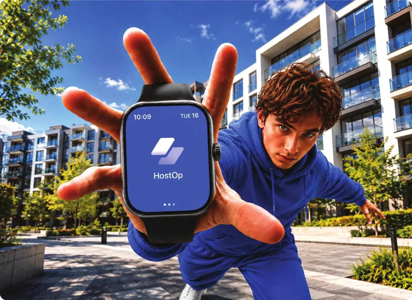
HostOp brings real estate operations into one platform for developers, investors, realtors and property teams. Its identity has to read as one product at the size of an app icon and a watch face, and at the scale of a billboard and a sign on a building.
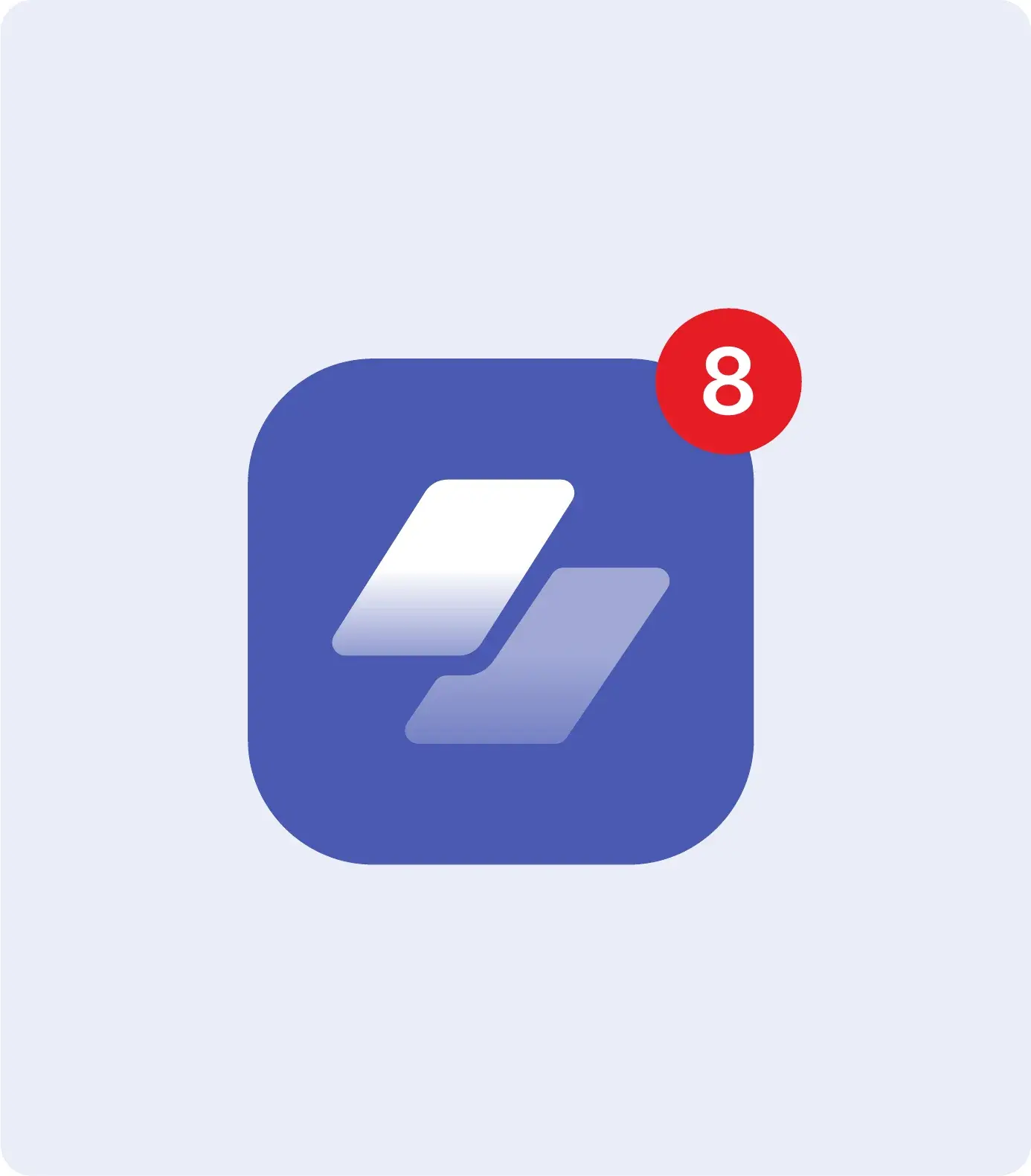
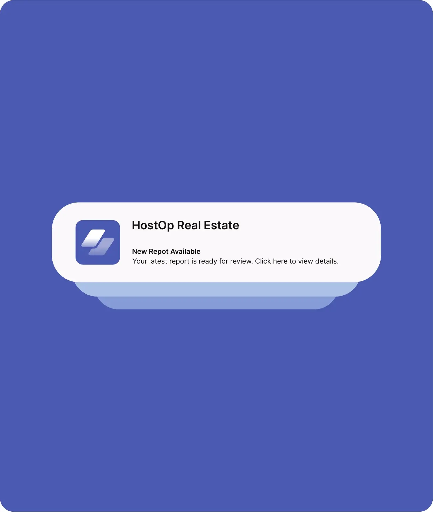
- 1Small: app icon and notifications
- 2Large: billboards and signage
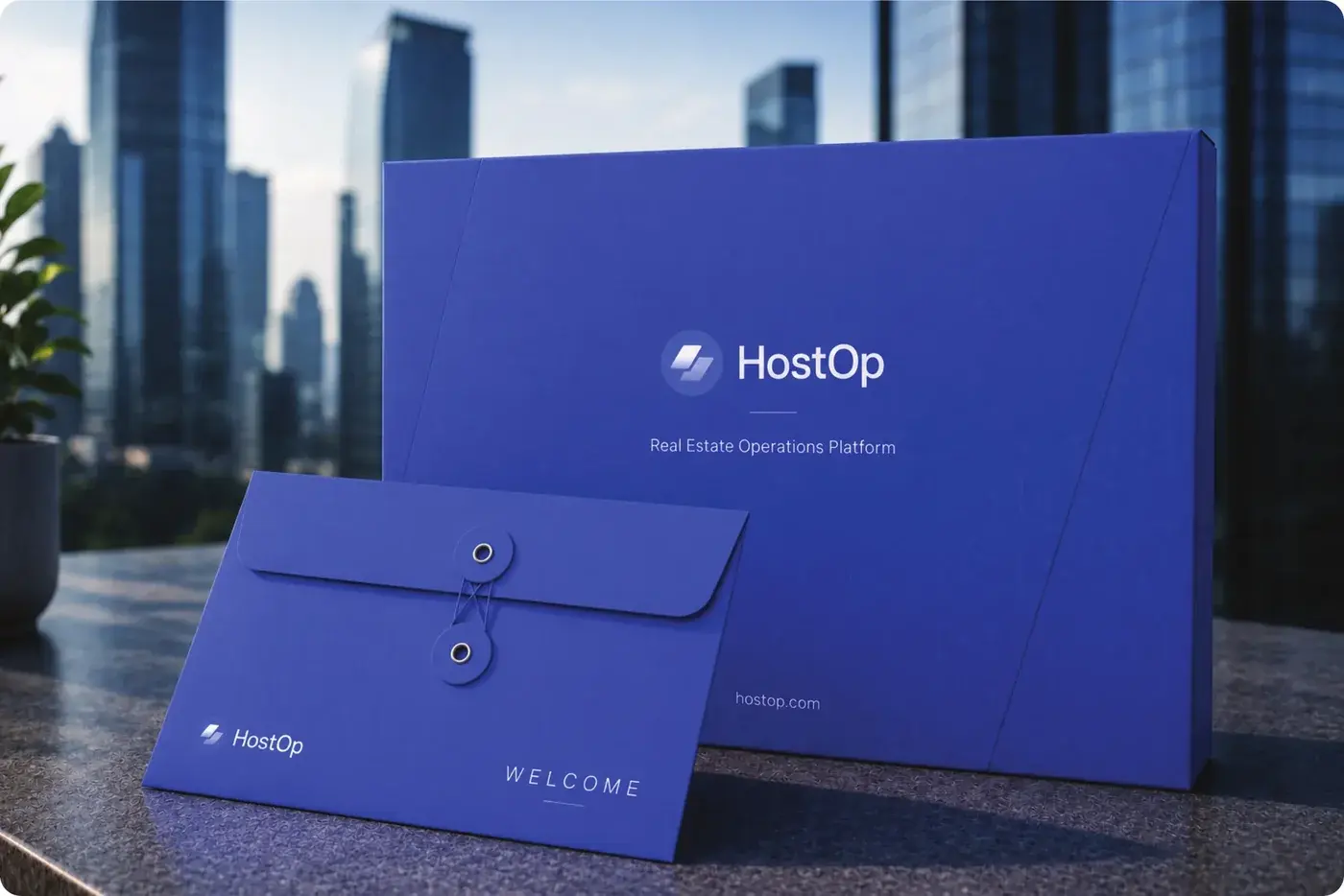
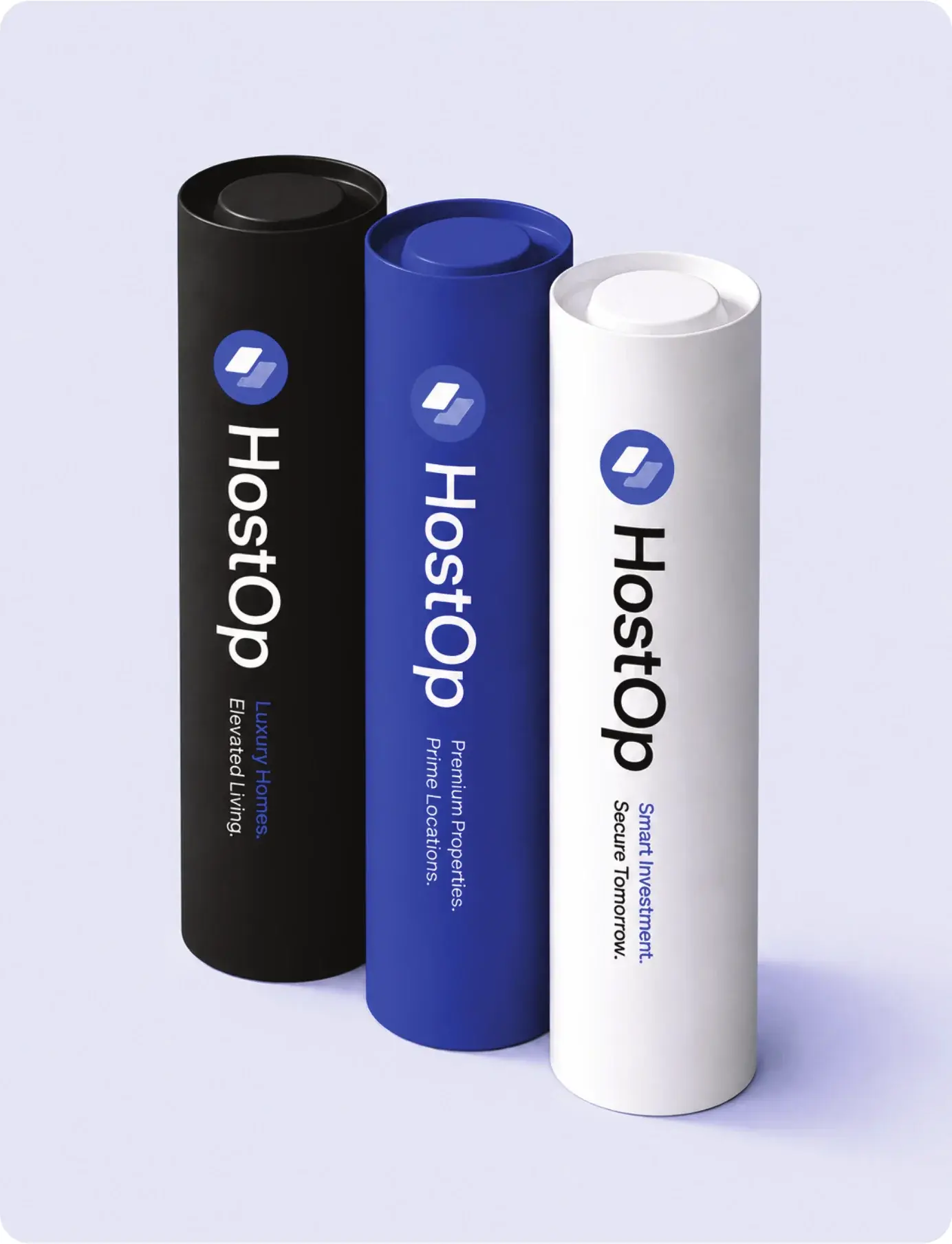
- 3In hand: stationery and packaging
The system
Four parts, used the same way everywhere.
- 1
Mark
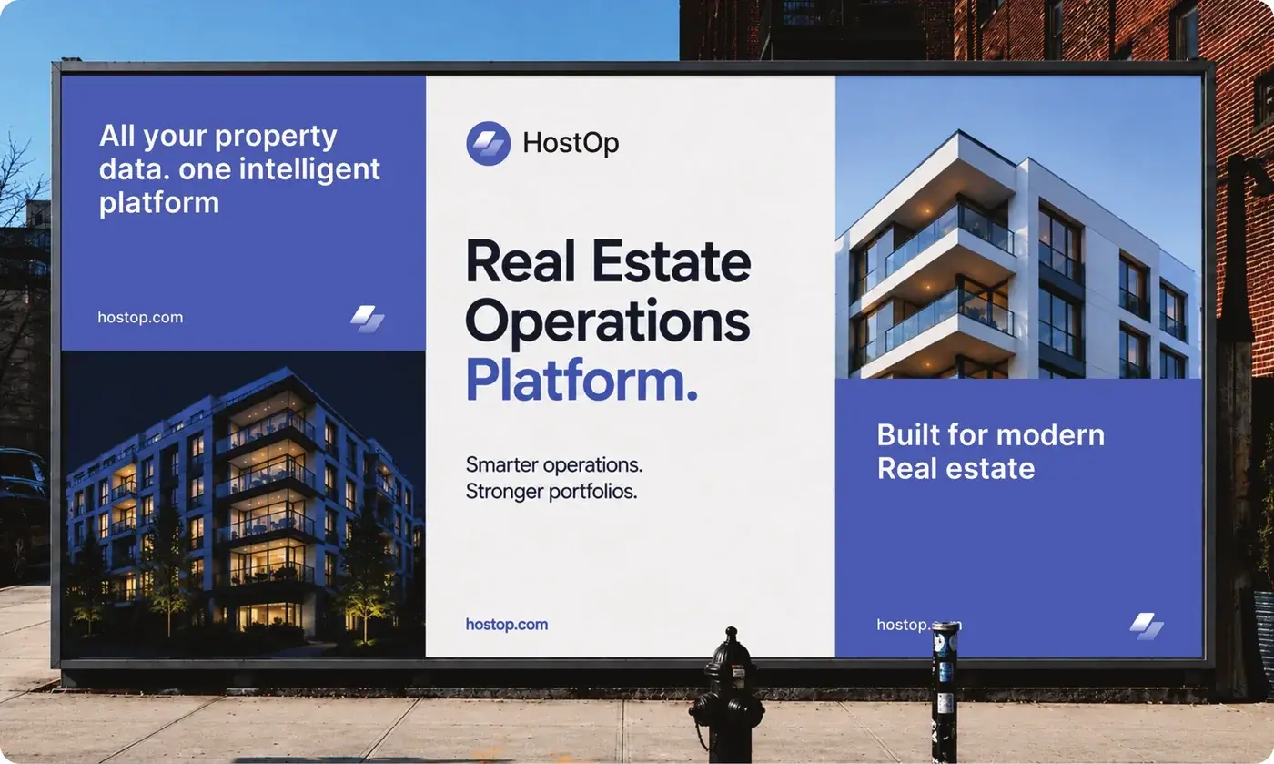
Two stacked panels in a blue circle: the platform layering operations.
- 2
Wordmark
HostOp set in a clean sans, locked to the mark on a construction grid.
- 3
Colour
One blue carries the brand, with a soft lilac, black and white.
- 4
Applications
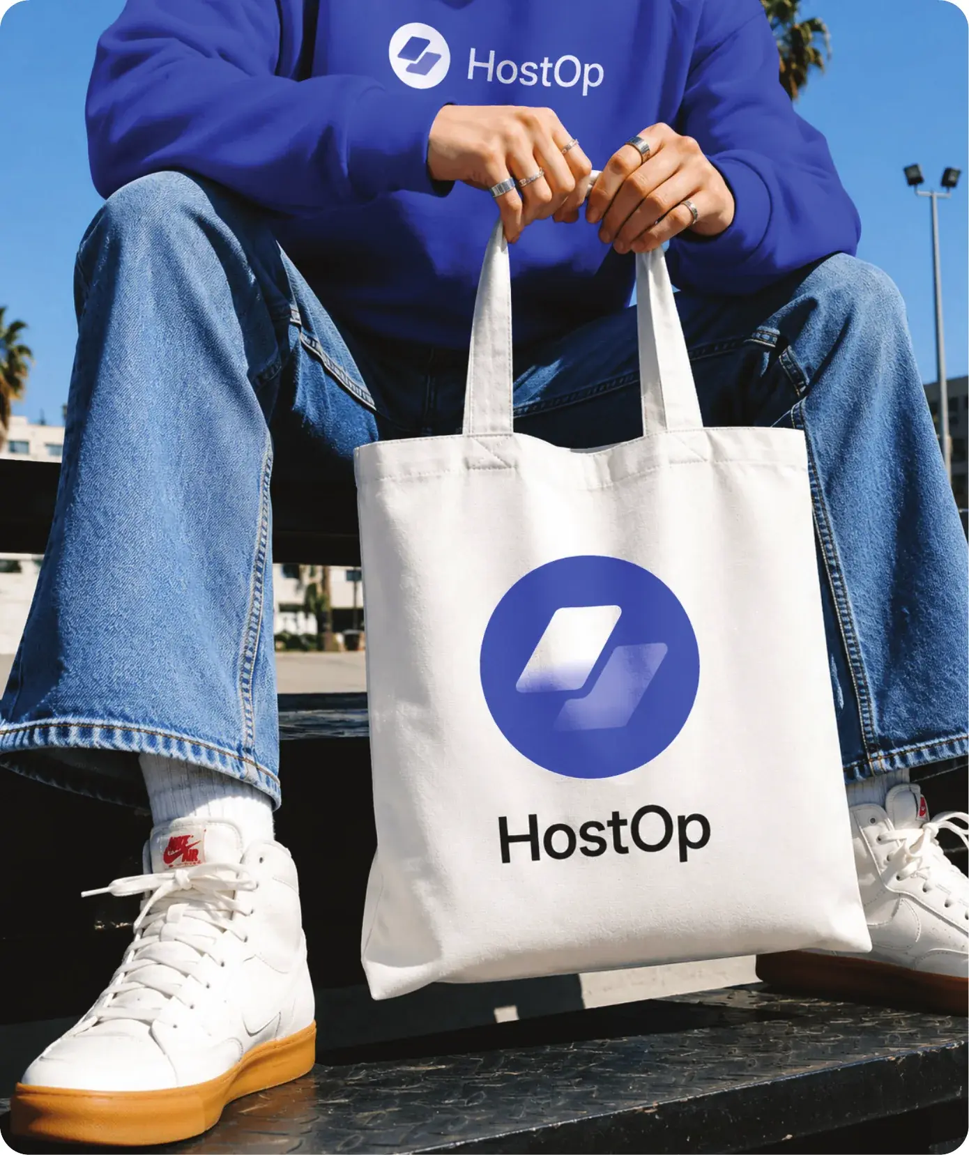
The same lockup on product, print, signage and merchandise.
Brand applications
The identity, applied.
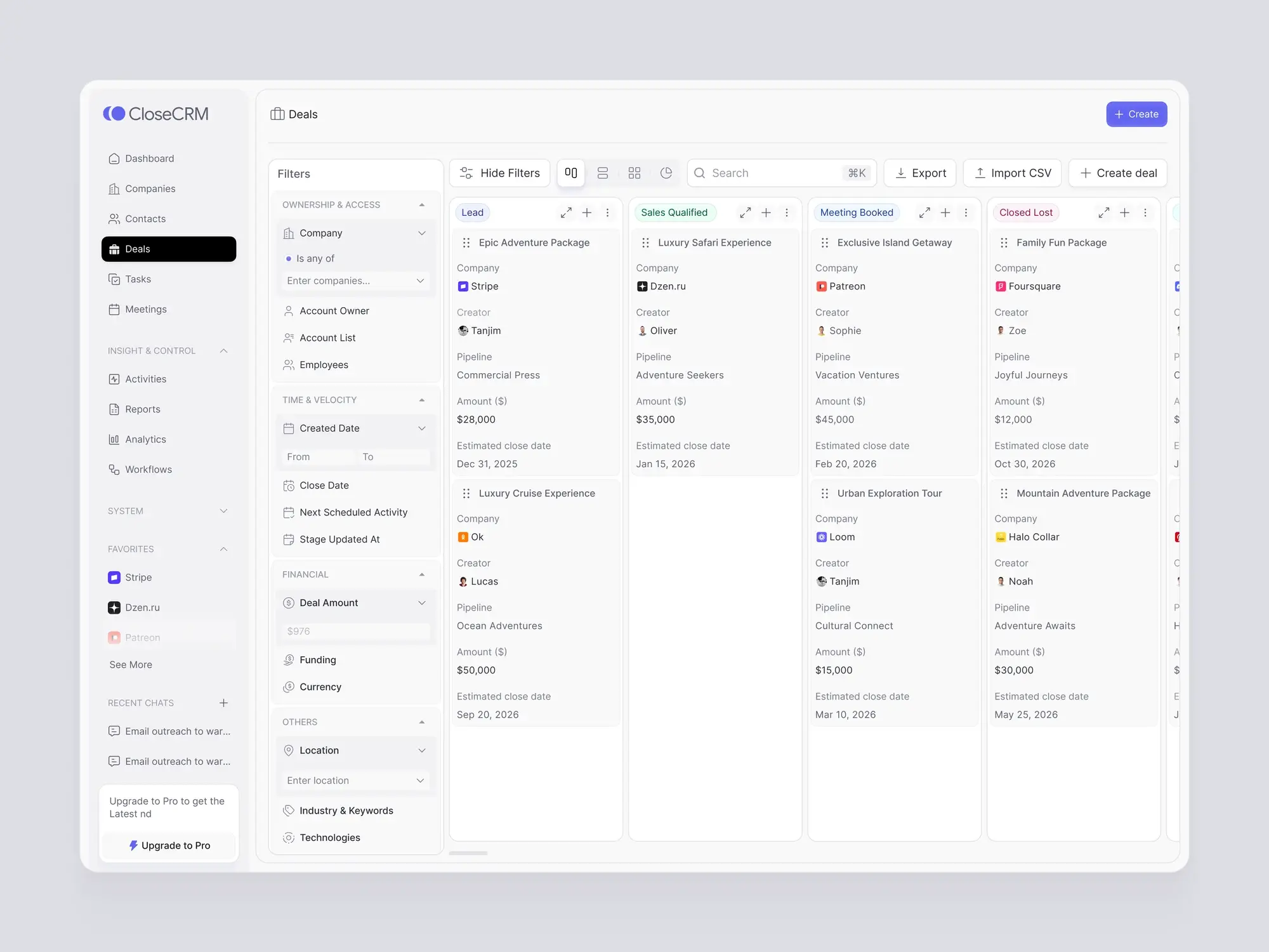
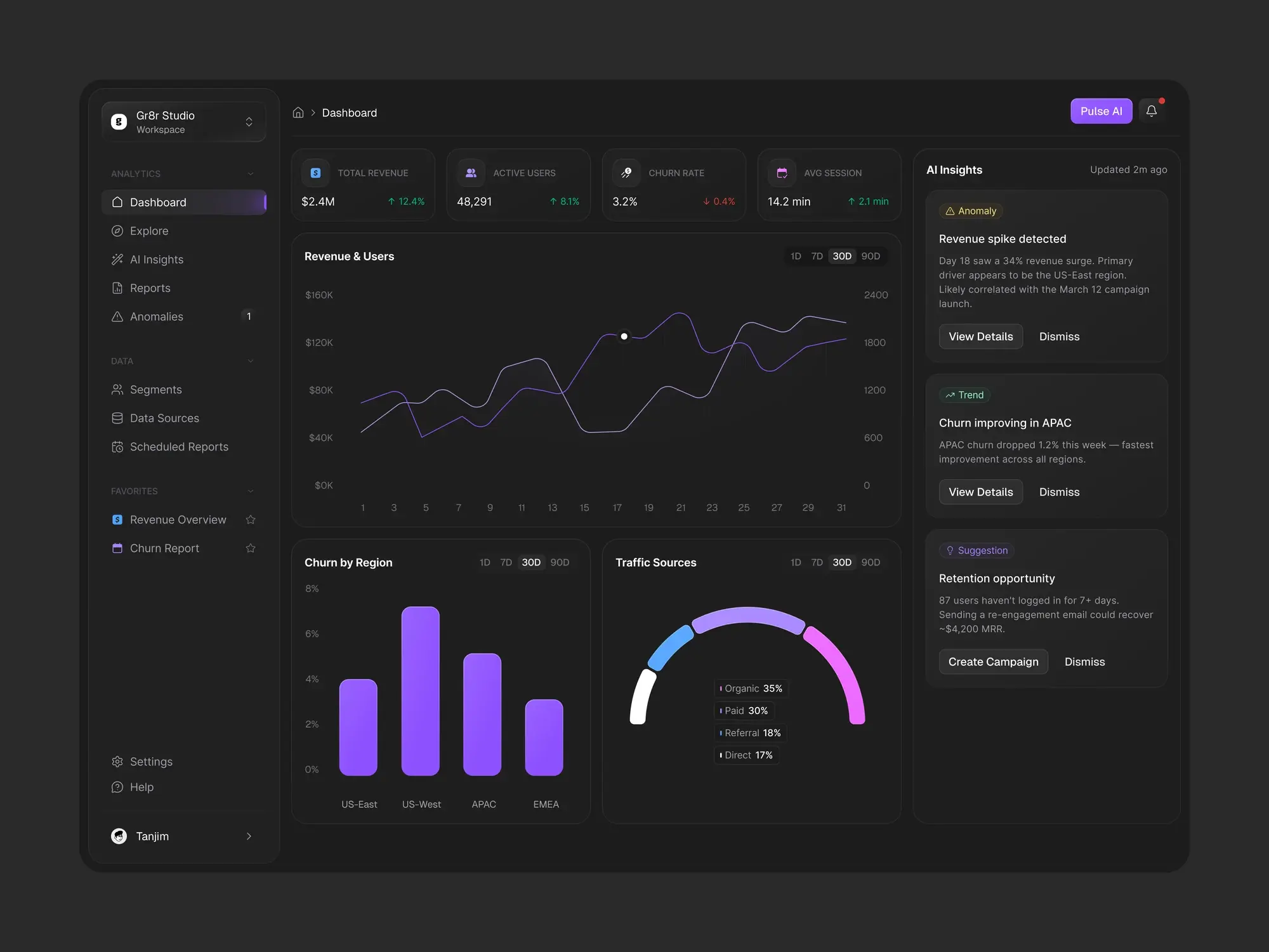
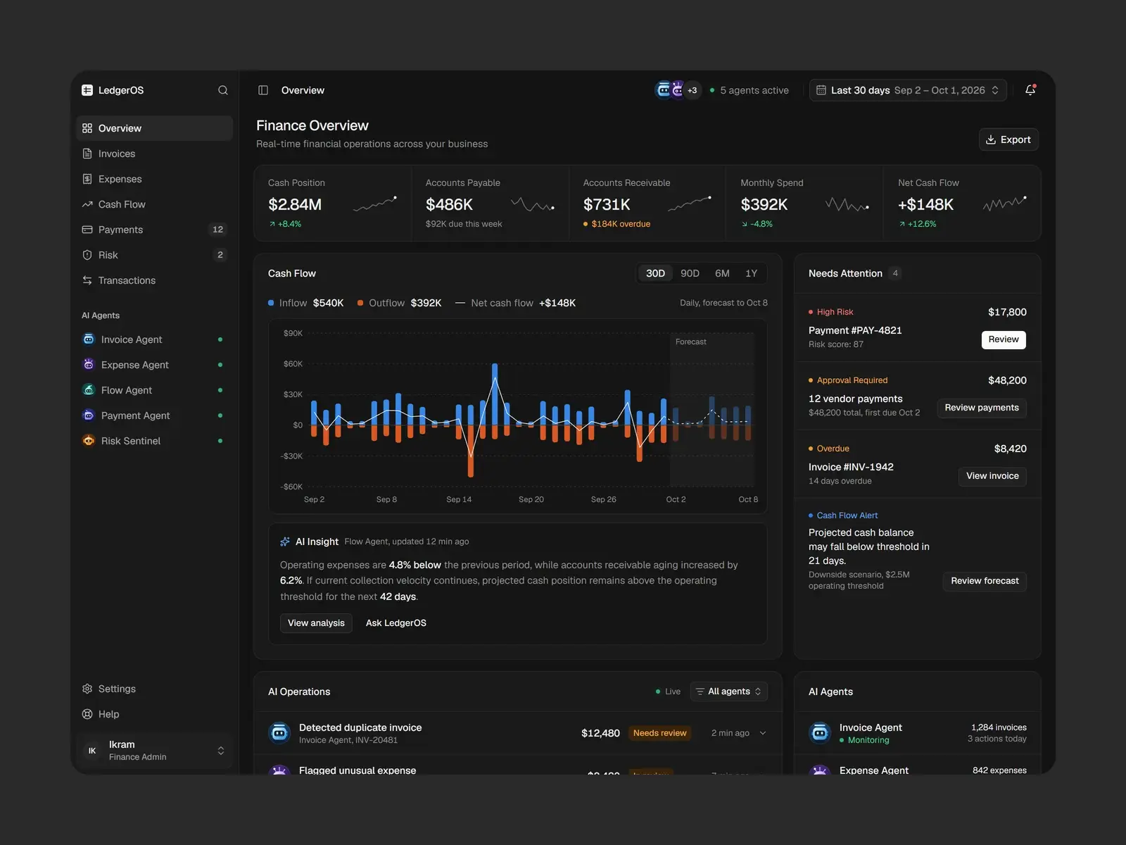
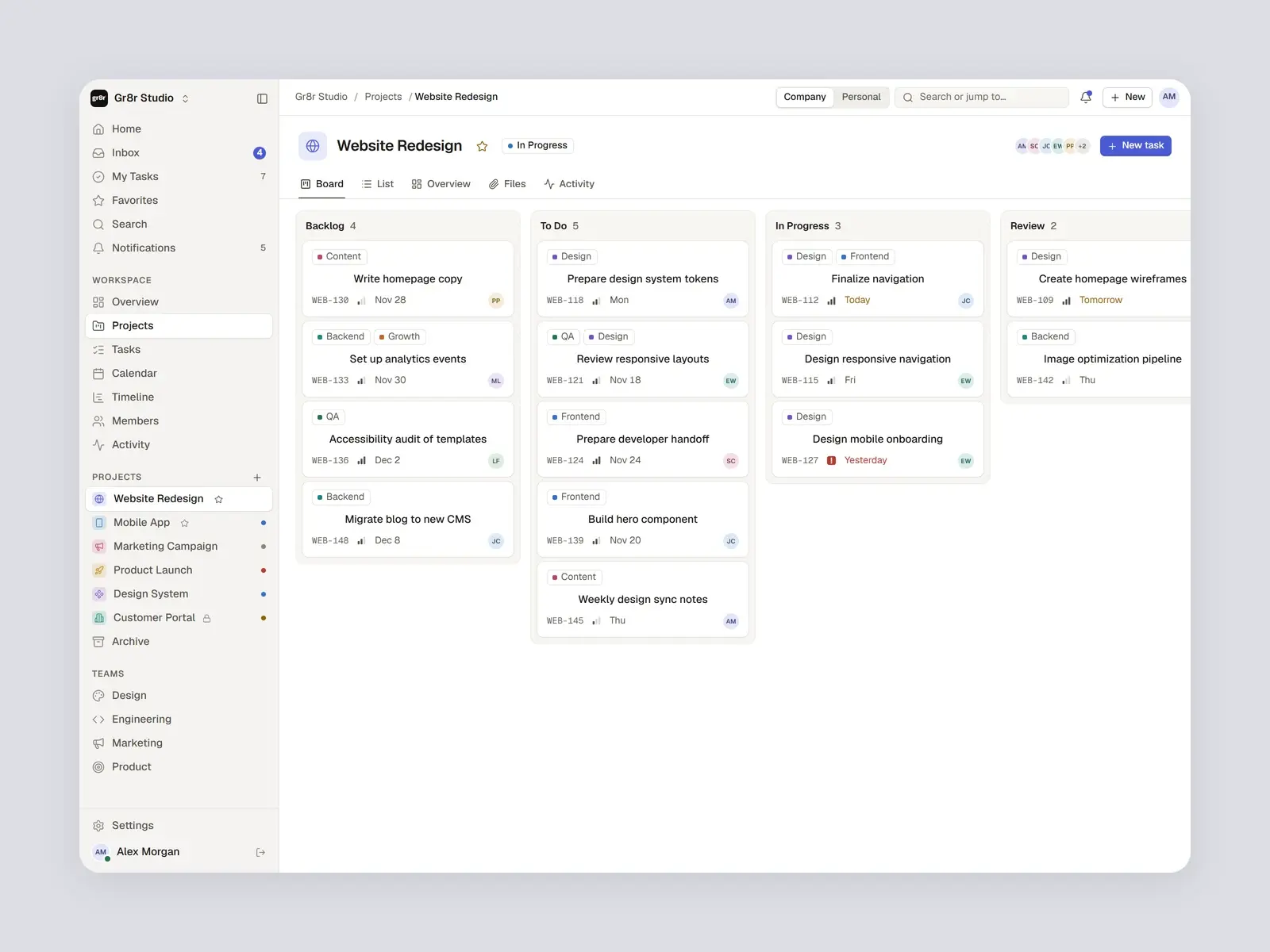
From the logo construction to the product, print and packaging: every application from the brand presentation.




Style guide
Typography & colours.
Inter for the wordmark and product text. HostOp Blue carries the brand, with a soft lilac for the mark's second panel, a pale blue ground, and black and white for print and packaging.
HostOp Blue
HEX #4B5AB2
Black
HEX #151312
Lilac
HEX #A2A8D6
Pale blue
HEX #EAEDF8
White
HEX #FFFFFF
Inter
- Regular
- Medium
- SemiBold
Outcomes
A complete identity, ready to use.
What we delivered. Measured business results will be added only with evidence and approval.
A mark that scales
The same two-panel mark reads on an app icon, a watch face, a billboard and a building.
One colour to own
HostOp Blue ties the product, print and packaging together, with black and white for contrast.
Applications ready to produce
Signage, stationery, packaging and merchandise designed with the same lockup and clear space.